Do think about the architecture of a room
Try and balance your furniture with its surroundings. Think of the room as a grid: if it's longer than wider, cut it across with sofas rather than placing the sofa along the long wall. It's important to visually square spaces off.
Don't forget about the corners of room
People seem to forget that rooms have corners. Often, there’s all this lovely furnishing in the middle of the room and then achingly bad corners. Pay attention to them - make freestanding shelves or something you can use to store objects and books. There used to be furniture made specially for corners - they were called ‘encoignures’ and they were great because they could round them off. When it comes to the corners of ceilings, I like to paint these a shade darker than the rest of the ceiling. It makes the room look a little more aged, which I like.
Do avoid clichés
I always say: don’t put bookshelves either side of the fireplace. It’s so boring. Put odd bits of furniture instead, which is much more interesting.
Don’t use ceiling lights
I don’t even like chandeliers. They often look ropey unless they're in a stately home. A chandelier in the middle of the room is all well and good if it's over a lovely table, but when you move the table, it looks odd hanging over nothing. Little ones are ghastly too. Eye level lighting is much nicer and makes people look pretty. The whole point of decorating is to make you look prettier and feel more comfortable.
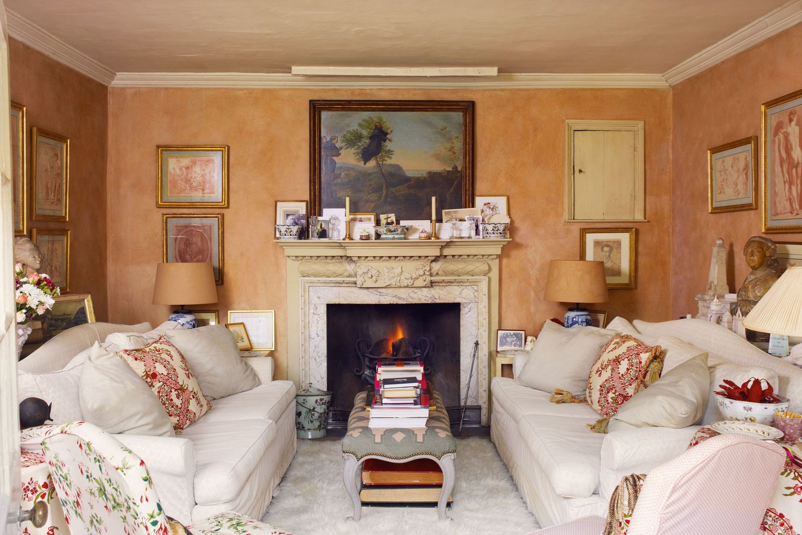
Do think about the room as a mirror
The walls will reflect the colour of the outside. People always forget this when they choose paint colours and then are confused when it doesn't look as expected. If it’s green outside it will make the room more green, likewise red bricks outside will make your walls look more red. Paint a board first and see what it looks like in the room before painting the walls.
Don’t just leave a ceiling white
Try a colour. I like a gloss grey blue which looks wonderful. The gloss reflects light and makes the room look much taller.

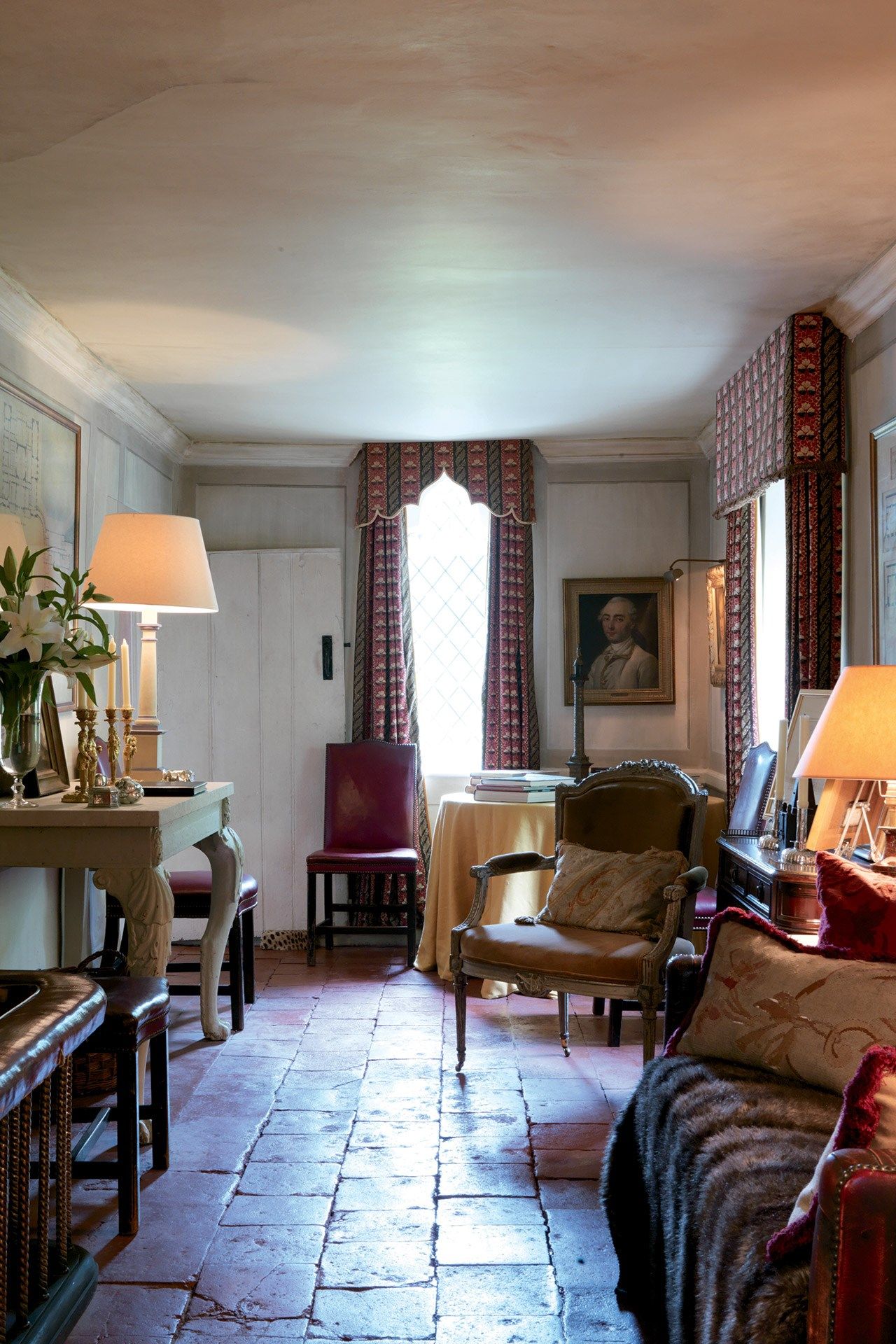
Do use a dark skirting board rather than white
The whole idea is to make the room meld into one whole, and the skirting is no exception. When walking into a room, you shouldn't be able to only pick out one thing. Instead, the eye should take in the whole thing all at one. I like a marbled skirting or a dark purple-brown. It's particularly nice to have a darker skirting board if you floor is stone or wood.
Do be bold with colour
I like picking up door architraves with colour - not just boring white. Give the doors presence with a colour that’s darker than the walls.
Don't use knife pleated lampshades, ever.
They’re so ghastly and common and ordinary and dainty and I hate them. Go for a card one instead. Paint the inside pink and everyone will look prettier. The the most flattering colour is the pinky-brown colour of a fabric Elastoplast. One of the most famous rooms I designed was the sitting room at The Hunting Lodge. Everybody thought it was pink, but it was more brown than that - if you put Elastoplast on the wall you couldn’t see it.
Do glaze over the paint on your walls
Even paint from leading brands looks much nicer with a thin, clear, matte glaze on top. Glaze mixed with a bit of white paint in it is also lovely. It creates a fog-like effect and stops the space from looking too staring. I think all rooms should be glazed, otherwise everything looks too new. It’s a shame we can’t smoke inside anymore, as the brown tinge from the smoke made everything look much more aged and nicer.

Don't leave too much space between your furniture
Furniture should always touch. Architects always draw things far too far apart. It’s the same with whatever you put on the walls: lampshades should slightly break into the pictures with no visual gaps. This helps the eye move seamlessly from one thing to the other. You don’t ever want to interrupt the eye moving around a room. Also, it can make a room look so much bigger when the furniture is positioned close together.
Don't draw attention to the legs of tables
If you want to put a side table between two chairs, try to find one with two tiers. It will look much nicer with books on the tier below - you don’t want to see legs if you can avoid it.

Do think of doing rooms all in one print
A while ago I decorated the drawing room of a London house where everything was covered in ‘Bloomsbury’ by Rose Tarlow from Tissus d’Hélène: the curtains, furniture, walls, lampshades, everything. It’s such fun and looks just wonderful.
Don't have too many light switches. And absolutely no dimmer switches
All lights should be controlled by one switch next to the door. You don’t want to go around switching all your lamps on and off all the time. I loathe dimmer switches because you never change it once you’ve found the right level. If you want to change the intensity of a light, try a brighter (or dimmer) bulb, but never a dimmer switch.
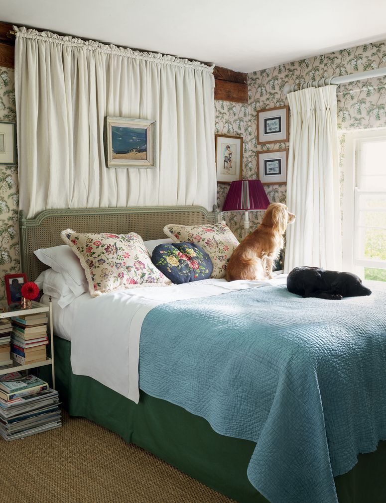
Do put a shaggy white rug in front of your fire
A fuzzy white hearth rug in front of the fire adds instant glamour. I buy flokati rugs from Peter Jones (for similar, try this faux sheepskin one from John Lewis) . Try to get it as big as possible, and don't worry if it gets absolutely filthy, just take it outside and hose it down in the garden.
Do put the chair rail much lower than you'd expect
Normally, people put the chair rail (otherwise known as a dado rail) far too high. If you put it an inch or so above knee height, the walls will look much taller.
Finally, don’t do anything I would do
I suppose you can ignore all of the above, in that case.