As we deck the halls in prepation for Christmas, red and green are once again taking centre in own homes and in shops across the land. The roots of Christmas’s red and green palette are a mix of ancient tradition, nature’s seasonal palette, and a touch of early modern advertising genius. The colours, which sit directly opposite each other on the colour wheel and are therefore complementary, can be traced back to pagan winter festivals, where evergreen holly with its scarlet berries was a symbol of life and resilience, providing a lush green backdrop in an otherwise barren winter landscape. Ancient Romans also decorated their homes with these hardy plants during Saturnalia, a festival of feasting and merriment marking the solstice, which later merged with early Christmas celebrations.
With the later development of Christianity, red took on a sacred symbolism, representing both the blood of Christ and the love that underscored the nativity story. Paintings of the Virgin Mary often depicted her in red robes (not the Marian blue we know today), a colour that eventually found its way into festive decorations. The combination of red and green endured throughout the centuries, mingling and merging with folklore and spirituality until it felt deeply rooted in the holiday spirit.
However, the real defining moment for red and green as Christmas colours was less ethereal and more commercial. In 1931, Coca-Cola’s advertising campaign, featuring a plump, jolly Santa Claus in a bright red suit (a shade closely aligned with the brand’s own signature colour), solidified the colour pairing in popular culture. Before Coca-Cola, Santa Claus was depicted in a variety of colours, including tan, green, blue and brown. He was also sometimes drawn in patriotic stars and stripes during the American Civil War. The campaign’s success gave red and green a fresh relevance, and – as is the power of commercial advertising and messaging – permanently embedded them as the colours of Christmas in the public imagination.

Yet, as with many traditions, even the most enduring ones can benefit from a little updating. Besides, red and green are not the globally accepted Christmas colour language: in Sweden you’ll often find red, white and gold adorning Christmas trees and presents, while countries that have warm Christmases like Australia often favour cooler or even beachy tones. So the world really is your oyster when it comes to Christmas colours.
This year, why not take inspiration from our colour consultants’ predictions for the 2026 palette, and introduce some richer teals, reds and purples? Or go bolder still with a cheerful injection of pink or orange or some magical metallics. We have looked through some of our favourite Christmas stories to find appealing alternative palettes that you might like to try this year. And if you’ve already decorated, why not introduce a few unexpected colourful accents to bring your whole scheme to life?

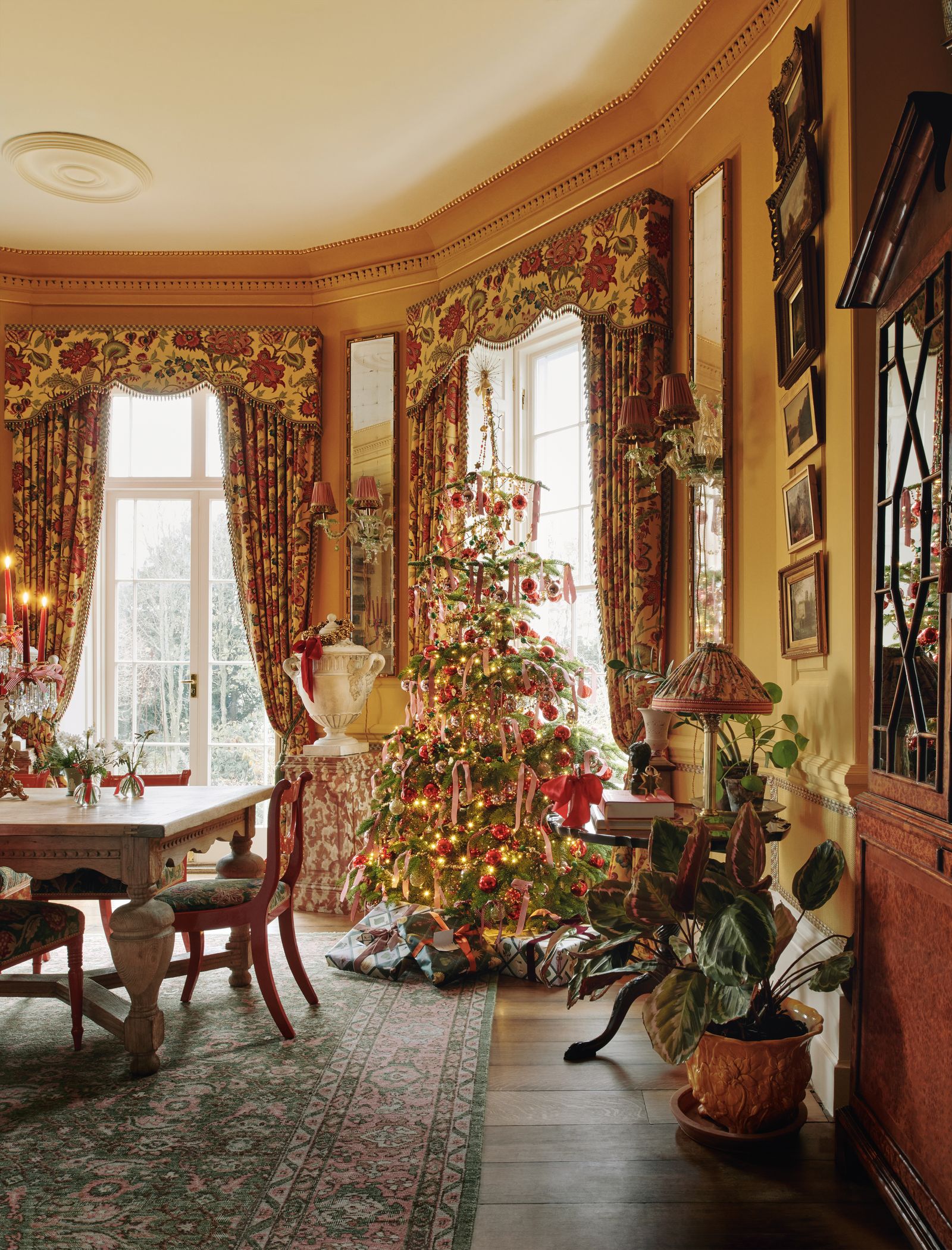
Metallic maximalism

We have long been incorporating metallic accents into our Christmas schemes, with glittering tinsel and baubles adorning our trees, mantelpieces and stairs. But we love the idea of going for a full-on metallic scheme, as interior designer Flora Soames has done here on her Christmas tree at home in Norfolk. The metallic ribbons from a vintage fabric dealer bring everything to life, and work especially well with baubles in a mix of traditional gold and more daring blue. It strikes just the right balance between gaudy and timeless, and ribbons are easy to switch up if you’d like to try a different mix of colours next year. You could even add some metallic ribbons to your tree in between Christmas and New Year’s Eve to help get your house into party mode. Or take inspiration from the House & Garden team, who hung some fabulous foil creations from the sitting room ceiling in their recent festive shoot. For a more subdued take on the metallic trend, take inspiration from designer Jess Wheeler’s beautiful house in Dorset, which is tastefully decorated with her own brass creations and seasonal foraged foliage.
-production_digital.jpg)
Pretty pastels

If your taste tends more towards the subtle and delicate, you might like to consider pastels as your new go-to Christmas colours. With so much going on at this time of year, there can be something very soothing about dialling down your decorations with softer shades, making your home into a haven of calm rather than an explosion of Christmas madness (though we are very fond of this aesthetic, too, of course). We were particularly taken by the elegant drawing room in the west London townhouse of Eva Karayiannis, founder of childrenswear brand Caramel. The starting point for this pretty pastel scheme was the lemon yellow ribbon that winds round the tree. ‘I collect all these things from vintage markets, and found this pastel ribbon, which works so beautifully because you can see through it,’ says Eva, who then added pink baubles and chose pastel blue candles for her silver candlesticks. The whole effect is beautifully considered yet offers a fresh take on Christmas decoration.


Teal, aqua and orange
Offering a fresh take on the traditional Christmas colour scheme, House & Garden’s own decoration editor Rémy Mishon whipped up a wonderfully inventive and whimsical take on the red and green regime, offering shades of teal, aqua and orange as this year's alternative. After all, if you edge slightly along the colour wheel from green, you'll find yourself at turquoise. Directly opposite the bluey-green shade is just the kind of burnt orange hues that Rémy recommends. So, despite veering away from tradition, Rémy's palette still maintains familiarity by keeping it in the family of red and green, as well as ensuring significant contrast between her two main tones.
‘I had some pictures saved from a Rubelli and Formafantasma collection which looked particularly nice clustered together in my photo library,’ explains Rémy, .‘There were apricots, a light pink, strong oranges and a zingy green which I thought would make a pretty, but off beat base for a scheme.’ She then came across The Perfect Nothing Catalogue’s pieces of ordinary household items incrusted in semi-precious stones: ‘I thought the two were a good marriage with the stones complementing the scheme while not being too delicate. I added a deep green into the mix to further toughen it up and make it more wintery. I thought the combination had something quite magical and fairytale about it, fitting for Christmas, though maybe more Brothers Grimm than Disney.’
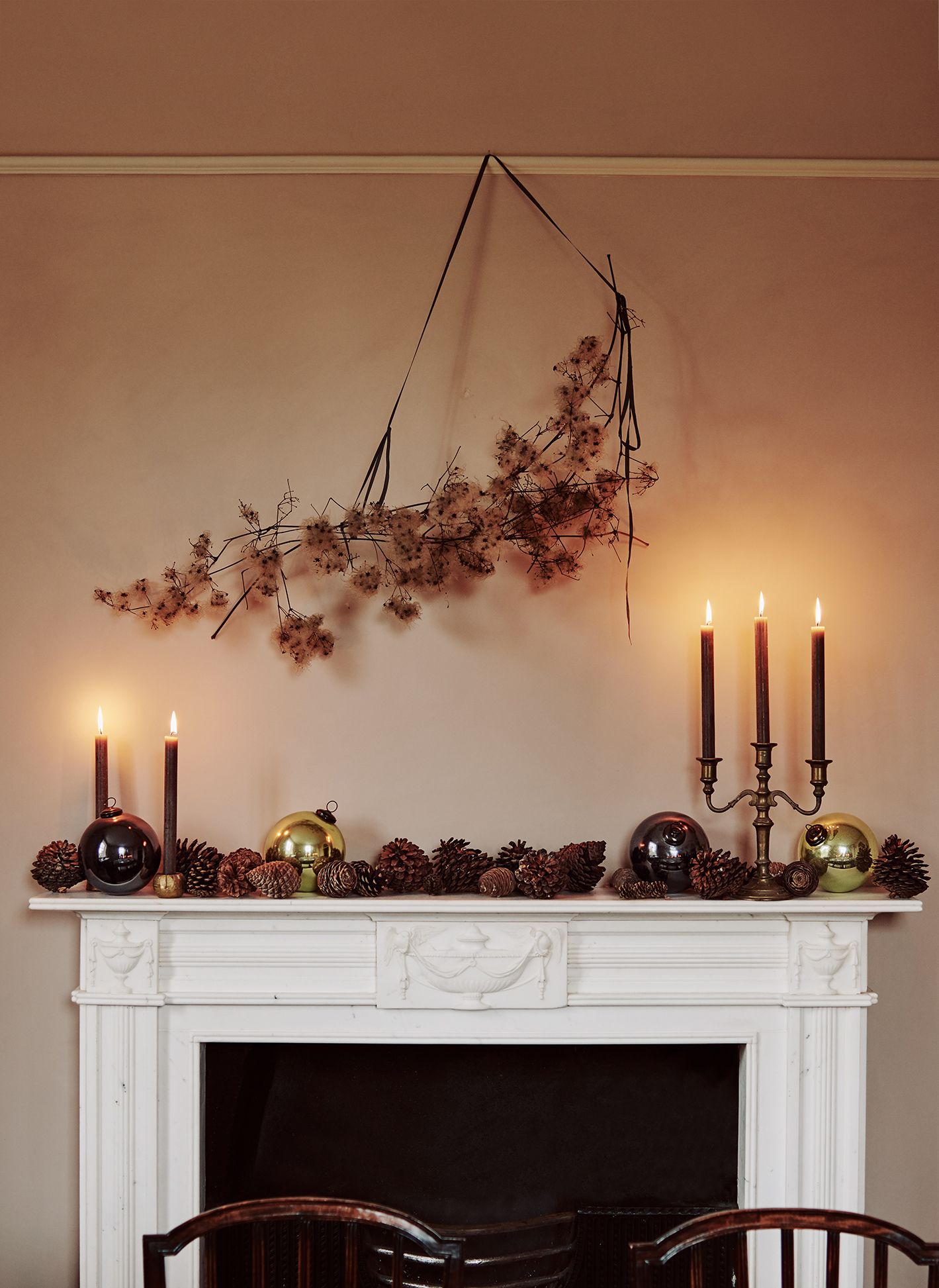
Brown and russet

Nobody could have quite predicted the scale of brown’s return to favour, both in clothing and interior decoration terms. We’ve seen plenty of glossy brown front doors and stairways that would take well to being adorned with branches, pine cones and other neutral foliage. The oak-panelled walls and large mahogany table in the showstopping entrance of Ven House in Somerset lend themselves to a brown ad russet and green. The owners used russet-coloured strands of leaves instead of garish tinsel to create a natural, warm palette that fills the room with an opulence that still feels organic.
Meanwhile, as a former rectory in the West Country, foraged Christmas decorations and salvaged materials enhance the sense of a house that has been made suitable for modern family life, while retaining its Victorian character. At Christmas, the family gathers pine cones and branches of old man’s beard to decorate this room at the front of the house, which has walls painted in Farrow & Ball’s ‘Setting Plaster’, a sandy pink colour that complements browns very well.
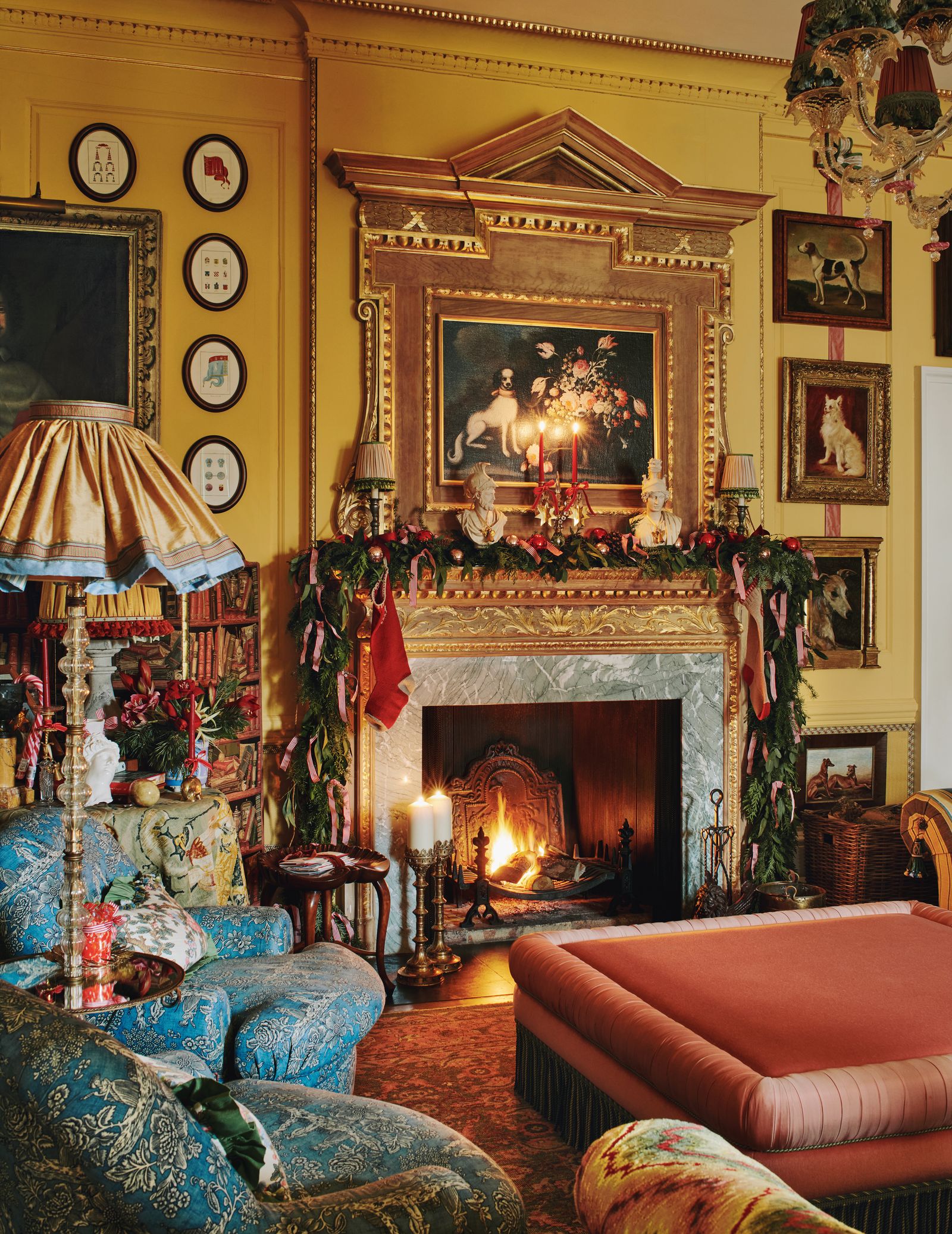
Pink and red
Unlike red and green, which are opposite each other on the colour wheel, pink and red are next to each other and are known as analogous colours. Some people cannot bear this combination, but we are rather fond of it, and have seen it making a real comeback in recent years (much like blue and green, which we think very much can be seen without a colour in between). This pairing was Martin Brudnizki’s chosen scheme for his country-house apartment, as it worked so perfectly with his existing interior decoration. We love the idea of using traditional red and gold baubles, which will transition easily from year to year, and combining them with pretty pink ribbons for an injection of something a little more unexpected.