.jpg)
The Farrow & Ball colour card has achieved iconic status among professional interior designers and homeowners alike. The richness of the pigment, the capacity of the colours to change in different lights, and, of course, the distinctive names of the paints have all contributed to the British brand’s popularity over the years. So it is worth taking note when it announces the launch of new colours, particularly as these are the first additions to the colour collection in four years.
‘What better time could there be to introduce new colours?’ says colour curator for Farrow & Ball, Joa Studholme. ‘We all feel ready to be rejuvenated, enhance our homes, and show off our own personal style,’ says Joa, who worked on the development of the 11 colours with Charlotte Cosby, head of creative at Farrow & Ball. The team prioritised the concepts of ‘joy, comfort and refreshment’, ultimately producing an appealing range of shades designed to serve as the basis for schemes that will make time spent at home more enjoyable, creating a sense of ‘emotional ease’.

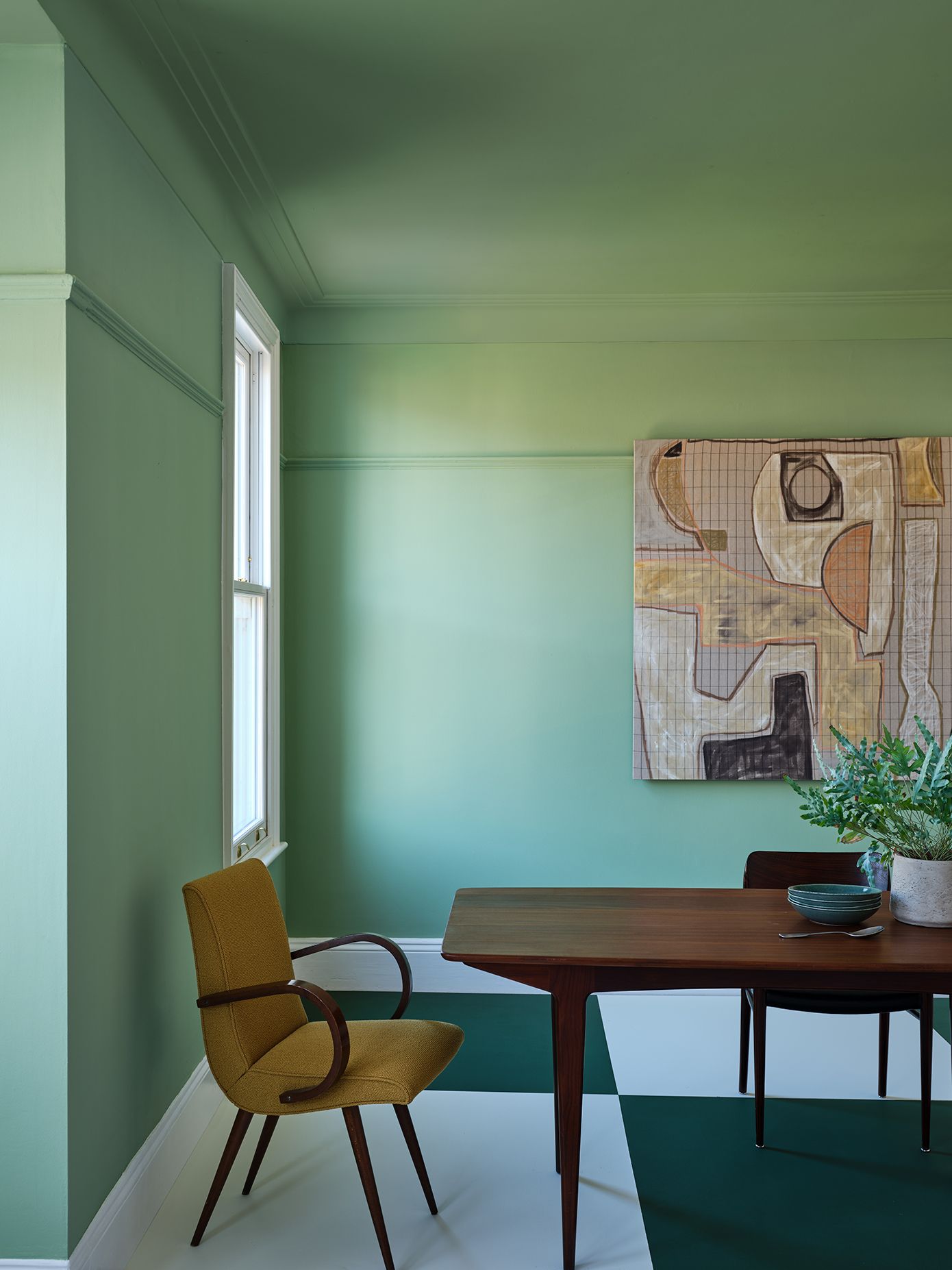
The new shades cover a broad spectrum, from the softest and palest of pinks to a bold flame red and rich, moody blues. Effortlessly usable and liveable, the colours are all named in Farrow & Ball’s famously idiosyncratic style, so that each one has its own memorable story to tell. Charlotte picks out ‘Beverly’ as a particular favourite, a medium-dark green named after a ‘kind and generous’ member of the Farrow & Ball team who passed away recently. ‘Just like its namesake, it is reassuring, uncomplicated and full of depth,’ says Charlotte. Meanwhile the cool blue of ‘Kittiwake’ was inspired by the wings of the eponymous seabird, which clusters at Lulworth Cove near the Farrow & Ball headquarters in Dorset, after which its already much-loved ‘Lulworth Blue’ is named.
A sense of history has always been an integral part of Farrow & Ball’s appeal, and this appreciation for the past – both for its grander and humbler elements – is reflected in the inviting new colours. ‘Templeton Pink’ was created for the dining room at Templeton House, a magnificently restored Georgian house in Roehampton in south London, as a foil to the Wedgwood plaques that hang there in memory of a former owner. Meanwhile, the warm neutral hue ‘Stirabout’ was inspired by the traditional porridge that has been made for centuries in Ireland.
.jpg)
Other shades reference processes of craft and making, a tradition in which Farrow & Ball is firmly embedded. Now the lightest of the brand’s pinks, ‘Tailor Tack’ alludes to the colour of sewing thread used for tacking in couture ateliers, while ‘Selvedge’ is named for the type of denim tightly woven on a shuttle loom to produce a stiffer finish and closed edges that will not fray.
As Farrow & Ball colours appear so frequently in the projects that are featured in the pages of House & Garden magazine, it will be most interesting to see how these new shades are used by both interior designers and creative house owners. The bright flame red of ‘Bamboozle’, inspired by the buccaneering tricks of pirates, would lend a distinctive air to a room of grand proportions, while the absorbing, enveloping dark blue-grey of ‘Wine Dark’, named for Homer’s atmospheric epithet for the sea, would make for a deeply comfortable and welcoming sitting room as the long nights and cooler days of winter unfold outside.
The long-awaited collection of 11 paints holds a wealth of possibilities for tonal decorating, which is a popular look in interiors at the moment. Imagine the soft green of ‘Whirlybird’ as a backdrop for woodwork in the darker green of ‘Beverly’, or the petrol blue of ‘Selvedge’ set against the darker hue of ‘Hopper Head’, which alludes to the iron containers used to catch rainwater at the top of a downpipe. Farrow & Ball’s wide range of whites will always allow you to make a discerning choice when wishing to create a striking contrast between the walls and the woodwork. But the idea of painting a room in entirely one colour would, of course, be just as effective: the soft grey-green of ‘Eddy’, influenced by the natural whirlpools beloved of wild swimmers, would be the perfect choice for this design statement.


