Our Interior Designer of the Year Sophie Ashby brings a bold scheme to a London house

Although I have long admired Sophie Ashby’s work, it has always been from afar. Until she invited me to see this recently redecorated house in south London, I had in fact never visited one of her interior-design projects or had the opportunity to discuss her decorating modus operandi. I knew how they looked, but not how they felt.
A combination of the right architecture and the right clients meant this house provided a unique opportunity for Sophie to express some of the ideas closest to her heart. The house was designed in 2004 by the influential architect Terry Farrell, who is better known for London landmark projects such as 2 Marsham Street (for the Home Office), Charing Cross Station and the MI6 Building than for private houses. Kelly Hoppen had decorated the interior for the previous owners, but Sophie’s clients, a South African couple who divide their time between London and Cape Town, wanted something that better reflected their bolder tastes. Sophie, whose mother is South African, has spent plenty of time in Cape Town herself over the years, so she had an instinctive understanding of where her clients were coming from. Charlotte Bryan, a designer from Studio Ashby, worked with Sophie on the project.
MAY WE SUGGEST: Style File: our Interior Designer of the Year Sophie Ashby
The two-storey house is long and linear with a double-height, sky-lit corridor running along one side. Opening off this are the living areas on the ground floor and bedrooms on the first. ‘The house was in great shape and much of what was there was good quality,’ Sophie says. ‘And I’m not one for ripping stuff out for the sake of it.’ That meant the existing kitchen units remained in place, although they have been updated with new granite work surfaces. Likewise, there was a perfectly decent stone floor throughout the lower storey. Instead of replacing it, Sophie chose to commission a series of vast runners and rugs by Deirdre Dyson, all in the same design, which add an instant element of aesthetic warmth to the ground-floor rooms.
They also establish the colour palette, which Sophie explains was inspired by the bushveld – South Africa’s distinctive woodland ecoregion, which is rich in shades of green, blue and russet brown. ‘It was so exciting for me to work with a South African client, to have this connection to the country and to, in a way, recreate some of that feeling here,’ she says.
Where this idea reaches its apotheosis is the glazed sitting-room pavilion – a double-height space that plugs into the middle of the building’s spine. The wall facing you as you enter is finished in a majestic blue tadelakt plaster, its uneven surface giving a sense of drama, texture and movement. At 3.75 metres, up soars the ceiling, while the contemporary Italian sofas are deep and low, accentuating the volume of the room. It is no mean feat to make a space larger than a squash court feel intimate. What helps is Sophie’s preference for furniture that is ‘quite big and butch’. Another example of this is the two-part, live-edge coffee table by Studio Ashby in kiln-dried American black walnut wood, which separates the sofas – a souped-up homage to the work of the 20th-century American designer George Nakashima.
Sophie says she is not a fan of having lots of tiny objects in a room. Even when it comes to vintage furniture (her studio makes judicious use of mid-century pieces), she generally prefers the strong, linear look of French and Italian designs to the teak-and-tapered-leg style of Danish ones. ‘I hate the stuff,’ she says. ‘Anything with a swish or a flick or a curl.’

This is not to say she has any aversion to including quirky or playful touches in an interior. In the bedrooms upstairs, pictures are hung off centre; in one, the upholstered headboard is wide enough to also serve as a backdrop to bedside tables. Lush fabrics mingle with geometric prints in otherwise colourblocked spaces. Sophie understands how to add a sense of dynamism without it feeling self-conscious or self-congratulatory.
It would be remiss of me not to mention the important role that art has played in the creation of this house and, indeed, in many of Studio Ashby’s other projects. Here, the owners had no shortage of beautiful ceramics and sculptural pieces for Sophie to work with, but the house also had acres of wallspace crying out for pictures. With a focus on the work of contemporary African artists, she helped them to add to their collection with 30 or 40 new pieces – including paintings and photographs – sourced from South African galleries. They scale the walls in the long hallway and invite moments of wonder in each of the rooms.
And how does the space feel now? It is energetic. It is a house with positive vibes. And one in which you very much get the sense of it having been created specifically with the lives and the experiences of its inhabitants in mind.
Studio Ashby: studioashby.com
Studio Ashby is a member of The List, you can view her profile here.
 Alexander James1/16
The runner is one of several bespoke rugs designed by Studio Ashby with Deirdre Dyson for this house.
 2/16
2/16 Alexander James3/16
The family dogs descend the stairs, which are carpeted with a runner from Crucial Trading. The photograph on the far wall is Xhosa Cow Sitting on the Shore by Daniel Naudé.
 4/16
4/16


 Alexander James5/16
The painting is by Sanell Aggenbach, sourced via What if the World gallery in Cape Town. ‘Hamilton Sofas’ from Minotti are paired with a bespoke stool in Guy Goodfellow Collection’s ‘Fez Weave’.
 Alexander James6/16
The pendant is a Tord Boontje design for Swarovski. Sophie sourced the vintage floor lamp from 1stdibs. American black walnut was used for the top of the two-part, live-edge coffee table designed by Studio Ashby. The armchairs are upholstered in ‘Teddy’ mohair by Pierre Frey
 7/16
7/16 8/16
8/16


 Alexander James9/16
A pair of large landscape photographs by Tim Hall – Skadar Lake I and Skadar Lake II – create a serene atmosphere. ‘Bure Dining Chairs’ by &Bespoke from Staffan Tollgard are teamed with a custom-made table, which has a terrazzo top created in a bespoke colourway by Olivia Aspinall. The ceramic pendants were commissioned from South African ceramicist Lisa Firer
 10/16
10/16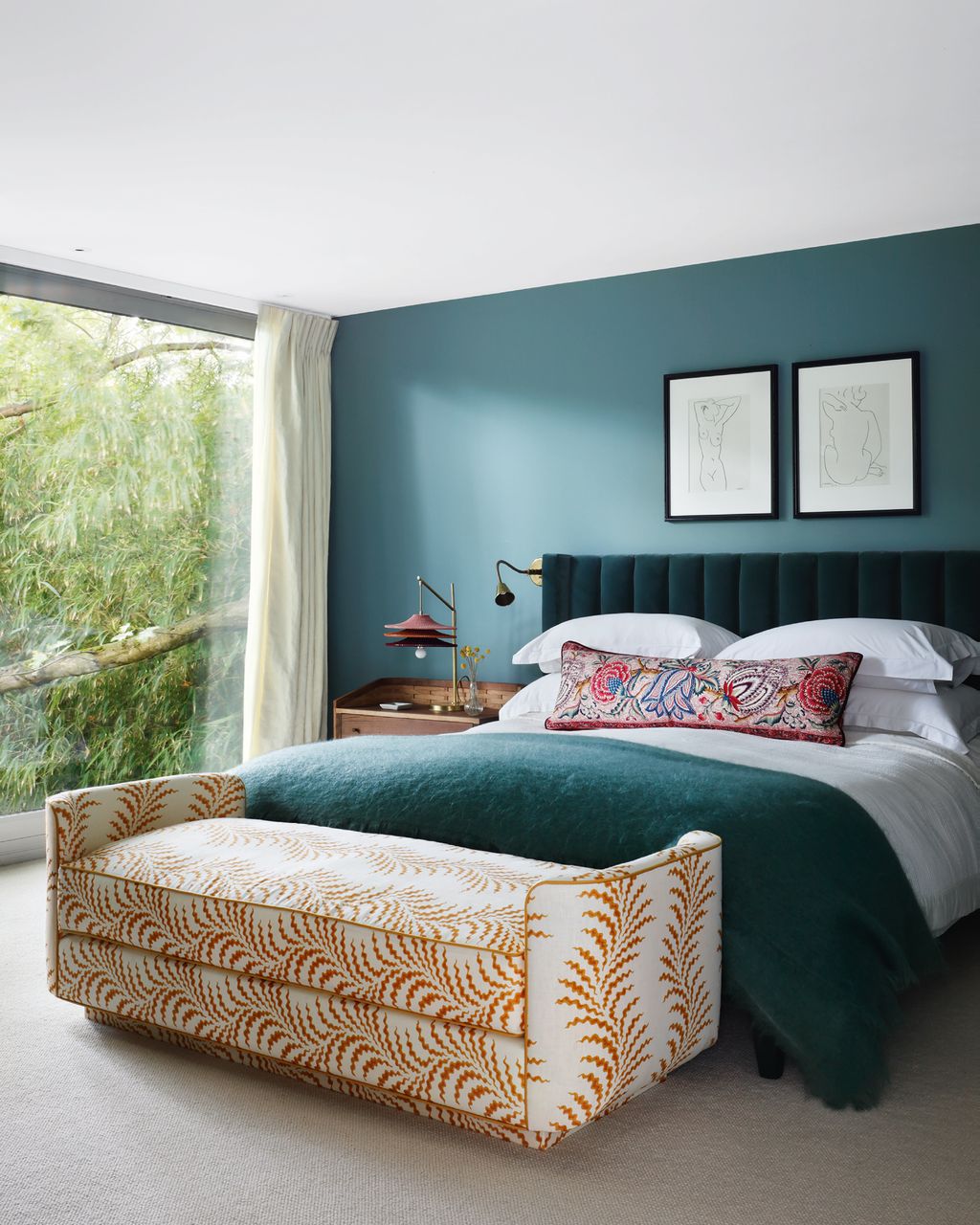 Alexander James11/16
An ‘SS03’ table light by Naomi Paul sits on a bespoke ‘Bayleaf Bedside Table’ by Sebastian Cox, with an ‘Argo Flexi Wall Light’ by Soane above it. Walls in an archived paint colour by Papers & Paints provide a strong background for some of the owners’ artworks and a headboard covered in ‘Hanover’ cotton velvet in the 'Elizabeth' colourway from Altfield. The bolster is in ‘Le Grand Corail’ in rouge fond crème cotton, by Braquenié from Pierre Frey. The bench at the foot of the bed is upholstered in ‘Scrolling Fern Frond’ by Soane in indian yellow.
 12/16
12/16


 13/16
13/16 14/16
14/16 15/16
15/16 Alexander James16/16
The house was designed in 2004 by the British architect Terry Farrell. In the part of the garden closest to the house, Hay-Joung Hwang of Hay. Designs used tree ferns and multi-stemmed flowering cherry Prunus ‘Kanzan’ with a lush underplanting to create a verdant effect. The outdoor furniture is from the ‘Teka’ collection by Roda.


