
Low ceilings are not everyone’s cup of tea, and often make a room feel a little boxed in. For those in the ‘tall ceilings or nothing’ camp who are faced with more modest proportions, it’s reassuring to know that a few careful choices can transform the atmosphere, helping a space breathe and, if not look taller, at least feel lighter.
Colour is perhaps the most effective tool. For Brandon Schubert, it’s not just about choosing the right shade but understanding how colour lines travel around the room. ‘For low-ceilinged rooms, I prefer to paint the cornice in a colour that either matches or complements the walls, rather than in the same colour as the ceiling,’ he says. ‘It helps lengthen those walls by taking the colour break all the way to the ceiling. Likewise, if you have a picture rail in an old house, definitely continue the wall colour above the picture rail too, but stop there. Nothing is worse than when someone has painted the wall above the picture rail, and the cornice, and the ceiling into the same colour.’

Contrast, Brandon explains, can also affect how we read height. ‘Darker colours will bring walls in, but they won’t necessarily make a ceiling feel lower. In fact, stronger contrast raises a ceiling, in my opinion. So dark walls with a white ceiling will actually make the room feel more compact but taller, whereas white walls with a white ceiling might feel more open, but the lower ceiling height would be more noticeable.’
Even small details can make a difference, according to Brandon. ‘When mounting a blind or curtain pole, don’t be afraid to cheat upwards and mount it higher above the window – a longer drop of curtains or taller blind will make the ceiling feel higher.’
Working within a single shade, or colour drenching, can be just as effective in making a smaller or lower space feel more cohesive, as Patrick O’Donnell advises. ‘You are creating less distraction and contrast but will still get decorative interest by mixing up the finishes, such as emulsion on your walls and eggshell on woodwork,’ he says.
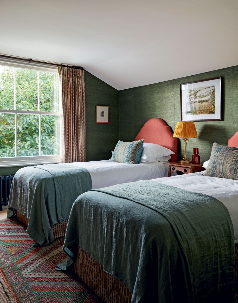
Paint, however, is not the only option on the table. For Lonika Chande, lighting can be just as powerful. If cleverly used, it helps shape how a room feels and guides the eye. ‘I always try to bring light into the corners of a room. It stops the space from feeling boxed in and helps the eye travel. Even a small lamp on a shelf, or a picture light in a tucked-away corner can add depth and balance to the whole scheme.’

Lonika’s approach is less about brightness and more about movement, allowing light to bounce, shift and create rhythm within a room. ‘Layering lighting is so important, combining wall lights and table lamps at different heights, breaks contrasts and builds atmosphere and warmth. Lamps or wall lights that glow both up and down, draw the eye up and make the space feel more spacious and the ceilings taller.’

And if all this is still not enough, Anahita Rigby has something to say about architectural elements such as plaster mouldings. For her, the trick lies in using them thoughtfully to ease the boxy feel of a space. ‘Adding details to a ceiling, with panelling, ceiling roses and even a faux beam draws the eye upwards and can make a room feel bigger. Using a contrasting colour to what is in the room can help make even the tightest of spaces seem comfortable.’ Ultimately, the secret lies in guiding the eye, not changing the architecture.


