Like so many people in London's terraced houses, our family lived for a long time with a classic Victorian galley kitchen. It was constantly overcrowded and the whole family were forever in each other's way. The space was overly crammed with cupboards which were overly crammed with stuff. Despite having a dining table in the double room particular to these houses, we were always in the kitchen, squeezed at a little table in the bay window.
It was obvious that at some point we were going to have to bite the bullet and build an extension. Deciding how it would look was a different story. For two people with enough in common to be happily married for almost 20 years, my husband Andrew and I had very different visions. I had initially dreamt of a chintzy kitchen and Andrew seemed determined to transform it into a minimalist art gallery. He wanted nothing but space and was obsessed with the idea of it being generous, calming – a haven from our hectic lives. For him it should be somewhere with little ornament and fuss and nothing but room to be together. Oh, and obviously we both wanted it to be affordable (tough for anyone who has worked on a kitchen extension)...
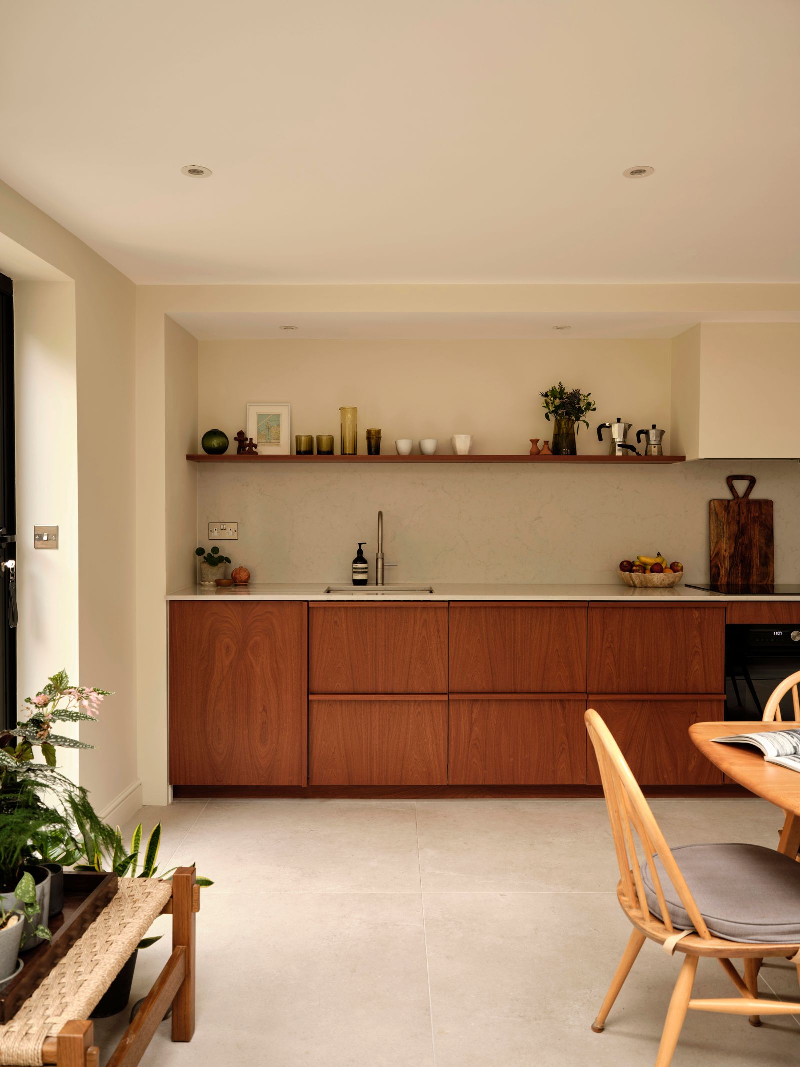
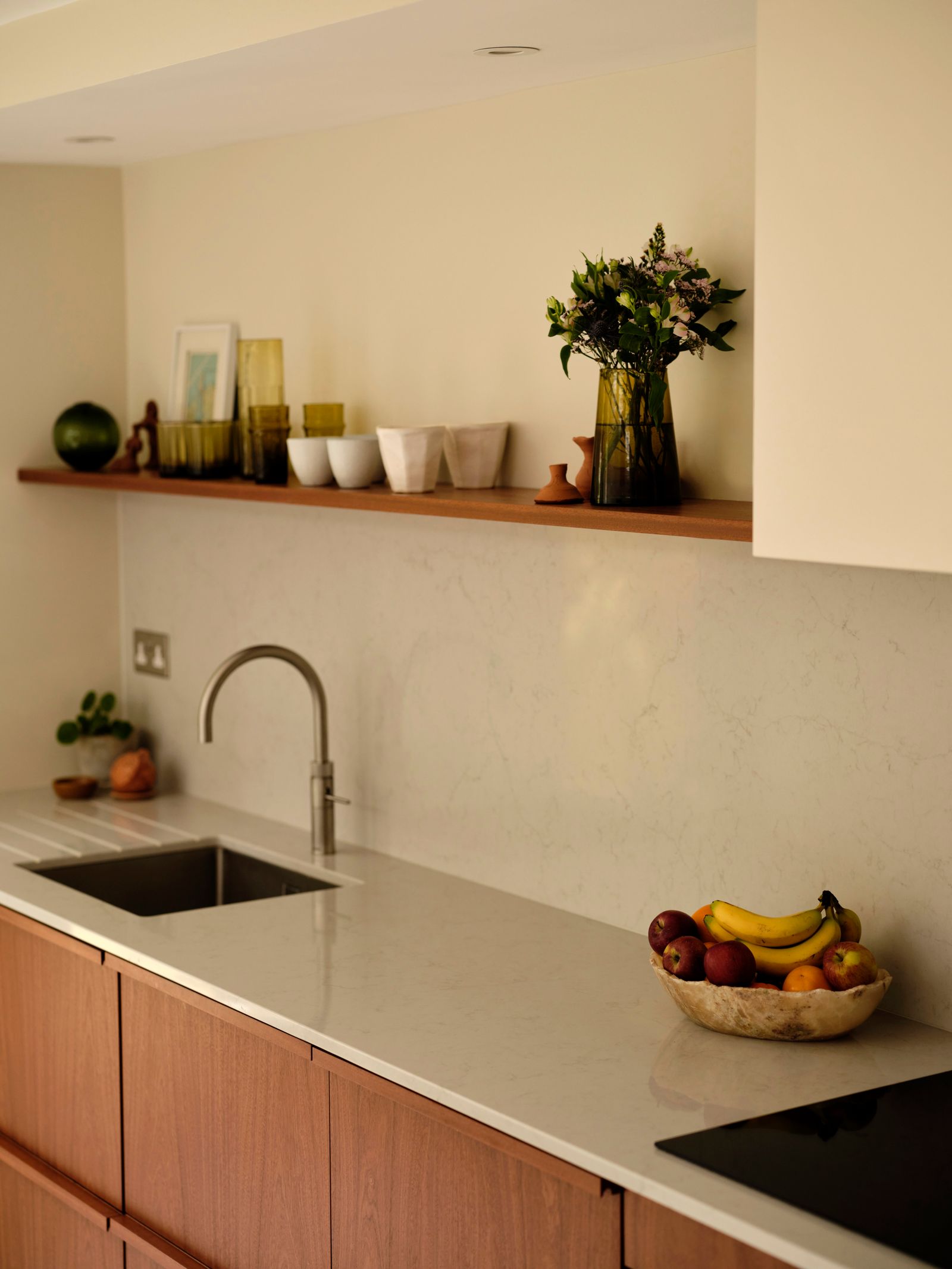
Once I realised I’d lost the battle for chintz and he realised he'd never have a stainless steel kitchen, we settled on the idea of warm and natural materials, with the Ditchling Museum of Art + Craft in Sussex being the unofficial starting place for our combined moodboard – a middle ground that pleased us both. We chose warm sapele wooden doors from Holte with a vaguely mid-century feel to front our Ikea carcasses, while the worktop is in 5000 London Grey by Caesarstone.
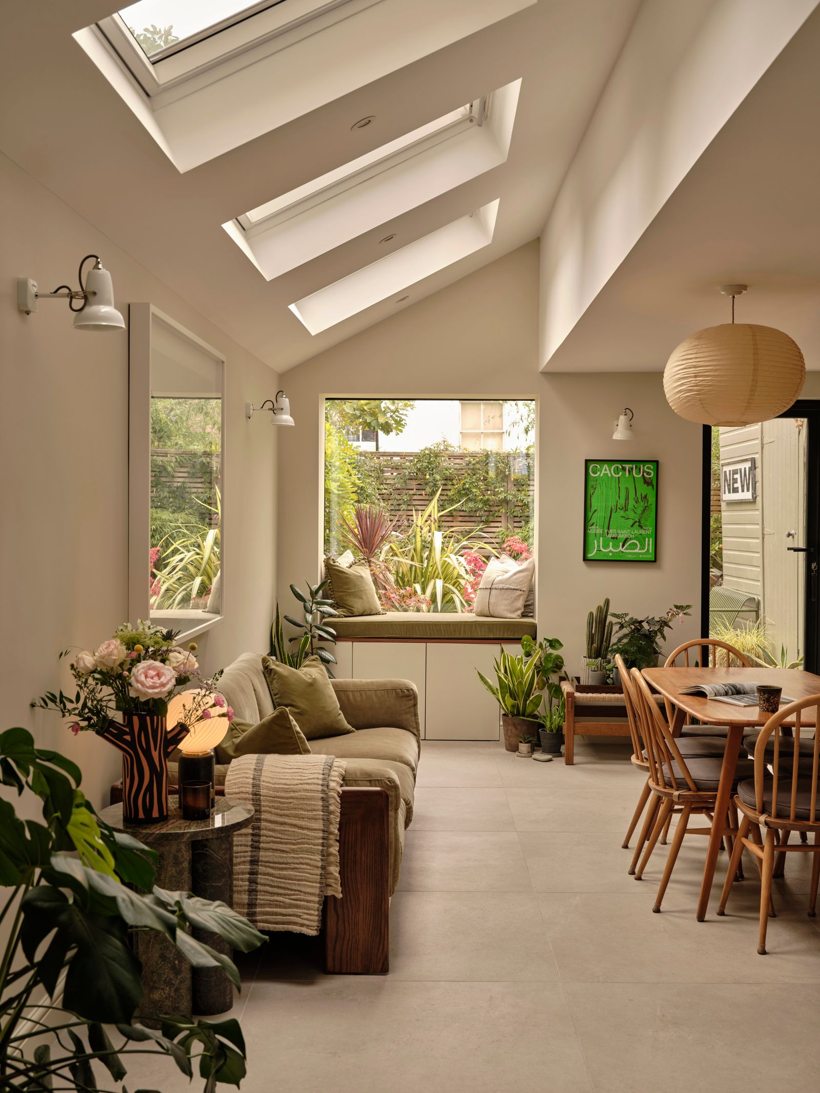
The extension was done by a local building firm and is quite simple – a painting by numbers extension but tickled up a bit with a repeating square theme (we’re both graphic designers!). There is a square opening between the sitting room and kitchen, three square roof lights and a large square oriel window and square floor tiles. It's possible not another soul will ever notice these details, but they make us smile. I got on board with the space mania and realised that we could increase the feeling of space further by having less in the kitchen as well as increasing the square feet.
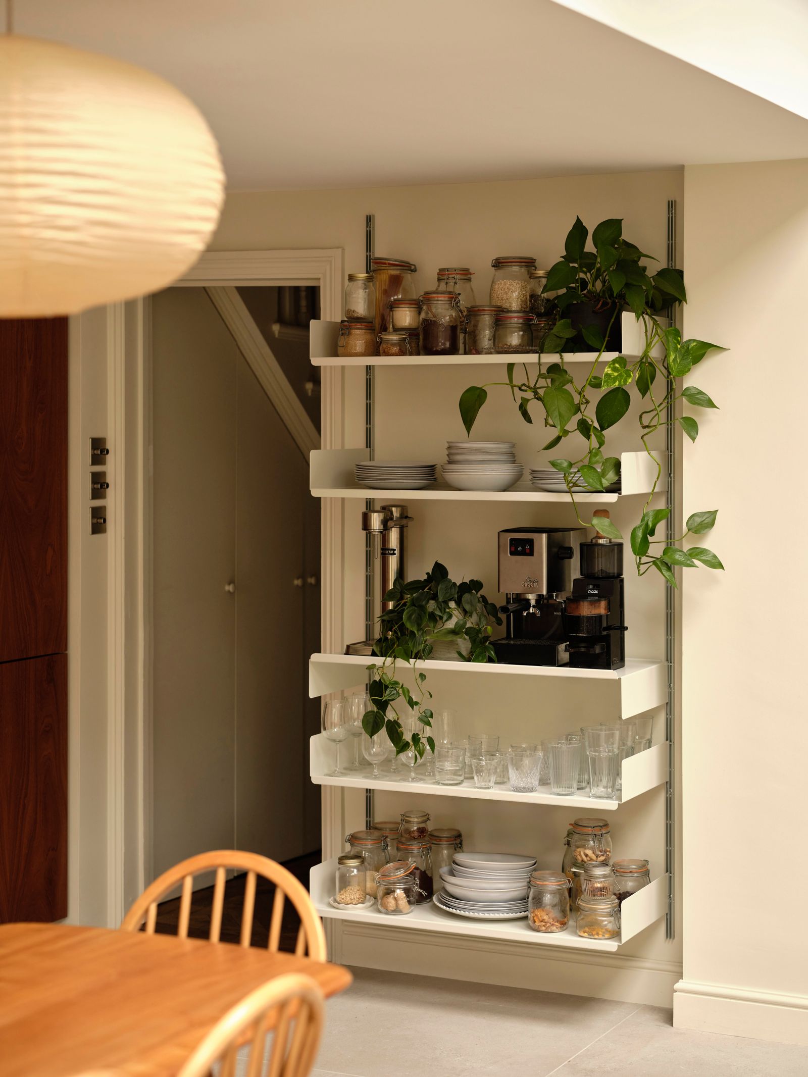
And so, throughout the weeks of the build, we ruthlessly reduced what we owned, getting rid of more than half of what had previously fitted into our tiny kitchen (perhaps something we should’ve done years ago). We were so ridiculous that when the big American double fridge arrived, we sent it back because it made the room look too ‘kitcheny’, and then filled in the space where it would have sat with some open Vitsoe shelves.
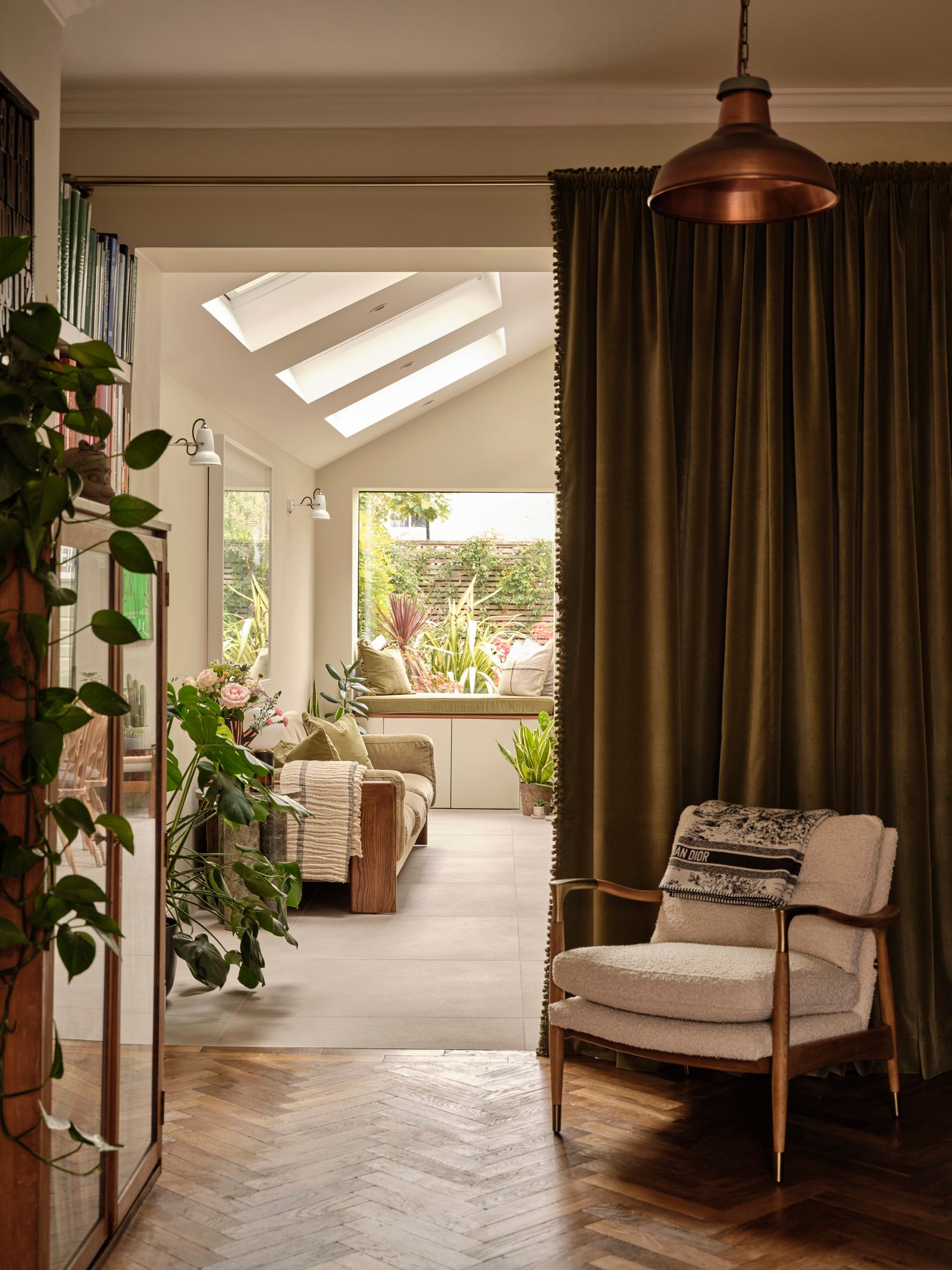
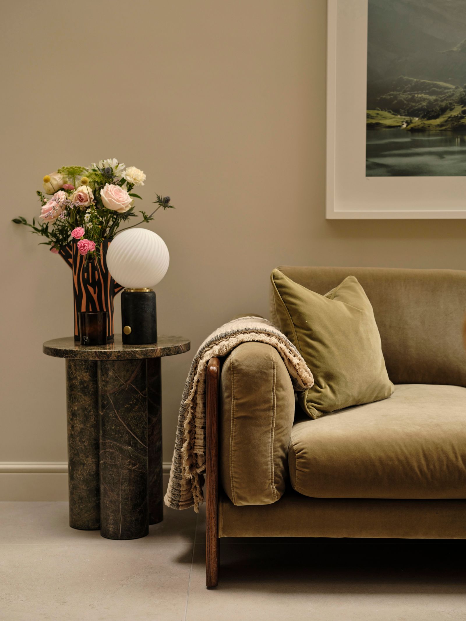
My husband is Creative Director at Soho House and so was keen to include some of the lovely furniture Soho Home offers including the ‘Marcia’ sofa (which is bigger than the one in our sitting room!) covered in lichen velvet. We also got a pair of velvet curtains in the matching lichen and hung one between the kitchen and sitting room and the other we repurposed to cover our window seat and to make cushions, - reducing the materials and colours and humouring Andrew's infatuation with minimising decorative details.
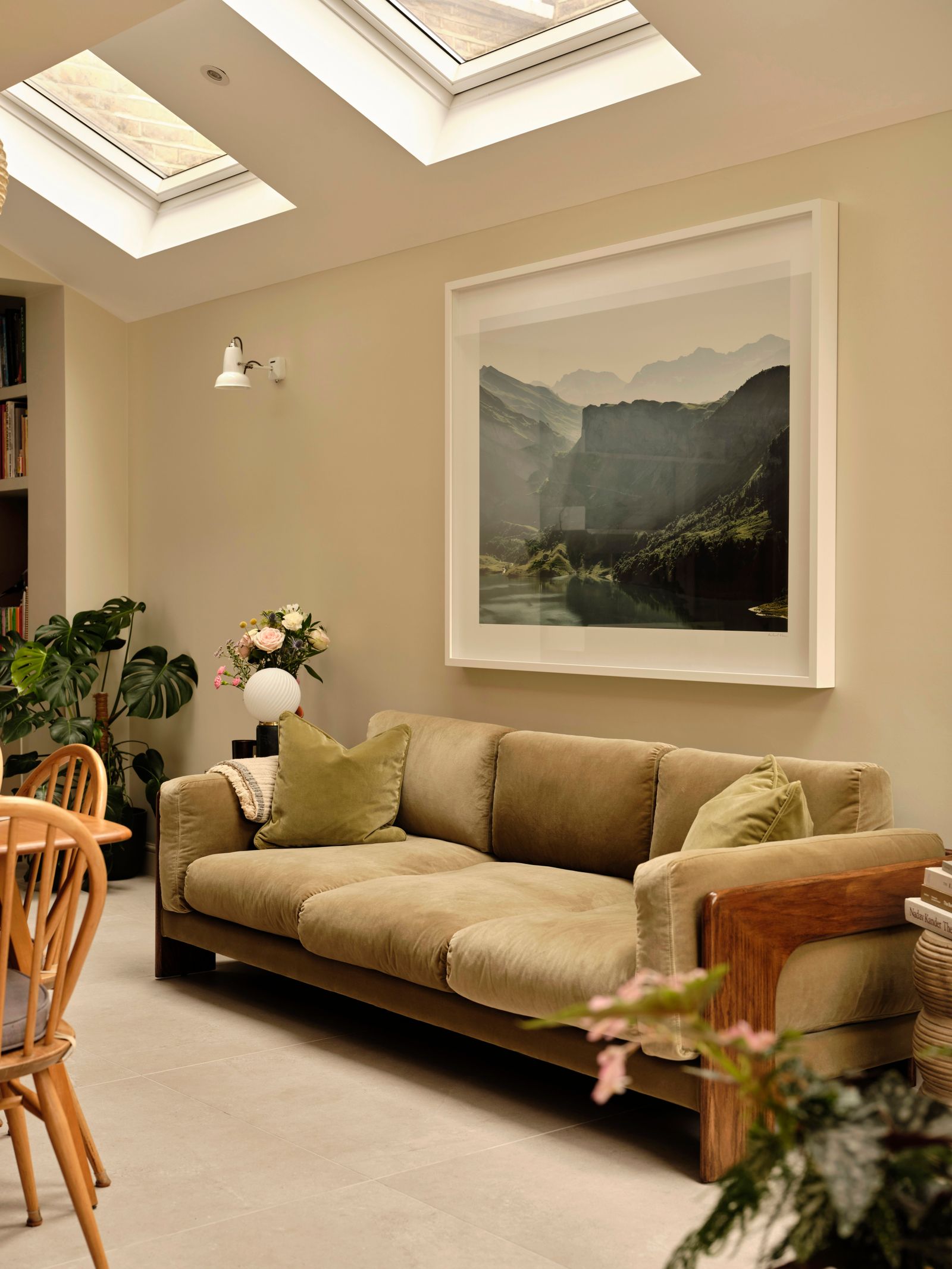
F&B Schoolhouse White covers the walls. Over the years, we’ve tried many colours but Schoolhouse just works everywhere in our home now runs in all the rooms downstairs and the hallway too. It picks up casts and has subtle variations from room to room but gives a faint consistency as we move around the house that we love.
Annoyingly, it turns out my husband was right all along. Though our new kitchen has half the storage of our tiny one, it works in exactly the way he meant it to and is everyone's favourite room in the house. We love the simplicity and our new found space is the biggest luxury of all.


