We first noticed it a couple of months ago when Carlos Garcia and Edward Bulmer announced their new paint collaboration. As soon as the imagery landed in our inboxes, showing jewel-toned blueish green ‘Iznik’ alongside rich and earthy orange ‘Karapinar’, we asked the question: is teal and orange back?

Then, naturally, we started seeing it everywhere, along with quite a few other colour combos that were all the rage in the 2010s. We would say it’s all in our heads, a classic case of frequency illusion, but the pictures don’t lie (and rest assured, there’s no AI in House & Garden world). Here are three of our favourite examples from then and now to celebrate this not-so-retro revival. Some are complementary, others sit side by side on the colour wheel, but they all pack quite a punch.
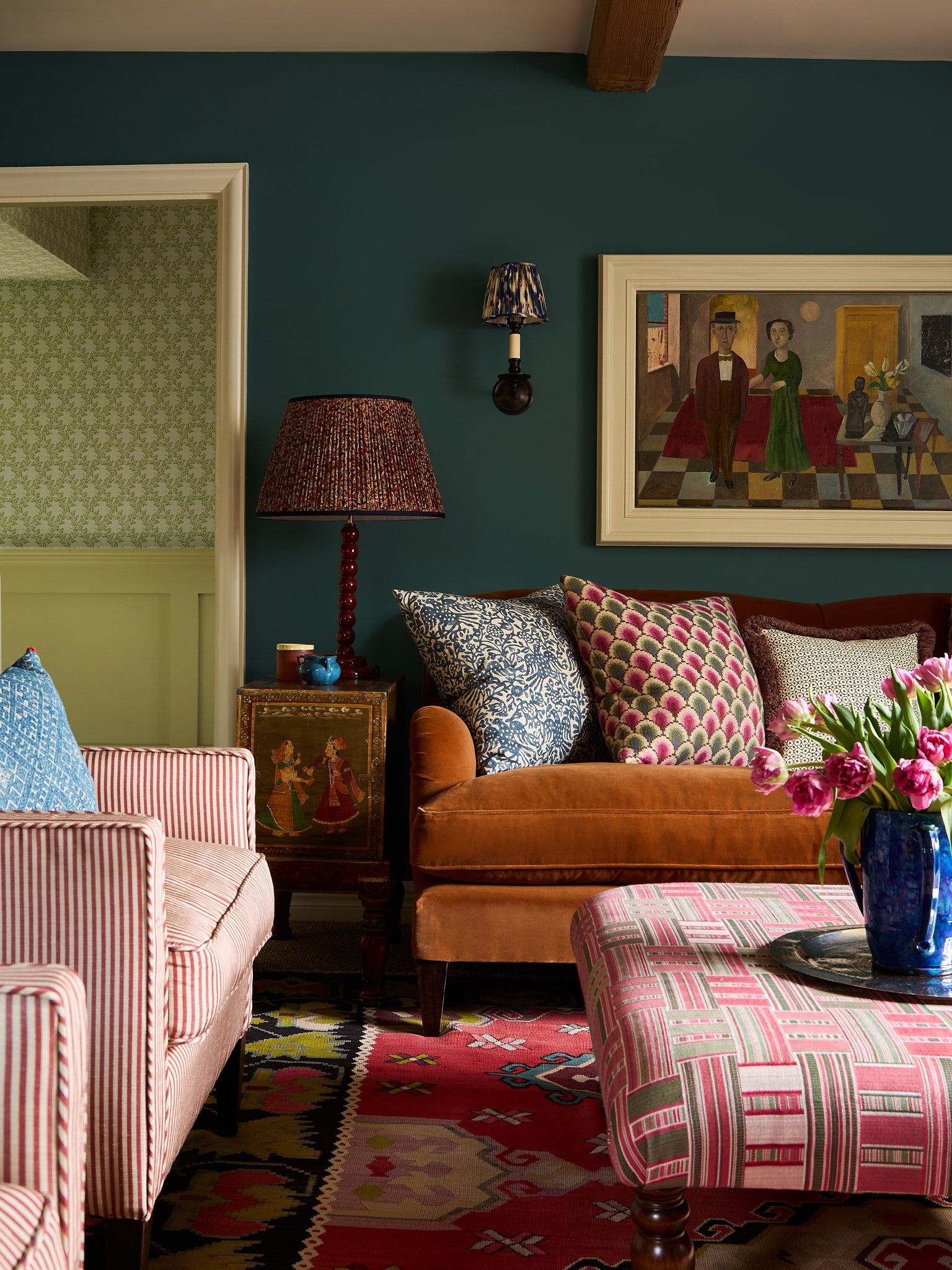
Teal and orange

We absolutely loved this north London project the first time we saw it and we’re still just as fond of it today. Rachel Chudley set up her own interior design studio in 2015, before being named winner of the House & Garden Rising Star award in 2019, and this project (which we photographed in 2018 for one of our 2019 issues) was one of her earliest. The entire house is a jewel box of colours, created by Rachel in collaboration with the paint specialist Donald Kaufman, who also happens to be her father-in-law. The deep orange curtains and dark teal sofa, both in sumptuous velvets, are echoed by the fantastical wallpaper for a bold yet completely harmonious scheme.
A very similar palette has been employed to create a decidedly different effect in this 16th-century cottage decorated by Brandon Schubert (another former House & Garden Rising Star). It first appeared on our website just last year and is a masterclass in using colour and pattern to breathe new life into an old house. The sofa is covered in ‘Rooksmoor’ velvet from Lewis and Wood and set against walls in ‘Tea with Florence’ by Little Greene, showcasing orange and teal and their very best. We have already declared that teal is making a comeback, and trend forecasters WGSN has named ‘Transformative Teal’ as its colour of the year for 2026, so it looks like we might be seeing a a lot more of this brilliant in-between shade in the months ahead, with or without its trusty complementary sidekick.
Pink and red

Like blue and green, the closely related shades of pink and red are a Marmite combination. However, we think that they very much can be seen without a colour in between, and it seems that many designers agree. In this Notting Hill house, which was featured in the March 2016 issue of House & Garden, designer Amanda Hornby chose this striking palette for the owners’ daughter’s bedroom. The ceiling is in a pretty pale pink – incidentally, painted ceilings have also been making a big comeback with the rise of ‘colour capping’ – and the red bed came from Sofa.com. The blanket, in a mix of both colours with some purple thrown in for good measure, helps to tie everything together. It’s such a joyful and vibrant scheme for a children’s bedroom, and won’t date quickly, as our next example demonstrates.

This dining room is a wonderfully theatrical showcase of pink and red, proving that Rachel Chudley still reigns supreme as the queen of colour. The designer worked closely with the owner of the London house, performance artist and writer Rachel Snider, to create this gloriously theatrical dining area, where red velvet curtains can be drawn around a pink velvet banquette. The same palette can be seen upstairs in the main bedroom, this time in reverse, with pink wallpaper providing the backdrop for a showstopping red headboard. If you find yourself drawn to this colour pairing, but aren’t feeling quite as brave, you could consider teaming a pale pink with a more subdued terracotta or even a wine red that is still intense but a little less shouty.

Purple and green

The combination of purple and green works so well because they are near-opposites on the colour wheel, resulting in an eye-catching contrast. They bring a sense of timelessness, too, as green is the colour of nature and purple has long been associated with opulence, wealth and royalty. So it’s no wonder that interior decorator extraordinaire reached this delightful duo when devising the impactful schemes for this London flat, owned by an American businessman. The generous banquette sofa was designed by Nick Plant and upholstered in Adam’s ‘Greville’ mohair velvet, before being paired with cushions, lamps and artwork in toning purple and complementary green.

When we asked our favourite colour consultants to predict the top paint colours for 2025, both green and purple featured prominently – and the same was true in our 2026 survey, albeit in a slightly moodier, more restrained form. It makes sense, then, that we are seeing an increasing number of examples of the two colours being used in conjunction, as many of us grow more confident in our use of colour (or rather regain the confidence we had a decade ago). This hallway in a distinctive Notting Hill home designed by Studio Vero, is a particularly memorable example, with its woodwork painted in Farrow & Ball’s rich aubergine ‘Brinjal’ contrasted by a rug by Gideon Hatch and a Palefire lamp in appealing shades of green. Introducing accessories like this is such a good way to experiment with more daring colour pairings, as you could quite easily banish the green from this space if needed. For a a softer take on the same palette, take inspiration from this Hampstead house by Anna Haines, where the dowstairs loo is decorated in lavender and muted sage green.


