
“Just like colour, it’s never just one pattern that excites me, it’s the combination of colours or patterns that thrills me. It’s fascinating to see the dynamic relationship between patterns elevating a room’s personality,” says the queen of pattern layering, Kit Kemp. There are challenges to layering print but considering scale, texture and colour palette makes the task more manageable. The reward is a dynamic and engaging space that will always be unique to your space.
Scale
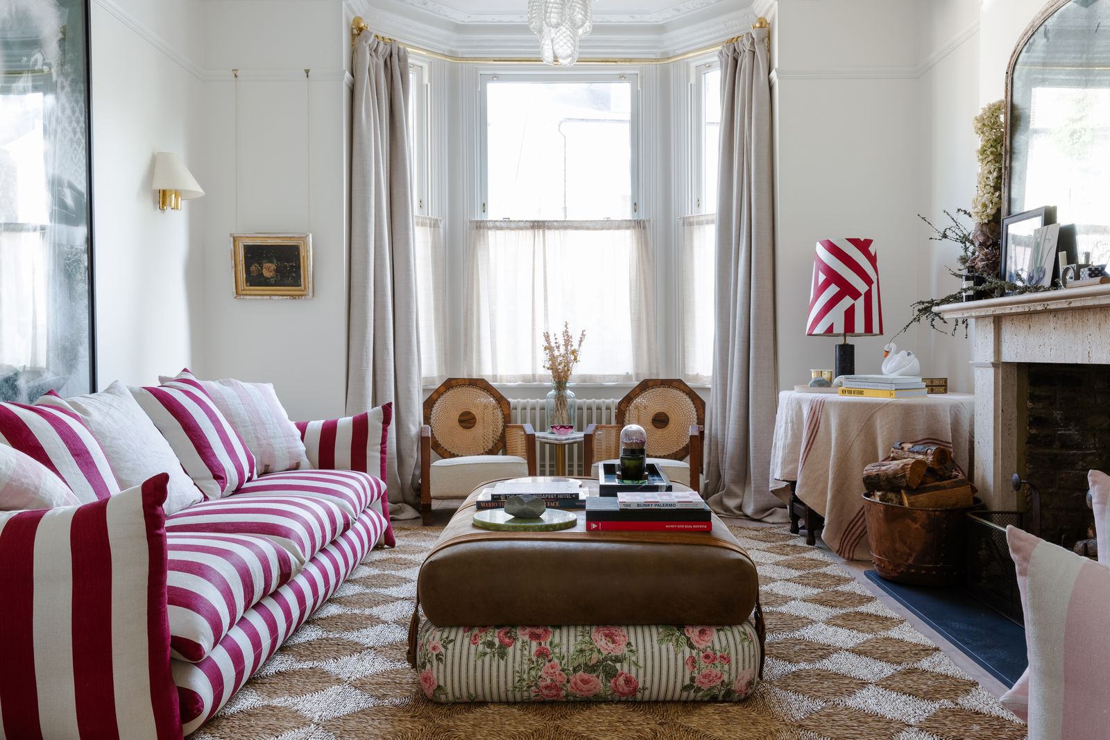
When mixing patterns and prints, designers tend to agree that scale should be a primary consideration. “Scale is key in combining a multitude of patterns," says Kit. "By incorporating different scales, each pattern can breathe and not fight against its surroundings.”
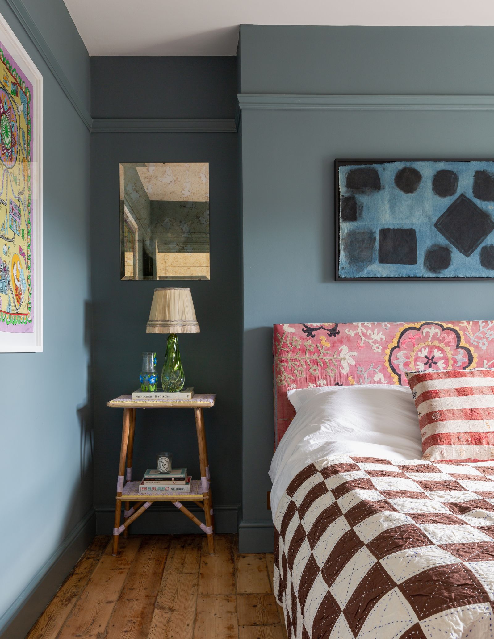
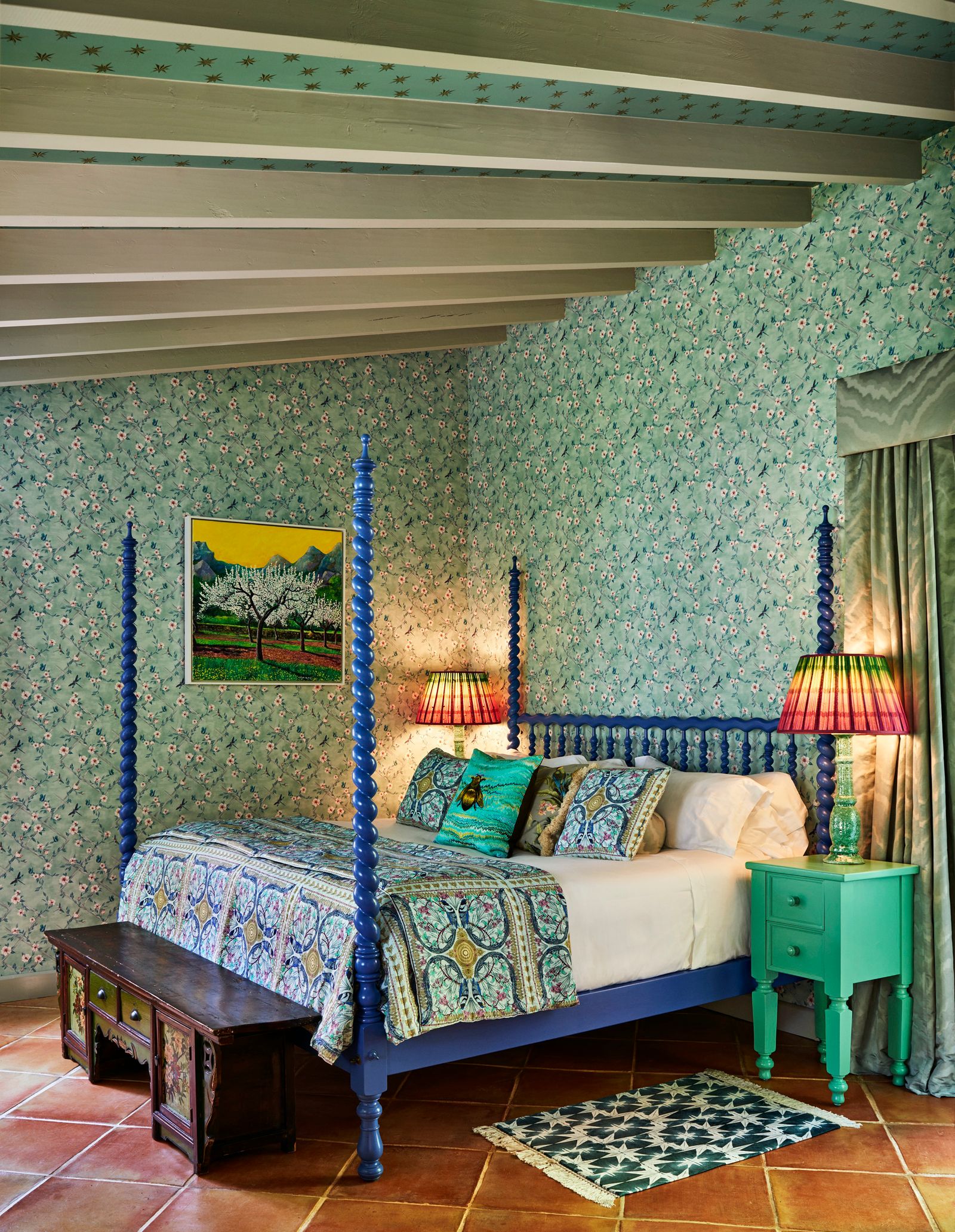
You may choose to combine several large prints or to combine all dainty, chintzy patterns. Generally, though, designers tend to carefully juxtapose a large print (think graphic flowers) with a small one (leopard print or a ditsy floral, for example). “I like to mix up the scale and texture of patterns when layering them in a scheme. It allows each pattern to speak for itself without competing with one another," adds interior designer Honor Devereux.


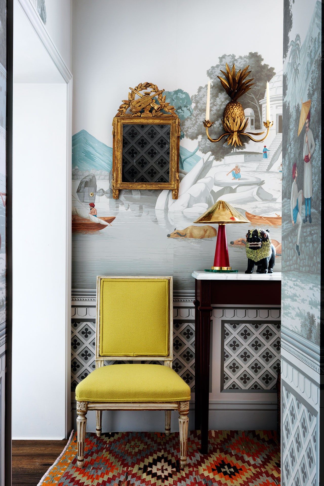
“I’m drawn to bold, motif-heavy patterns with a narrative and vast scale as well as detailed textural weaves and smaller repeating patterns in my work,” says Kit. “These opposites definitely attract, and it is that moment where the patterns combine to create the whole scheme that entices and energises a room.” When it comes to specifics, she recommends combining “geometric, floral, ikat, pictorial and organic patterns. They can work together in harmony to create inviting, exciting and balanced interiors.”
Palette
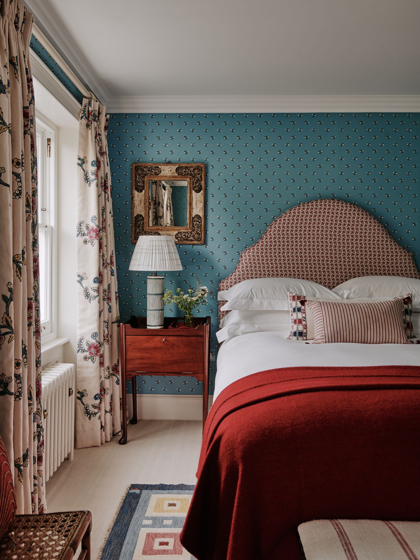
Palette, says Matthew Williamson, is also a key factor when achieving a successful ‘pattern on pattern’ look: “As with colour, always try to have a clear palette in mind before you begin a project. Try limiting your pattern-drenched scheme to a few key prints, preferably with the same colour palette running through them or at least one colour that ties them together. For example, a floral pattern in a blue or green shade, whether blowsy and bold or delicate and ditsy, always brings an air of whimsy to the space. To contrast this, I’d head towards something more graphic, such as a check or a stripe mixing blue, green and white, which invariably looks sharp.”
Honor agrees: “I like to use contrasting patterns to lift the space, however connecting them through colour and tone stops them from being too busy.” Kit maintains that choosing a specifically muted palette will avoid sensory overload when pattern combining: "A curated use of colour is essential in uniting a disparate collection of patterns. For a calmer atmosphere opt for softer more muted shades in a tighter colour palette or go bold and with a rich and bright palette for a more dynamic feel. The trick with bold and bright patterns is to showcase them in a way that ensures they work in harmony, rather than fighting to overwhelm the space. A similarity in colour will often make a relationship between patterns that seems impossible come together in harmony."
Pattern drenching
"Pattern drenching is a joyful way of elevating your interior and mixing prints that you’re drawn to," says Matthew. A different and somewhat opposite approach is to choose a variety of colours but maintain the same pattern, says Alexander Shepel of SHEPEL, who has enjoyed the new ‘pattern drenching’ trend in interiors. “Interior design is all about expressing one's creativity and our clients are becoming increasingly bold in their decisions and choices. Using the same pattern through one’s wallpaper and soft furnishings creates an utterly individual and wonderfully cohesive appearance. To create a real statement, we suggest applying this trend to smaller rooms of the home such as downstairs bathrooms and home offices. Either choose the same pattern or combine the same pattern in different colourways for a high design, curated feel.”
Start with a print that you love
Wondering how to begin when approaching a ‘pattern on pattern’ look? Starting with one pattern – perhaps your existing curtains – and working out from there is a smart approach. Kit believes you should follow your heart. “The starting point for layering patterns should be finding a design that you love, one that you just can’t stop thinking about, and simply must use!”
Think about material
When layering patterns, it's important to remember that each pattern will exist as a material. Simply comparing images of the pattern may not be helpful in your design process. Instead, try thinking about the pattern's destination: would this leopard print rug work with the Ticking Rose print armchair from Buchanan Studio? How would a moiré lampshade work with a chintz curtain? Would a marble table work with a graphic wallpaper from de Gournay?
Kit advises the tentative decorator to: “Ask yourself where the pattern should be seen, does it drape or work on upholstery, or should it be seen on a flat surface such as a headboard or walling? Get a sample and experiment with patterns and colours to build a composition that resonates with you.”
Somewhere for the eye to rest
Another way to avoid feeling overwhelmed by print is to sandwich it between moments of stillness, like blocks of bright colours or neutrals. Honor likes to make sure that there is “somewhere for the eye to rest, even if it’s something small like using a solid trim. This can be an elegant break between the fabrics.” Patterned bedding and rugs might be interrupted by a neutral, linen headboard, for example.
“That moment of calm might be a leading edge on a curtain, a plain border on a headboard, or bold but plain colour on walls", says Kit, “these pauses ground a scheme, helping to create balance, and allowing the other patterns to come together without overwhelming the senses.” Finding the perfect combination of print and non-print may take some work, but you can rearrange freestanding furniture and soft furnishinga – “helping different patterns talk to each other” as Kit says – until you feel happy.
Rule of three
“As in so many areas of design, things that come in threes always seem to work well,” says Matthew. So rather than trying to make two prints sing together, try adding in a third to the mix like an “animal print or perhaps a classic ikat in a complementing shade. Both of these options are timeless additions and will sit well within any scheme.”
Whilst layering prints can feel like a challenge, the reward can be immense. “Once integrated within a curated and layered scheme, combining patterns won't be as frightening as you think!” encourages Kit.


