A House & Garden editor's guide to choosing and mixing fabric

A ‘scheme’ tends to refer to the things in the room that aren’t furniture, lighting, or accessories. While these will all eventually contribute a huge amount to the look of a space the scheme is built using fabric, paint colours, flooring and perhaps a trim. It’s the decorative ‘materials’ of a room.
The best way to begin a scheme is with just one fabric you absolutely love. If you’re going for quite a decorative look then it will make your scheming life easier if this one fabric has a few colours or tones in it that you can search for in other fabrics. A painting or a rug is also a brilliant starting point. You just need one fixed thing that sets the mood and around which to build your colour and pattern plan.
MAY WE SUGGEST: How Gabby Deeming brought identity and permanence to her rental flat
Balancing patterns isn’t as hard as you might think. A good rule of thumb is to have one larger scale or figurative design. Then you might want a stripe that pulls a colour or two from your larger pattern. Add a couple of textures too. Boucle wools are very popular at the moment. Pierre Frey have an excellent collection that they have just launched in a range of colours. I expect you’re on a budget so plain linen can be a good affordable bulking fabric, especially for curtains which can require many metres of cloth, The Cloth House, Linen Me and The Hackney Draper all offer well priced plains. A pretty blind peeping out from behind the curtains rarely requires more than 2.5 - 3 metres making it a much savvier place to spend. Smaller patterns have a very important role to play in balancing a scheme. There’s a reason for the enduring popularity of checks and stripes - they work so hard and checks in particular are returning with a vengeance! Check out pictures of Hotel Peter & Paul in New Orleans to see their power unleashed in a way that feels totally fresh.
Gather all your samples together before committing! Try to have a piece of everything; the flooring, the paint colours brushed onto pieces of card, the fabrics and images of any key pieces of furniture. Ask yourself some questions. Do you have two fabrics doing a similar job? Do you really need both? Can you edit the scheme down, or, is it lacking a little something? Some smaller print designs can be very pretty up-close, but disappear to look almost plain from a distance which may not be the look you want. Switch a few things in and out, you want to give yourself choice but not too much. Endless variations mean you’ll probably never settle on anything. Also, take too long about things and you’ll eventually get hung up on the idea that there’s something better out there and before you know it you’ll be back at square one.
There is usually a point at which a scheme needs to be de-stuffed or it can all start to look a bit contrived and show-homey. This is often where a bit of bad taste comes in. Embrace a rogue element. This could be a fabric, trim, colour or painting that just throws things off a bit.
Antique textiles also work extremely hard to treat this problem bringing character and charm to a room. The ultimate layered look can really only be achieved after many years of careful collecting, so my final piece of advice? Patience.
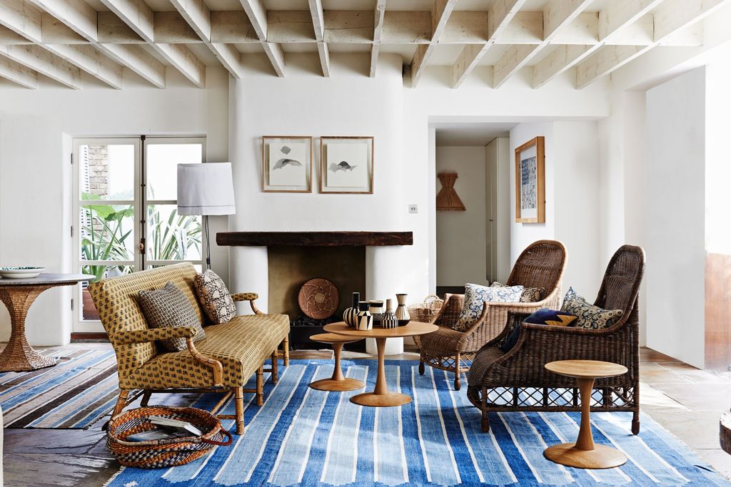 Adrian Brisco1/4
The Kalamkari collection from Les Indiennes is produced using natural dyes, a perfect choice if you don’t want things to look too ‘new’. The antique dhurrie from Guinevere ensures the look is timeless.
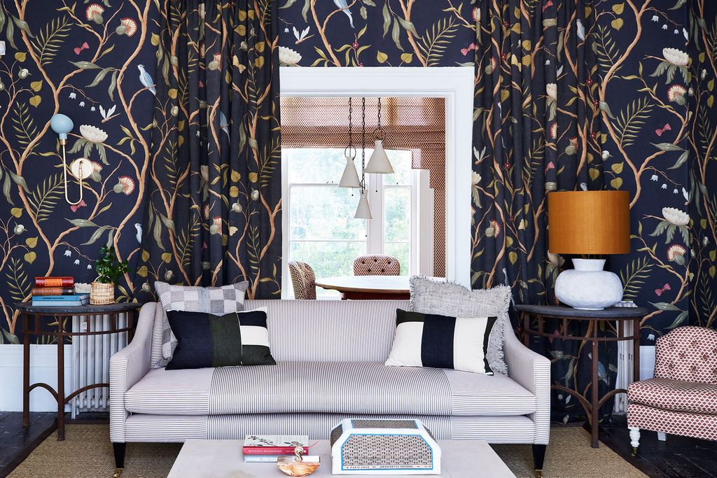 2/4
2/4The large scale Lewis & Wood wallpaper takes centre stage with a host of great support from the hard-working ticking stripe on the sofa to Howe’s great ‘Knurl’ linen print and a pair of smart geometric patched cushions. By running the stripe two ways on the sofa it makes the pattern work harder than it otherwise might.
 Damian Russell3/4
The role of plain fabric is essential to a scheme, providing a foil for any pattern and creating harmony in a room.
 Paul Massey4/4
Rita Konig is a master of layering. She applies her well-trained eye with great confidence and an obvious passion for colour and pattern. Look and learn!


