Farrow & Ball colour curator Joa Studholme's house in Somerset

Some of us make life-changing decisions in a nanosecond – others weigh up the pros and cons through long, sleepless nights. Joa Studholme and her husband fall into the former category. ‘We were staying with friends in Somerset for the weekend and, over dinner on the Friday night, some friends of theirs mentioned that they were selling their weekend home nearby, a 19th-century schoolhouse. Intrigued, we drove over early the following morning and, by the afternoon, it was all agreed. We had bought a house. What made it particularly appealing were the lofty ceilings in the kitchen and the main living area – I’m not tall, but my husband and children are 6ft and over.’
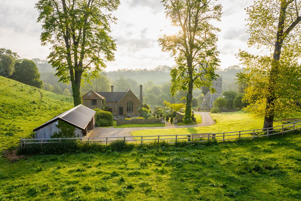
Approaching the schoolhouse, one quickly comes to understand that it was not merely the exceptional ceiling height that prompted the impulse buy. The view from the hillside setting resembles a stage set evoking quintessential scenes of rural England: a flock of grazing sheep munches away in the field below, with the village church and its tower visible through a canopy of trees.
MAY WE SUGGEST: The founder of Farrow & Ball's remote Scottish country house
Joa could be described as the éminence grise behind Farrow & Ball’s global renown for colour and design. She explains how it all began: ‘I was friends with Tom Helme who, in the early Nineties, with his business partner Martin Ephson, acquired Farrow & Ball – the Dorset-based company known for producing fine-quality traditional paint. Tom had worked for the National Trust and was knowledgeable about historic colours, so when he and Martin opened the first Farrow & Ball shop in London on the Fulham Road in 1996, I helped out on a part-time basis. I’d been working as a decorative artist, so my experience with colour and finishes was useful when customers needed advice. One thing led to another – these days, in my role as colour curator, I consult all over the UK and abroad, advising homeowners, interior designers and architects on a range of projects.
‘Another aspect of the job is developingFarrow & Ball's range of colours. I’m constantly experimenting – the inspiration for “School House White” came from wanting to find a soft white that would harmonise with the exposed limestone and reflect the abundant light in our new house,’ Joa explains. ‘The floor in the living area, once the main schoolroom, was originally lower in order to prevent the children from being able to look out of the windows, but previous owners had raised it to take advantage of the view. I painted the boards in “Mouse’s Back” – an earthy shade that merges well with mud tracked in from the garden but, more importantly, creates the warm look I was after. It’s one of the original drab shades in the range – colour with no brightness.’
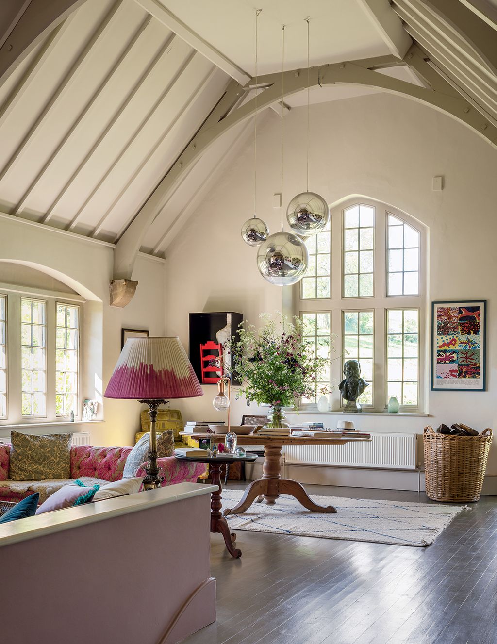
Joa says the decision to use the lighting designer Kate Beard was one of her best, ‘Kate suggested that we illuminate the ceiling in the sitting room using concealed uplighting. It accentuates the height and feeling of space, as do the Tom Dixon silver globes. They were in my son’s bedroom in London, but here they add a quirky, contemporary touch to a Victorian room.’
MAY WE SUGGEST: Farrow and Ball paint colours in real homes
Joa bought little in the way of new furniture for the schoolhouse, adding to the illusion that its look evolved over decades rather than weeks. The Chesterfield sofa was inherited 30 years ago and reconditioned by Revival Upholstery in All Saints Road, W11. With a sheepskin throw hiding a couple of red-wine stains, it looks good to go for another 30 years. And a bergère sofa – ‘a perfect fit as it is no higher than the low wall behind’ – was kindly left by the former occupants. The kilim-covered footstool was a wedding present from Joa’s sister, Nicky, who found it in Robin Guild’s long-gone shop on Pimlico Road, SW1. The art consists mostly of prints by Editions Alecto – a Sixties print publishing company that worked with contemporary artists, such as David Hockney – which was founded by Joa’s father-in-law, Joe Studholme.
The significant changes Joa did make to the house concerned colour. To create a dark, dramatic space as you enter the main room, she chose ‘Railings’, a soft off-black, to give the area with a gallery and bookcase below it a cosy, library-like feeling. This contrasts with the white space beyond. The gallery serves as her studio, where she writes and works on new colours. With around 250 sample pots from the factory to play with – and lots of brushes and ramekins in which to mix the paint – she finds new colours evolve. ‘I think there’s a definite link between the colours we choose for our homes and what is going on in the wider world. Currently, customers are opting for strong, saturated colours, whereas five years ago, all anyone wanted was shades of grey. At least in the world of colour, things are now looking brighter’.
farrow-ball.com
katebeardlighting.com
Danny Robbins: 07772 570052
 Andreas von Einsiedel1/10
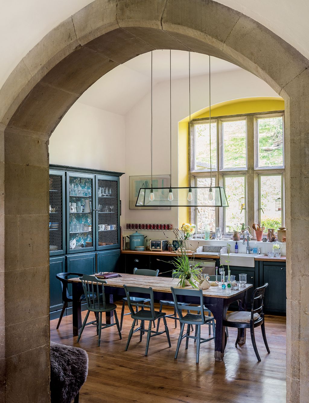
In what was the smaller classroom, a ‘Diner Pendant’ light from Holloways of Ludlow hangs above an old wooden table bought on the Portobello Road. Chairs painted in ‘Paean Black’ and ‘De Nimes’, and units in ‘Studio Green’ are offset by cheery ‘Babouche’ used around the window.
 Andreas von Einsiedel2/10
In the library area, leading off the entrance hall, the bookshelves and ceiling below the gallery were painted in ‘Railings’ to create a dramatic contrast with the lighter look of the main living space. The rugs are from Bluebellgray.
 Andreas von Einsiedel3/10
Originally the main classroom, this area has been transformed into a relaxed space furnished with an eclectic mix of pieces, including a leopard-print bergère sofa and pink patterned Chesterfield.
 Andreas von Einsiedel4/10
Walls in ‘School House White’, created by Joa for her new home, provide a backdrop for prints by Editions Alecto. The floorboards are in ‘Mouse’s Back’ and the low wall in ‘Sulking Room Pink’.


 Andreas von Einsiedel5/10
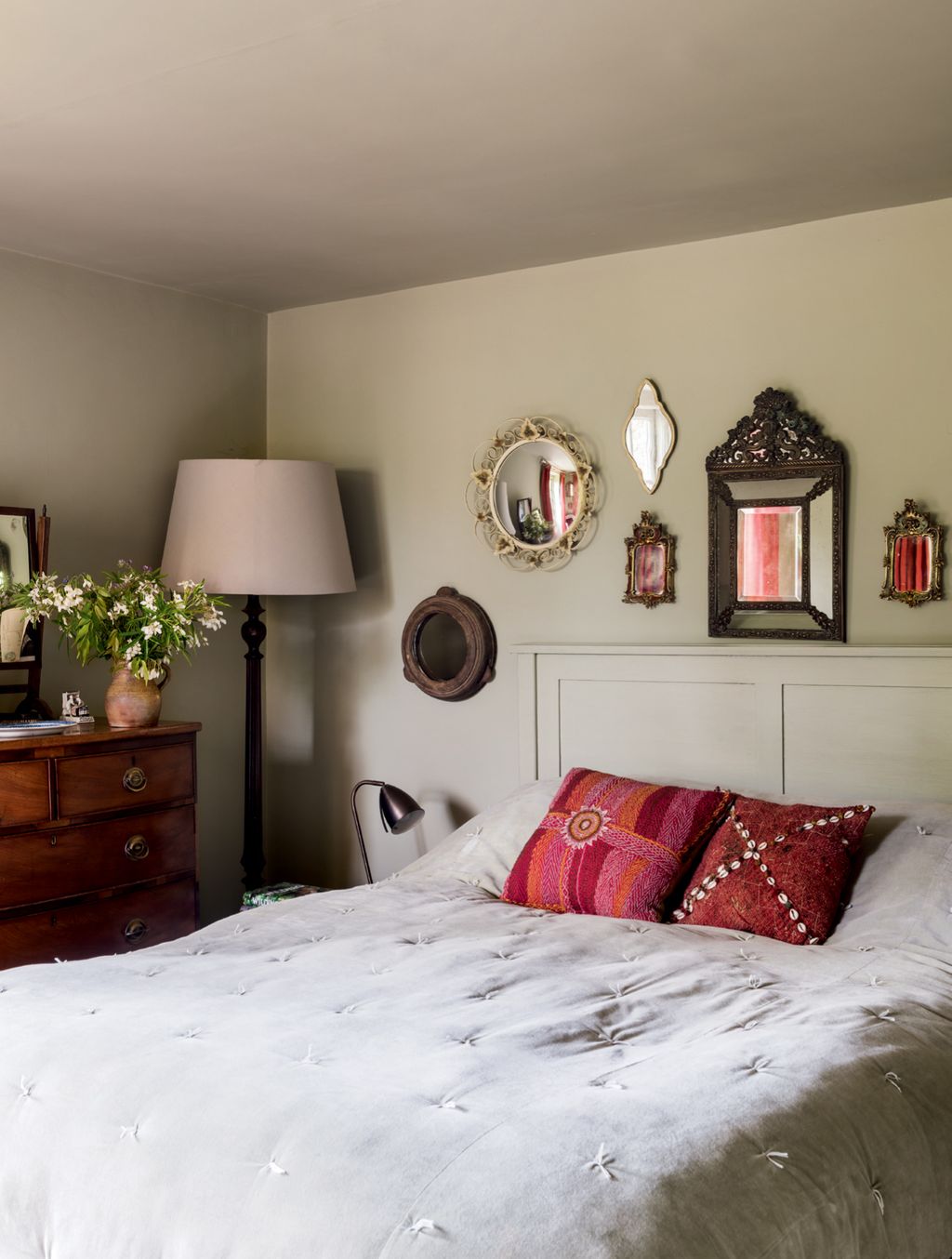
Walls in ‘French Gray’, which has an underlying green tone, create a backdrop for antique mirrors in the main bedroom.
 Andreas von Einsiedel7/10
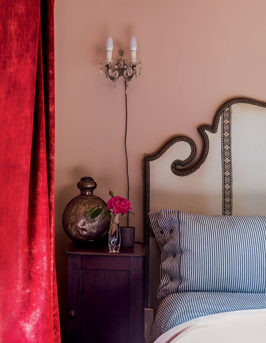
Aged red velvet curtains and an ornate braided headboard Joa inherited from her great uncle are showcased by walls in ‘Setting Plaster’ in the tiny spare room.
 Andreas von Einsiedel8/10
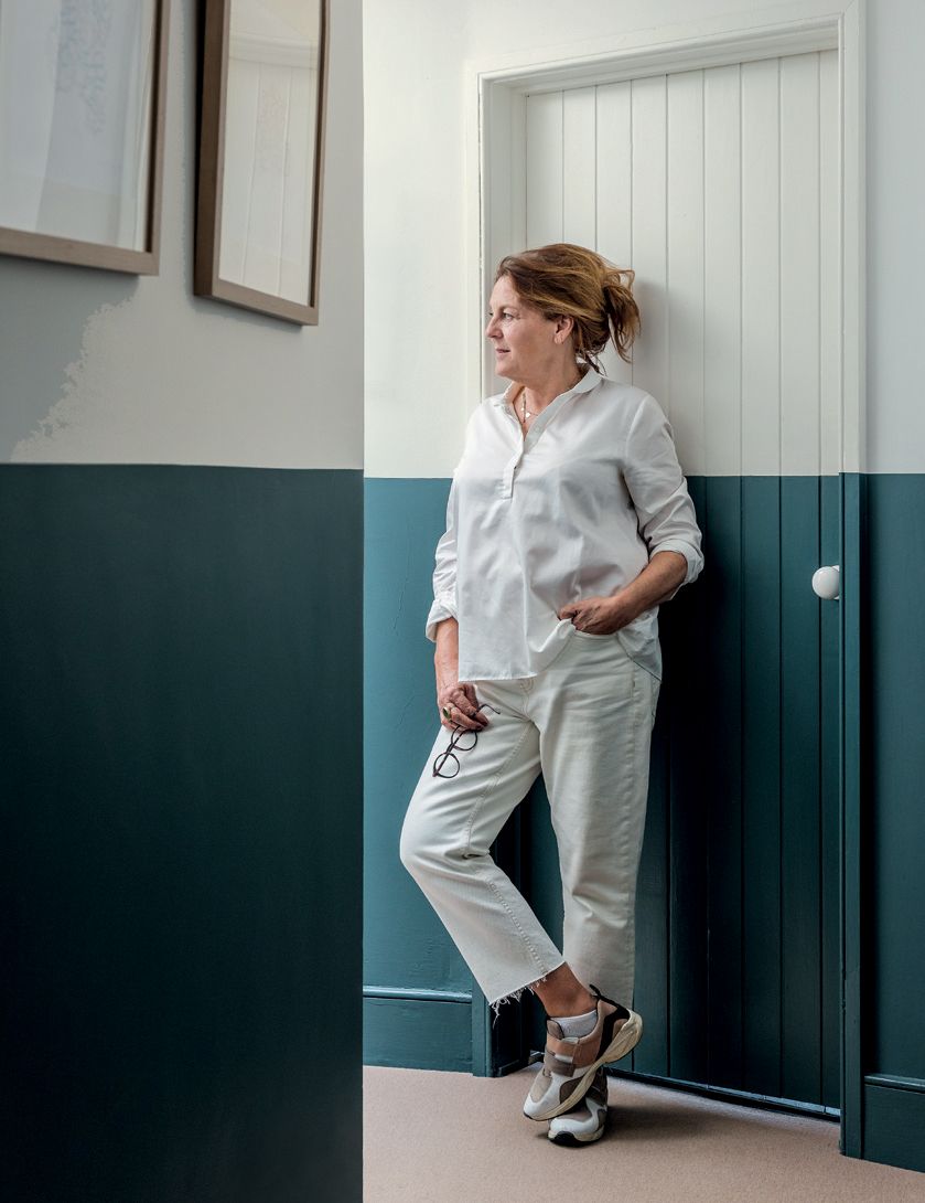
Joa in the corridor leading to the bedrooms and bathrooms, where the lower sections of the walls and doors are painted in ‘Inchyra Blue’, with ‘School House White’ above.


 Andreas von Einsiedel9/10
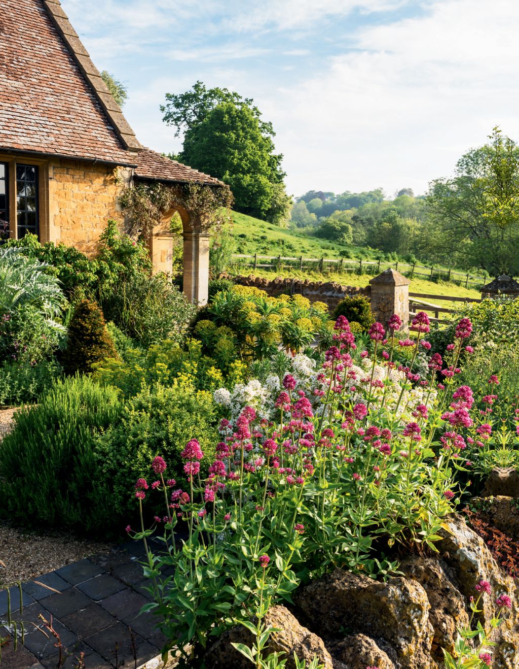
The garden has views of the Somerset countryside.
 Andreas von Einsiedel10/10
Built in Hadspen stone, the former Victorian schoolhouse has an idyllic location and is surrounded by fields, with a view of the village church visible through a canopy of trees


