Maddux Creative brings colour and life to a Grade II Primrose Hill house

One of the most flattering things for a designer must be when an existing client comes back to them years later for help with a new home. It is a sure sign that things went well the first time round and that they enjoyed the process enough to go through it again. It acknowledges an element of trust.
Such was the case when previous clients of Maddux Creative bought this Grade II-listed house in Primrose Hill. They had commissioned Scott Maddux and Jo leGleud to work on their previous – smaller – house in Islington but, as Scott explains, ‘By the time they’d had two children, they had outgrown it.’ What they had not outgrown was the furniture that Scott and Jo had designed or sourced for their last home, so it was coming with them. ‘On the one hand, this meant half the work was done,’ Scott continues. ‘But we also knew that, to some extent, we would have to put our money where our mouth was.’ The brief was to reuse what they could without making it feel like the same interior transplanted into a different building.
The new house retained plenty of its period detailing and needed little restructuring: it remains essentially two-rooms deep with a side staircase. But a lower ground floor extension designed by Maddux Creative, with access to the garden, did create space for a television and games room. Here, Scott and Jo found a home for the owners’ huge Seventies sideboard.
There are many examples of repurposing like this, where pieces have been reupholstered to give a new accent, or fresh combinations have been created. While this steered many of the design decisions, it is not the defining characteristic – if anything, this was the emphasis they placed on pattern and colour, and their interesting use of textures. It was exactly what the owners wanted and they encouraged them to push things.

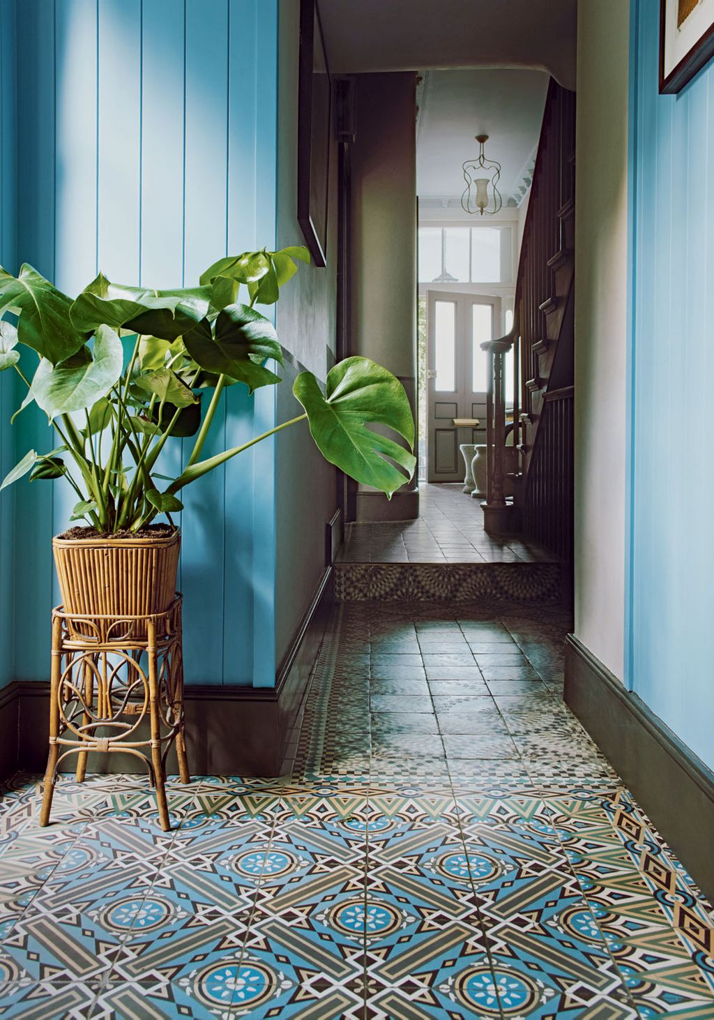
Scott took them on a road trip through the Netherlands looking for reclaimed encaustic tiles. It was a very fruitful excursion, with the floors of the hall and the open-plan kitchen and dining room now tiled in a combination of deliciously busy patterns. Renowned interior decorator Robert Kime famously said that he begins designing a room around a rug and, in a similar vein, the design duo based a lot of their choices around these tiles. And not just in regard to the colour palette – for example, the kitchen island was specially designed to fit within a series of border tiles used on the floor. White Metro tiles line one wall and, teamed with oak cabinets with riveted copper fronts, give the kitchen the feel of an old dairy or butcher’s.
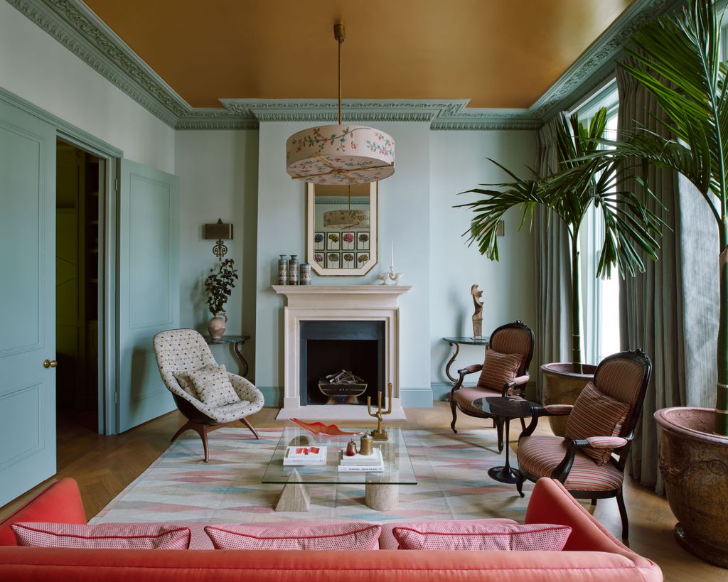
Warm metallic accents continue one floor up, where the ceilings of the sitting room and adjoining library have been painted a coppery gold. ‘For a house of this size, the budget was relatively modest,’ Jo explains. ‘So we wanted to tart it up a bit with simple, less expensive finishes.’ The ceiling has a touch of varnish on it to give it some movement and add ‘a bit of sunniness’. A feelgood vibe also comes by way of the apple-green joinery in the library. Two different shades of blue (on the walls and the woodwork) with a gold ceiling is an unlikely choice, yet the casual, thrown-together air makes it work.
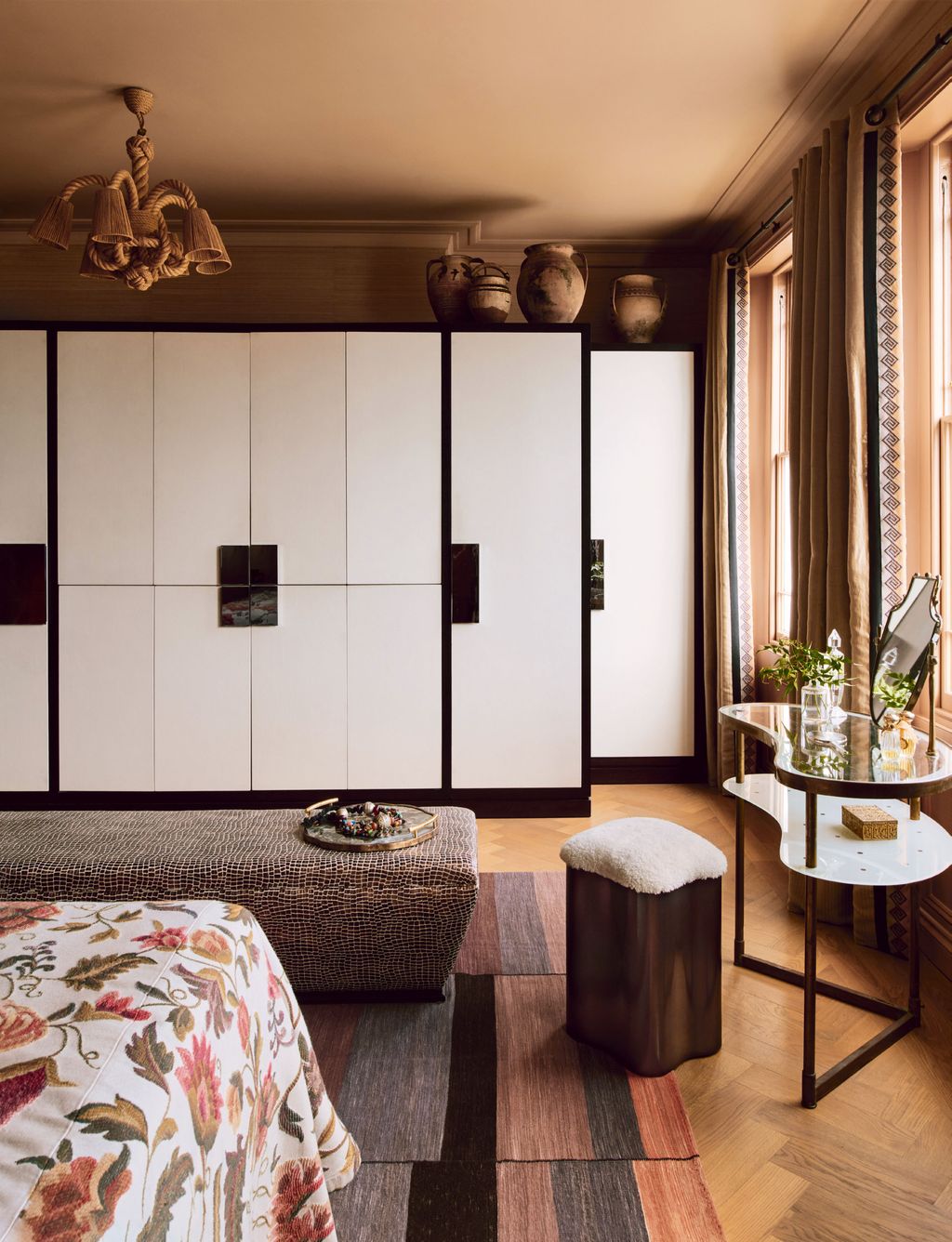
On the second floor is the main bedroom and, here, things are far earthier and richer in tone. A particular triumph is the en-suite bathroom, in which three different colours of tadelakt plaster were applied to the walls, floor and vanities. The upper portion of one wall is clad in swirling Portuguese tiles, which extend up to a chocolate-brown painted cornice.
There is a nice balance to this house. It is playful, elegant and, in many ways, brave – but that is not at the expense of it being liveable. This is something that Maddux Creative does so well – it pushes the boundaries just enough.
 Michael Sinclair1/7
The ceiling in ‘Classic Gold’ from Charles Roberson Liquid Metal ‘adds a bit of sunniness’ to Little Greene’s ‘Salix’ on the walls. A vintage sofa, armchair and two wooden chairs from the owners’ previous home are complemented by a new Sinclair Till rug and a Vignelli ‘Metafora’ coffee table from Béton Brut. The pendant light, picked up by the owners in south east Asia, has a shade made with the help of Fromental.
 Michael Sinclair2/7
Tongue-and-groove panelling painted in Sanderson’s ‘Dazzle Blue’ picks up on the reclaimed tiles from a dealer in the Netherlands.
 Michael Sinclair3/7
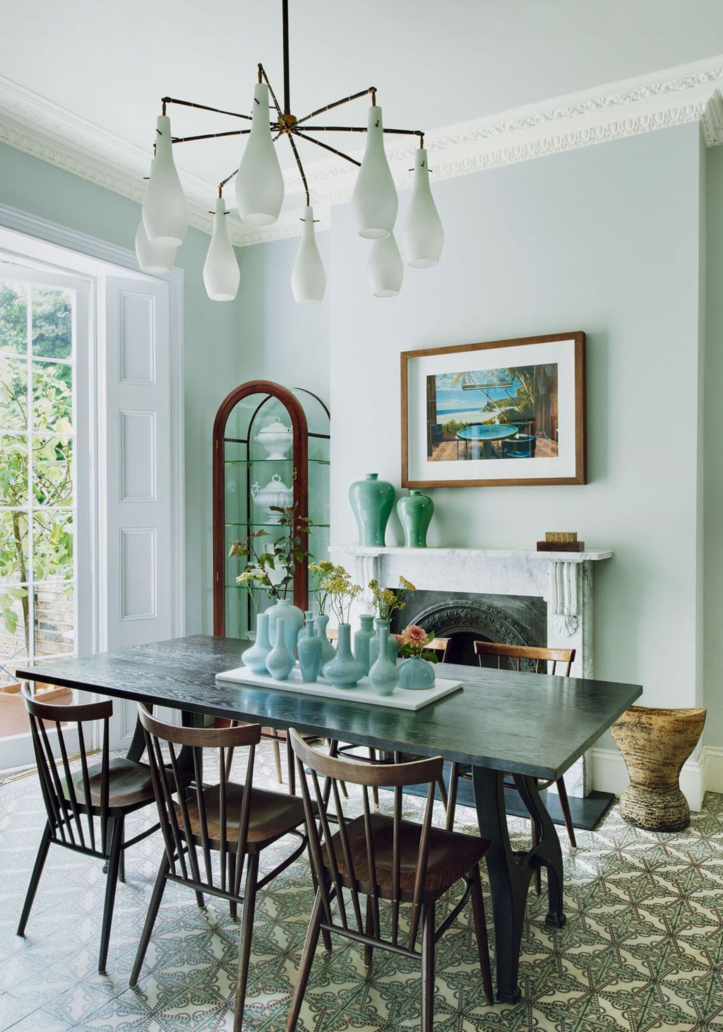
Walls in Little Greene’s ‘Pearl Colour’ provide an elegant backdrop for a table from Arxe and vintage Ercol dining chairs.
 Michael Sinclair4/7
Maddux Creative designed the island, which is in Paint & Paper Library’s ‘Greenback’, to fit within a reclaimed floor-tile border. The copper-fronted oak cabinets are by Orsinibrewin.


 Michael Sinclair5/7
An Italian dressing table from Fiona McDonald has been paired with a ‘Lily’ stool from Tom Faulkner.
 Michael Sinclair6/7
A mirror from Knowles & Christou hangs on a wall in Stereo’s ‘Java 2274’ woven grass covering above a Robert Langford headboard covered in a Donghia fabric. The bedcover is in ‘Il Ricamo’ by Etro.
 Michael Sinclair7/7
A freestanding copper bath, similar to those from Catchpole & Rye, is framed by tadelakt plaster on the floor.


