A Danish creative's coolly colourful Copenhagen apartment

For creative consultant Michael Dansk, colour is a powerful tool with the capacity to provoke a reaction. In the Copenhagen apartment he shares with his partner and two children, he deviated from typical Scandinavian design conventions and chose to pair maximalist colour choices with minimalist shapes and curves, creating an artfully conceptual yet comfortable family home for four.
The family purchased the three bedroom, two bathroom apartment in Nørrebro in 2019, after a long search for the perfect mix of vibrant city life and homely comfort. The neighbourhood, which is renowned for its cafe and restaurant culture, just felt right. “We wanted something as central as we could find, but with enough space for the four of us,” Michael explains. They were particularly sold on the high ceilings of this early 20th-century building, which make the space feel even larger and airier than it is.
“It needed quite a lot of work, and we touched on almost every surface,” Michael continues. The renovation process saw walls moved, a full electrical rewiring, a new kitchen and new floors installed. The plasterwork was also in need of some attention, and some of the beautiful mouldings were remade. Although many of the design decisons were significant, the family took on all of the planning, designing and even some of the grafting themselves. Despite updating every room but the bathroom, they were determined to preserve the apartment’s historical core. “I always feel that if there’s something original to the building in a state worth preserving, you should do it,” Michael says.
As a creative consultant, Michael focuses on storytelling in a variety of ways, using language, forms and colours to get his message across, and credits his ability to be decisive when it comes to decorating to his job. “I work with many creative people, so there were definitely outside influences and lots of inspiration, but we really made all the decisions ourselves. I am rather quick at deciding what I like and what I don’t like,” he laughs, maintaining that tuning into your gut feeling, instinct and emotive responses will give a project soul.

Michael's thoughtful approach to colour, honed in the course of his work for interiors clients such as paint and tile makers File Under Pop, is immediately obvious in the decorative scheme. “In Scandinavia, people often talk about colours as if they're passing trends," he continues, “but I don’t think that at all. It's a thing that's so easy to change, after all, and I'm not afraid of it.” He thinks carefully about the use of colour in historic design, and the idea that certain colours can be to stimulate emotion. Different colours can mark the purpose of a space and form a division even where there is no physical barrier. “What kind of life should be lived in this room?” he frequently asks himself, and then uses the answer to determine the colours he will use.
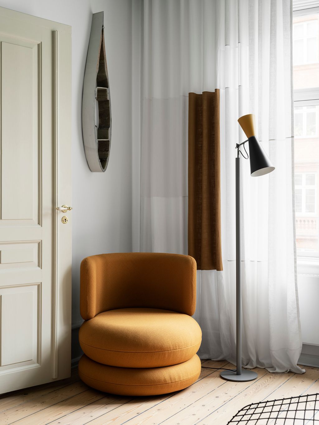
In the communal rooms, the family wanted brightness and warmth to suggest the pleasure of spending time together and the fun of raising a young family in the city. The kitchen, for example, features splashes of sunshine yellow, which take on an ethereal glow when the sun shines through the lemony curtains. In the living room, framed art adds colour to white walls, while slices of cobalt blue and red sit under a teal ceiling which prompts visitors to look up.“I love seeing some kind of reaction in interiors,” Michael remarks. The bedrooms, on the other hand, have a purposefully cooler palette. Blues, greys and whites wash the ceilings and walls, invoking a sense of calm and rest. “For a Scandinavian home, it’s definitely a bit more vibrant," admits Michael, "but we tried to balance colours without being overwhelming.” There are clever aspects to this, with all the more neutral colours at eye height, and richer colours on the ceilings.
Michael grew up in a family heavily involved with design and interiors, his father and grandfather both having trained as architects. Exposed to an abundance of art and design movements from his childhood, he notes Bauhaus as a style he fell for at a young age, and this is evident inspiration for the apartment’s art and furniture choices. “To me, Bauhaus didn’t at all feel soulless, because it has so much space for human lives and emotion. It’s such a clear example of balancing quite a lot of colour with very strict interiors, and I’ve always been drawn to that look” he reflects. “I am fascinated with the primary colours also, and still I am drawn back to them in most things I do.”
Moving from a smaller space, the new apartment presented the family with a welcome opportunity for furniture shopping. “I love spending time browsing online auctions looking for unique pieces,” says Michael. He wanted the apartment to be a collection of things that told a story, and as such it’s "a mix of random, no-name flea market finds but also some more classic pieces and things I have inherited.” The designs of Finn Juhl and Verner Panton are particularly prominent, alongside a few beautiful contemporary pieces. The space is curated, but rich in personal and artistic history, and the family are realists when it comes to their possessions. “Sometimes I feel like I have an inner struggle of wanting to live very minimally, and on the other hand having the walls plastered with paintings and hanging carpets,” Michael laughs.
Follow Michael on Instagram at @michaeldansk
 Line T Klein1/13
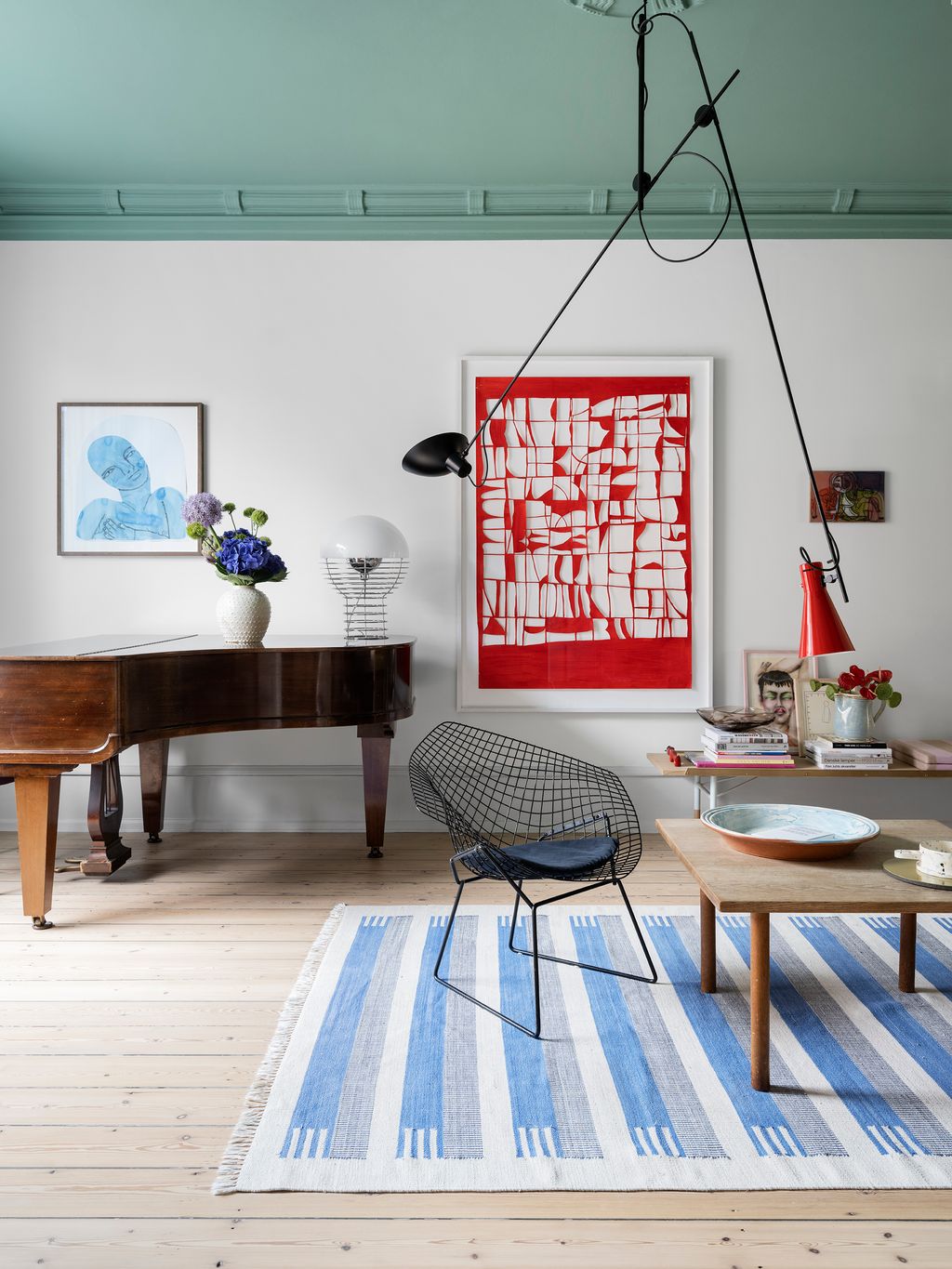
In the living room, blocks of colour appear in the form of the teal green ceiling is painted in Early Spring by File Under Pop and the red artwork by Mathias Malling Mortensen. A sofa and bench, both by Finn Juhl, set the tone for the room. The black and white painting is by Tal R and smaller painting by Mads Hilbert - included in a pop-up gallery exhibition last year by Michael in 2021. The cupboard is Michael’s own design and was produced in collaboration with carpenter Blom Handcrafted. A selection of glass and ceramic items by Nina Nørgaard, Peter Shire and HAY decorate the space, along with a carpet by House of Dhurries and a striking ceiling light by Astep.
 Line T Klein2/13
The piano lamp is by Verner Panton. The blue painting over the piano is by American artist Emma Kohlmann and was bought at V1 Gallery.
 Line T Klein3/13
The main living room opens into a smaller area for reading and watching TV. There, a curved sofa from Sofacompany features a pillow by Durup, while a lamp by Helle Mardahl hangs overhead. In the foreground the pink painting is by Fredrik Næblerød and the vase and bowl are by HAY.
 Line T Klein4/13
In this corner of the living room, an artwork by Danish artist Lea Porsager hangs over a chair by Verner Panton for Verpan. The sheer curtain is handmade by Fie Paarup and the ‘Parliament’ lamp by Le Corbusier is now produced by Nemo Lighting.


 Line T Klein5/13
The walls, woodwork and ceiling in the TV and reading room are painted in Castle Made of Sand by File Under Pop. The low sideboard is by Tylko, and pillow by Durup. On the ceiling the pendant light is by Helle Mardahl. Wall art is by Frederik Næblerød, Cathrine Raben Davidsen and Richard Mortensen, bought in independent Copenhagen galleries and online art auctions.
 Line T Klein6/13
At the other end of the room, a Noguchi lamp and orange chair by Verner Panton lend their rounded forms to the scene. The photo to the left is by Mads Juel, and a painting by Maria Wandel hangs on the other side.
 Line T Klein7/13
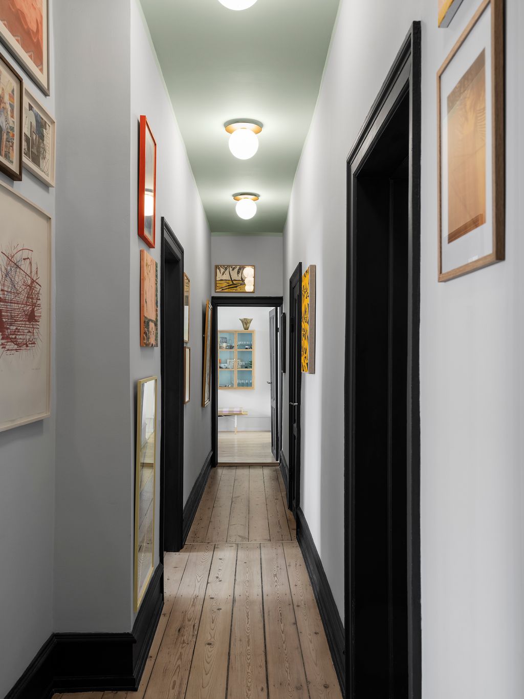
In the hallway, woodwork is painted in Tangled Up by File Under Pop and ceiling lights are by Nuura. The long hallway functions as a rotating gallery for the household’s art collection.
 Line T Klein8/13
In the dining area, the ‘Nyhavn' table is by architect, artist and designer Finn Juhl, produced by House of Finn Juhl. The column of handmade tiles features shades of yellow and white by File Under Pop. The dining chairs are by Swedish artist and architect Fredrik Paulsen and the yellow wall lamp artwork is by Anne Nowak. A Noguchi rice paper lamp hangs overhead, while candlesticks by HAY decorate the table. Various artworks by Malene Landgren, Frederik Næblerød, Bobbye Fermie and Jais Nielsen feature throughout. A bench with storage by Montana provides clever seating on the other side of the table


 Line T Klein9/13
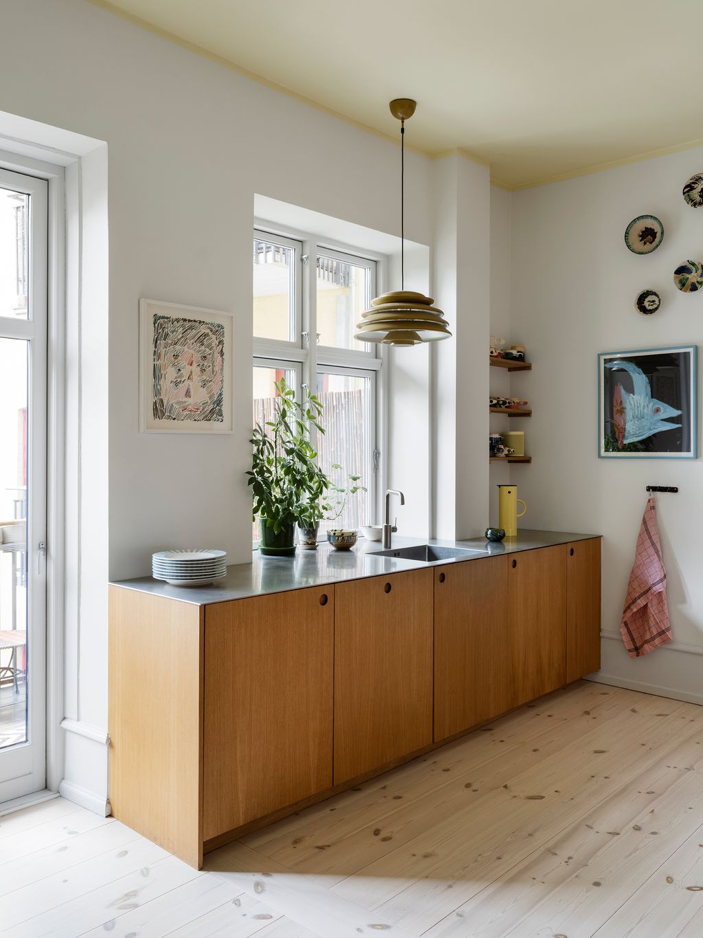
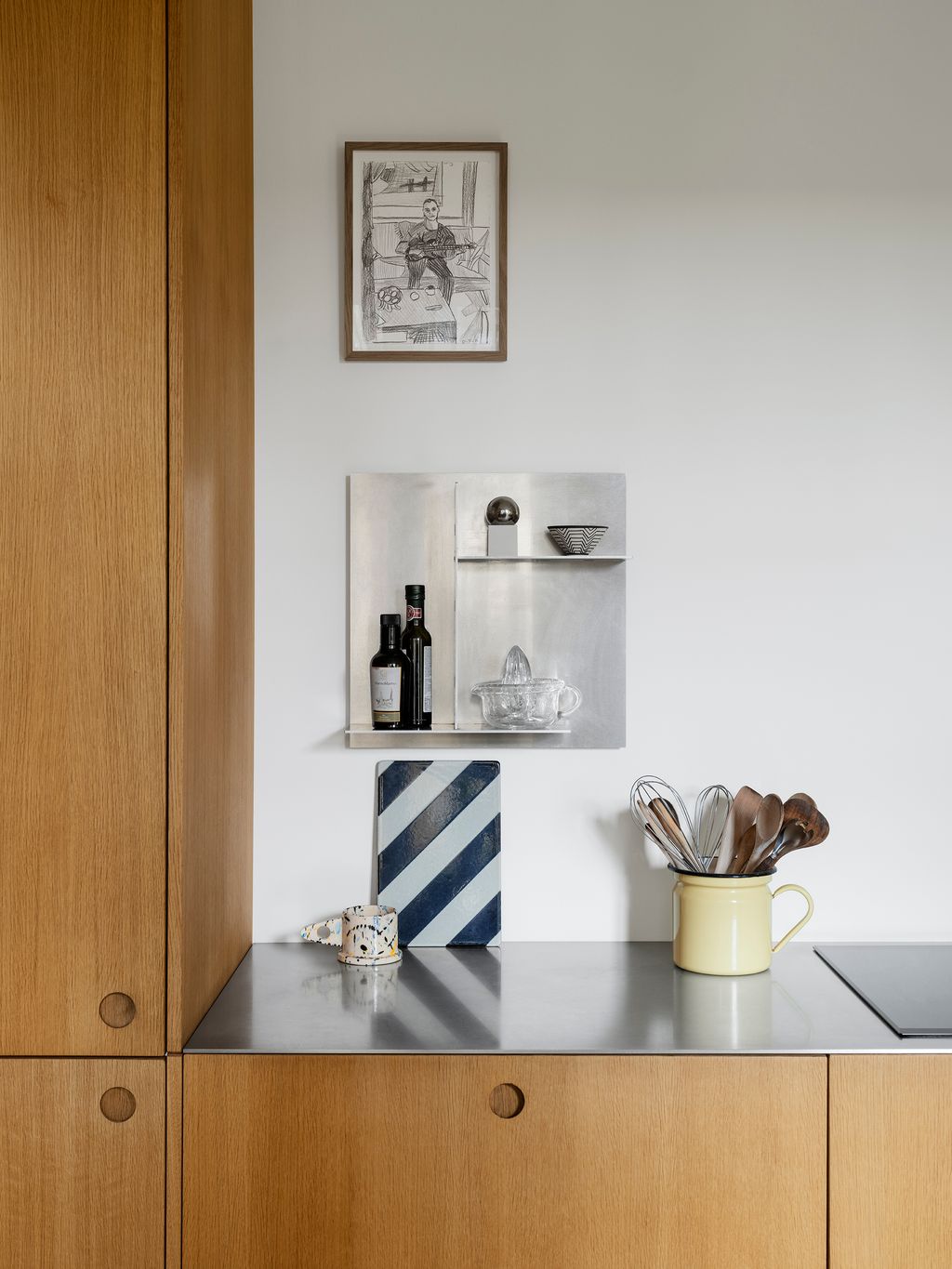
The oak kitchen is from Reform and features brushed steel countertops. A ‘Hive' ceiling light in mustard, originally designed by Verner Panton in 1960, hangs above the sink. Artwork by Howard Fonda and Frederik Næblerød occupy the walls next to vintage Mexican ceramic bowls from the 1950s, purchased from Marie Worsaae. The ceiling is painted in Mellow Yellow by File Under Pop.
 Line T Klein10/13
 Line T Klein11/13
In the main bedroom, a bed by Rye Sleep is spread with a cover from Tekla. The ceiling is painted with Son of Mr Green by File Under Pop and the walls with Stones & Bones. The large rice paper lamp is by Isamu Noguchi, whose lamps Michael collects.
 Line T Klein12/13
On the Jacob Edgeberg side table are a vintage tea mug and small ceramic jar from a local flea market. The artwork is by Kinga Bartis and the sculptural standing lamp is by Arne Jacobsen for Louis Poulsen.


 Line T Klein13/13
The geometric wall tiles are by H+O, with simple cream curtains by Arne Aksel. A vintage shelf by Knoll, inherited from Michael's grandfather who was an architect for the company in the 1950s, is the setting for a lamp by Verner Panton for Louis Poulsen and a glass artwork by Nina Nørgaard.


