
As with all things decoration, there are many ways to approach art in your house. There are gallery walls, statement pieces, artless walls, hanging tapestries, small paintings, huge oils and the list just keeps on going. Generally though, people tend to fall (unknowingly or not) into one or other camp amongst the art maximalists and art minimalists. These are not remotely linked to the idea of maximalism and minimalism within decorating generally, as someone in a minimalist house could still hang art like a maximalist and vice versa. Look at Rachel Chudley's projects: the interior designer definitely falls into the ‘more is more’ camp of interiors, adding ruffles, bold colour, crenellated kitchens and incredible detail to all of her projects. However, when it comes to art, she tends to opt for one statement piece in a room rather than a myriad of competing artworks.
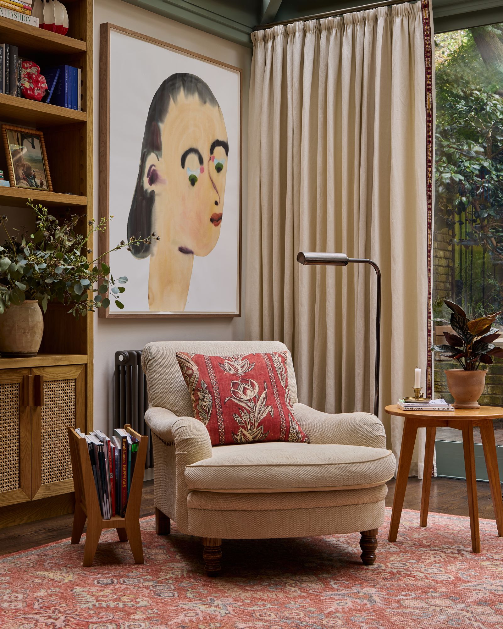
The same is true of Anna Haines, whose general aesthetic is much more pared-back than Rachel's, though still not considered ‘minimalist’ in its truest sense. “I like the impression on a room one large piece creates,” Anna explains of her choice to showcase less art than more in a space. “It has a very different energy and relationship to the space than smaller artworks might,” she continues. “It instantly draws the eye, creates the mood and a focal point”. As to how this fits within the overall look of a room, Anna states “we will often layer in rich textiles, larger scale patterns and bold colours to weave in a narrative with a single artwork – and then keep the layout quite structured to bring a balance and sense of calm to the space.”

On the other side of the spectrum, Julia Collins, who runs art dealership Collins & Green Art, recently put a poll on her Instagram asking followers if they thought she should start hanging art on her ceiling as a way of cramming more into her house. “The answer was a resounding no,” she laughs, but “maximalism to me means pretty much every vertical surface being covered and pictures in piles on shelves and leaning against walls, usually with lots of books too. I like paintings to go from top to bottom; two of my big hates are picture rails and dado rails so I have had them removed from my new house”.
It's a wildly different approach from Anna's but one that many people align with, albeit not always to the full throttle degree in which Julia does. “In the context of having larger pieces and fewer of them,” Anna continues, “it is about provoking thought and emotion with the restraint of less. For me, each piece stands out on its own, and when properly installed with space around the artwork to breathe, it brings a very welcome balance to the interiors we create. Aesthetically it feels cleaner.” On this point, Julia is in complete agreement as “it's hard to emphasise particular pieces on a maximalist wall,” she acquiesces. “Bigger and more ornate frames can tend to get more attention but part of the joy of a maximalist scheme is that everything gets the same attention; in my kitchen I have one wall with a mix of vintage art, a couple of contemporary pieces, a framed poster, paintings by my children, a photo, a framed postcard. It all sits together really well with no one thing getting more attention than another. It’s a very democratic way of displaying art.”
For the art minimalists amongst us, Anna's advice on choosing the one piece of art for a wall is that “importantly it wants to suit the space rather than dominate it”. What this means is looking for larger artworks that can anchor a space rather than command your attention too much. “I am drawn to abstract or conceptual artworks when looking at larger scale artworks,” she details as “they can work in various settings without feeling overly intrusive”. She is not against things like a gallery wall, but they have to be in the right setting otherwise they end up feeling “quite fragmented and disconnected”. One such example Anna states is in a recent project, where “we installed a gallery wall in a hallway which travels up the staircase. It’s a myriad of pieces the client collected over time. It works well because it tells a story as soon as you walk in the door, and the smaller pieces travel up the stairs like an interlocking jigsaw puzzle”.
However, on the whole Anna is firmly team minimalist and sums it up very well: “I love a larger statement piece as you walk into a room. It can carry so much more weight and has more gravitas than smaller artworks might”.
For the maximalists, Julia has both lots of advice but also very little as “by its very nature, maximalism is incohesive and that this is part of its attraction.” Variety is key for Julia, in terms of medium of art, size, framing style and period all existing happily together but really, she believes “there is only one rule for a maximalist display – never ever start with your biggest painting bang in the centre of your wall. I know several really top UK designers would completely disagree with this but for me it just kills any life in a collection completely dead. I generally suggest starting with the biggest, and maybe most “important” piece off centre and then fitting everything else around it.”
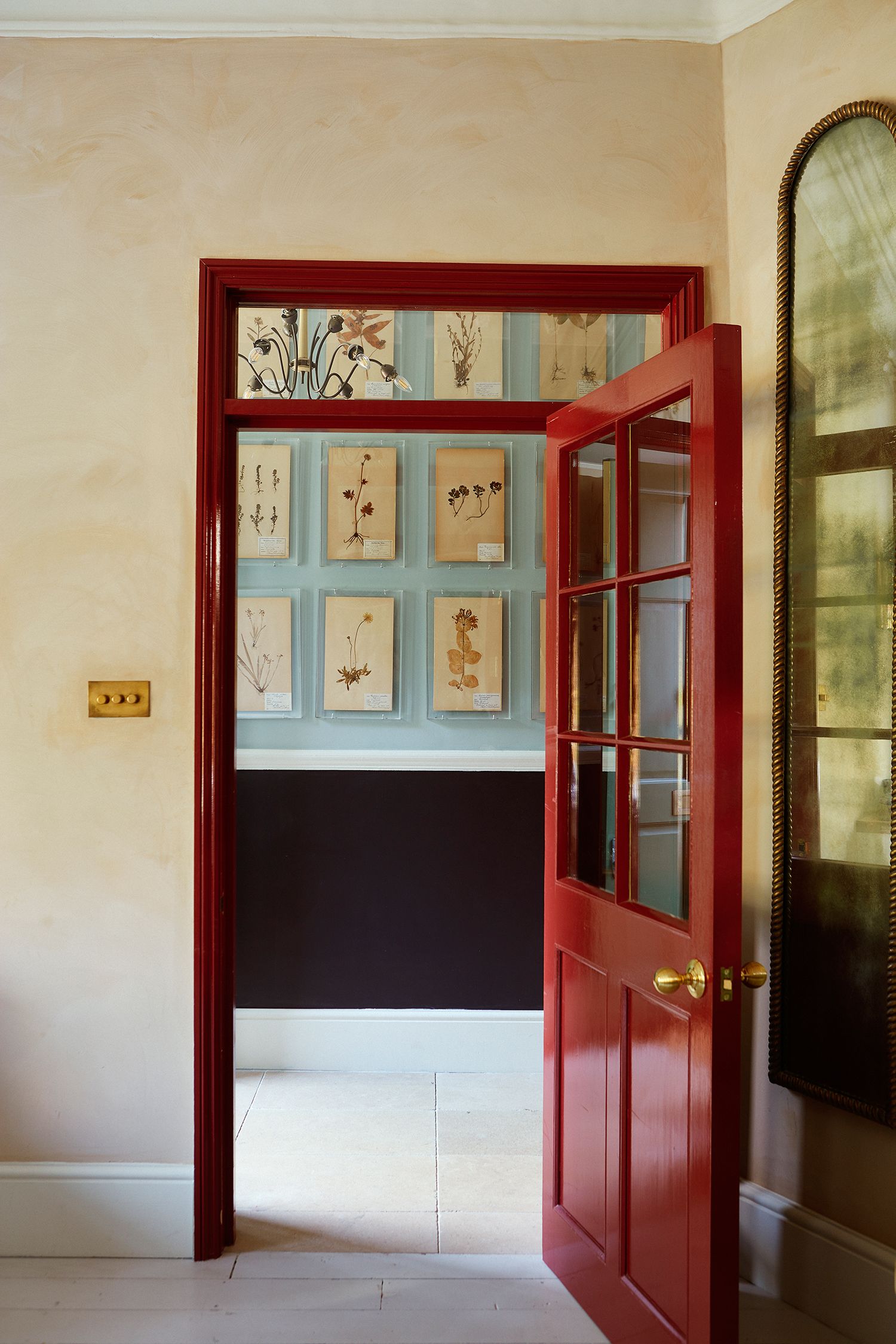
And what about those people who aren't quite sure where they fit into all this? Well, for Julia “anyone, maximalist or minimalist can enjoy the maximalist approach. If it’s a scheme for a minimalist I would suggest veering towards less variety within the artworks and their frames to reduce any sense of visual chaos, which a maximalist might be very comfortable with. A minimalist might be very happy with a rigorously hung array of 19th-century botanicals where everything is in the same frame and all the edges line up. Pretty much every inch of the wall would be covered but it would be ordered and symmetrical so would appeal to the more disciplined minimalist mind.”


