If you're scared of decorating with red paint, you're not alone. Paint psychologists report that red rooms ‘increase the heart rate’ and create an unsettling atmosphere, a feeling borne out by several haunted red rooms in literature. Charlotte Brontë's Jane Eyre was terrorised as a child in the red room where her uncle died, and H.G. Wells' 1894 ghost story The Red Room features a horror-struck narrator spending the night in an eponymous haunted room at Lorraine Castle. But, as Farrow & Ball's grande dame of colour Joa Studholme says, “there's red…and then there's red.” And we couldn't agree more.
“The kind of reds that get your blood flowing are reds in their purest form, or most saturated,” explains Tash Bradley, Director of Interior Design at Lick, the booming ‘new kid on the block’ paint company. “As soon as they're cut with white or grey, they become so much more soothing." Cassandra Ellis, the founder of Atelier Ellis, explains that ‘clean reds' – those that are closer to the primary colour form – speed up your metabolism and make you eager to leave a space. “That's why fast food restaurants so often feature bright red in their interiors. They want you to get in and get out!." Across the board, paint experts suggest that the most approachable and least fear-mongering shades of red are earthy tones that are cut with brown, white and yellow. And there are so many beautiful options on the market.

Pale reds
“Softer red shades can act as the perfect gateway to experimenting with the hue, ensuring all are able to make the most of red’s enchanting qualities,” says Marianne Shillingford, the Creative Director at Dulux. At its least saturated (mixed with the most white) before it becomes pink, red is a soul-warming colour that can make a room feel both lively and classic. “Lighter, brighter shades that veer towards the softer pastels feel uplifting,” agrees Helen Shaw, Director of Marketing at Benjamin Moore. "They work especially well in brighter rooms as the changing light will reveal the undertones. Paints with hints of coral, like ‘Raspberry Blush’, come alive throughout the day offering a charismatic, vivacious energy to your home.”
Marianne points to ‘Red Sand’ from Dulux Heritage if you want to paint an entire room. “The tone is reminiscent of autumn leaves and sandstone, and fills the home with a welcoming warmth.” Its approachable feel makes it especially useful in hallways and entry rooms, particularly if there isn't any natural light. “It's a common misconception that you should paint a room white if it's lacking in natural light,” says Tash, "when actually white creates the most shadows and contrast, so it will feel smaller." Instead, Tash says that mid tones “try the eye and make it look bigger, more powerful and more sexy.”

Tash recommends Lick's 'Red 03' as the perfect entry point for red sceptics, a “lovely pinky red with lots of white and brown pigment.” This shade is also Lick's best selling paint colour, which is "super unusual for a red paint, and that's indicative of its versatility," says Tash. For Joa, ‘Faded Terracotta’ offers a similarly soft, milky, flat red that's evocative of ‘terracotta pots and tiles baked to a pale hue by the California sun.’
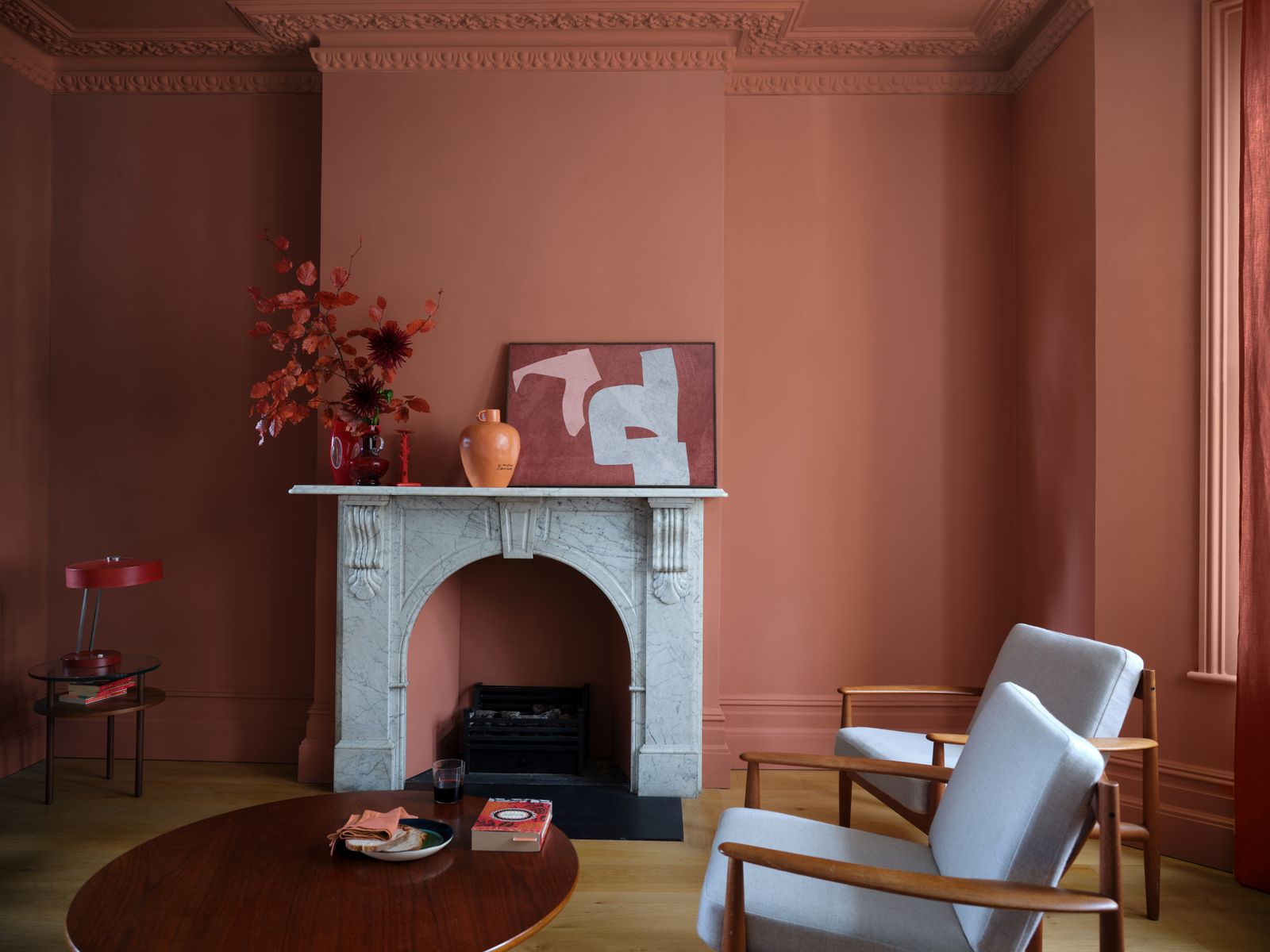
Pinky reds are good options when you're looking to coat an entire room in red. “Generally, the more soothing a colour is, the more area you can use it across,” explains Tash. “So ‘Red 03’ was built to be colour drenched." ‘Drenching’ - a technique which involves painting the entire room, including the woodwork, skirting boards and ceiling - has grown massively in popularity this year. “By taking a dusty, pinky red over everything you're going to absorb all that horrible shadow and open up the space.” She recommends painting the ceiling the same shade, “because if you paint it white it's the first thing you notice in the room!”
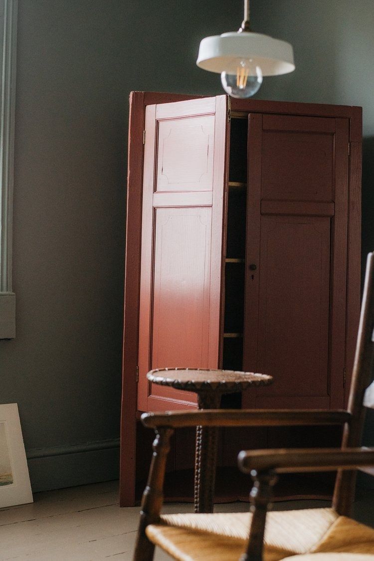
Tash also recommends using a technique that Little Greene have dubbed ‘double drenching’, which means picking one colour and then selecting a range of ‘weights’ and thereby creating a tonal scheme. “And our paints are all carefully curated to go together, so then you can add in pops of a burnt umber red like 'Red 01' to something like the inside of a bookshelf or a mantlepiece," she suggests.
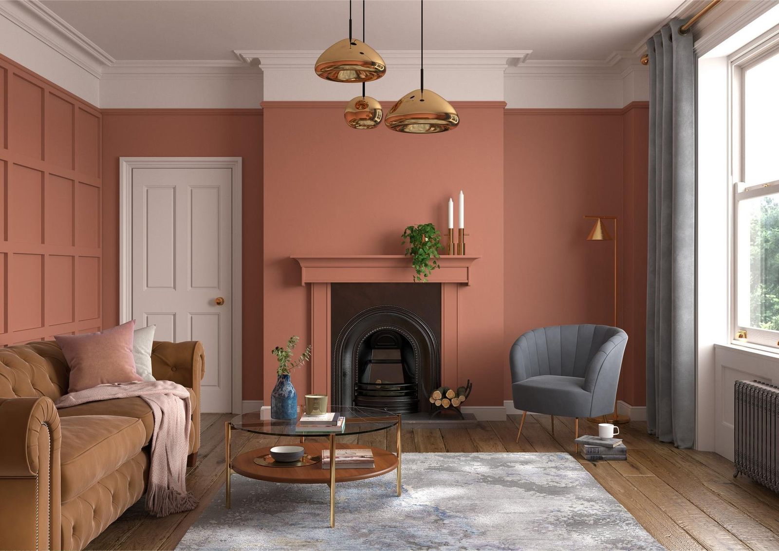
If you're working in Dulux shades, then Marianne loves using soft reds with “more muted shades that have complementing natural hints, like ‘Powder Colour’ and ‘Pale Walnut’, for those that want to add a sprinkle of the shade amongst something a little more neutral.” Or, she says, you could try combining an orangey red like ‘Inca Orange’ with a deeper shade like ‘Red Sand’, to "create a true fireside feeling, especially in cooler north-facing rooms in the house. These shades might be more daring, but tonally they are the most cosy and comforting pair.”
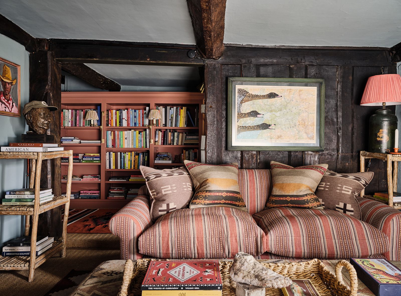
Warm, earthy terracotta
Head slightly deeper into red and you'll find the kind of rich terracotta tones that everyone is loving this year. Lucy Steele, the new Paint & Interiors Expert at V&CO, believes that red should be “just red enough to make an impact, but soft enough to help you unwind." Cassandra suggests that the key to creating a “red that's not quite red” is to “filth it up” with plenty of different pigments, rather than opting for anything too ‘pure.' “A red like our ‘della Casa’ has around eight pigments with tones like salt and pepper or cumin seed, to make it feel alive.”
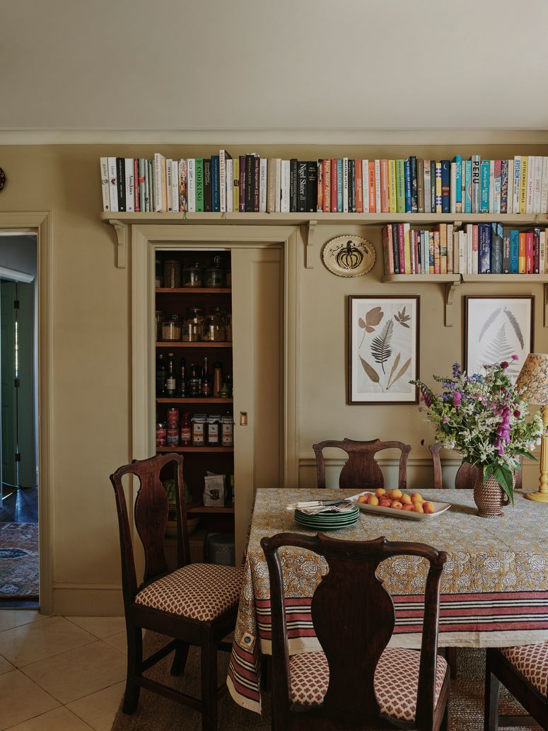
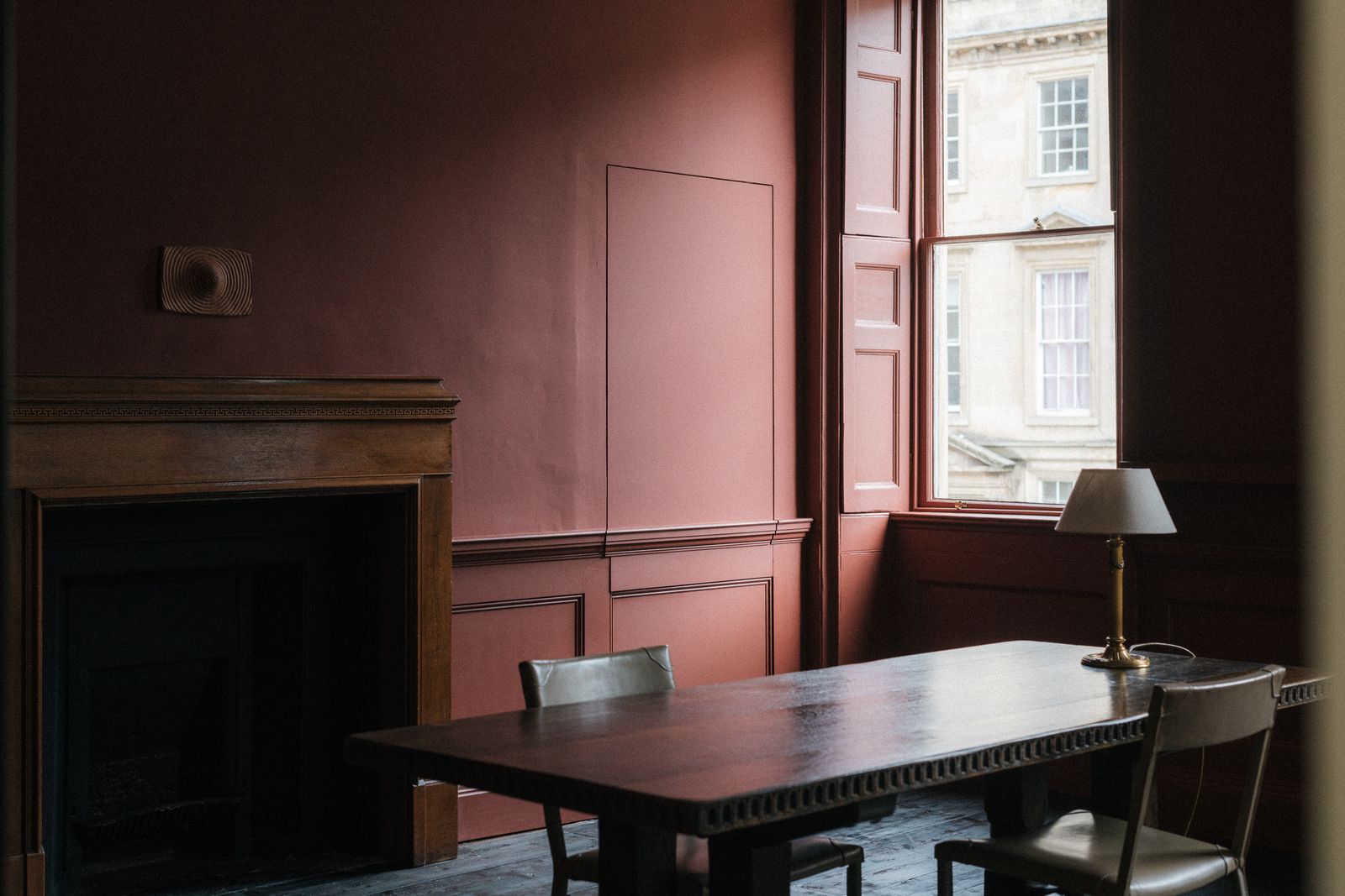
Evoking the warmth and patina of terracotta tiles and their Mediterranean native climates, this kind of hue is the perfect way to add a warm, welcoming feel to a room, particularly, as Joa says, a small, intimate living room or snug. “It's now becoming less about the ‘proper reds’ like ‘Rectory Red’ or ‘Incarnadine Red’. We're all turning to much warmer, earthier tones. Colours like ‘Fox Red’ or ‘Red Earth’, for instance, all have an organic feel, like they're from the soil," Joa suggests. Marianne similarly notes the “earthy” and “rusty” quality of something like Dulux's ‘Red Ochre’, which roots a space in nature, so it remains feeling “familiar and homely."
For something a little hotter and more energising, Joa points to ‘Bamboozle.’ This is one of my all time favourite reds. It's a warm and spicy, orangey red. It can add a cheeky, spirited feeling to any room." This could be a fun option for a playroom, for example, as the piquant colour will bounce absorb sunshine and give a lively feel to a room.
Joa loves using these peppery shades in conjunction with very warm whites (whites that have red or yellow in them, rather than blue) like 'Dimity' or 'Stirabout'. “Red is the most difficult colour to balance, and it will probably take you a while (and a lot of working it out) before you really get it right." Whatever you do though, she advices against using red with a bright, cold white with a blue base.
Said ‘warm whites’ could be used on book shelves or woodwork to create a classic, country house feel, but also just in the room next door to create an interesting alternating feel. “These colours are so good for your mood," she says, when discussing why they've become so popular in the last few years. "We all spend so much time at home, particularly in a post-lockdown world, and tend to spend a great deal of time in bright, light rooms like our kitchens. It's so nice to leave those white spaces and feel pulled into somewhere different. Somewhere darker and more welcoming.”
Tash also explains that red has been proven to instantly attract you, so if you need some encouragement to leave the bright, energised feeling of a work day and enter into a more intimate space with a good book and a glass of wine, try painting it an intense, bricky shade of red. Lucy recommends using ‘Red Shade 4’ from V&CO in a bedroom for the same reason: “it's a perfectly romantic shade that draws you in and leaves you feeling relaxed and at ease.”
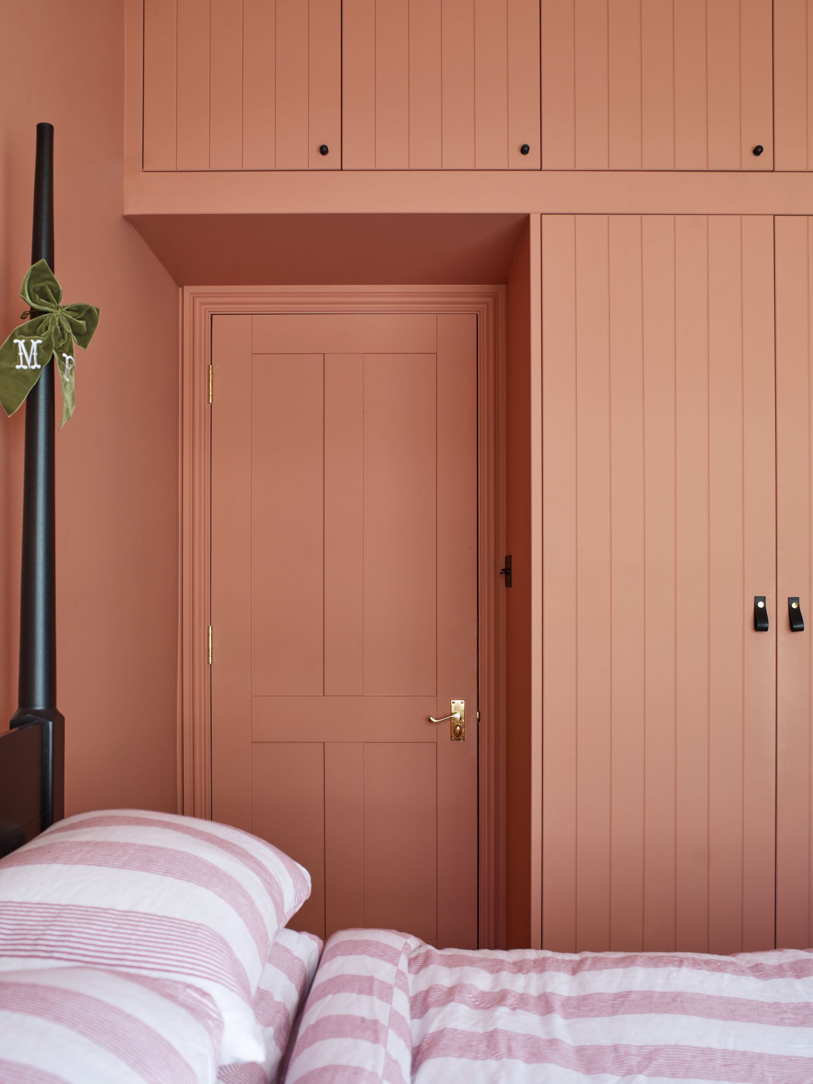
Rather a red room with warm white woodwork, Cassandra is partial to an warm white room with large red pieces, like built in cupboards. She recommends using the biscuity shade ‘Tea & Toast’ or the deep, dusty green tones of ‘Mollie’ as the perfect counterpoint for a rusty red.
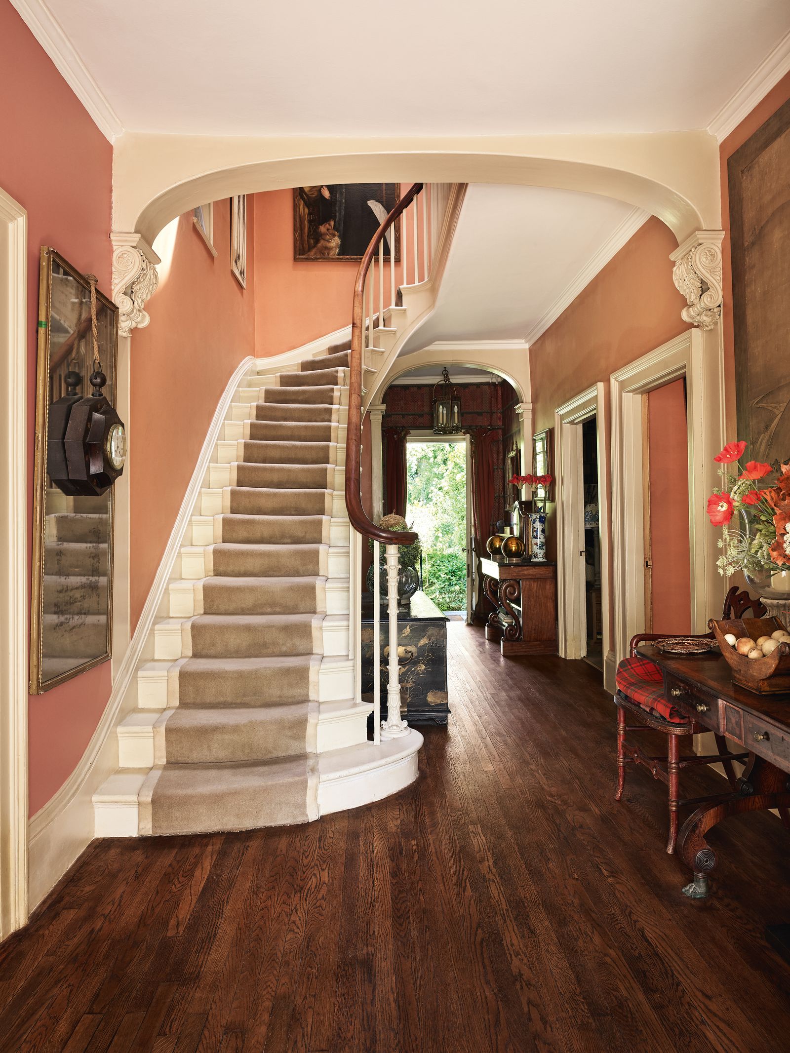
You could also try terracotta tones in combination with other colours. For Lucy at V&CO, mixing a soft red with beige creates an inviting palette with slightly more contrast than a tonally layered scheme. Another popular pairing is terracotta with dusty blue. Pale blue might seem like a rather cold colour, but when combined with the warmth of terracotta reds, it can be a delightful scheme for cosier rooms. Tom Cox of HÀM Interiors deployed it in the sitting room of his 17th-century house in Devon, using Farrow & Ball's ‘Oval Room Blue’ on the walls, Edward Bulmer's ‘Sang de Boeuf’ on the bookshelves and a stripe by Mulberry Home on the sofa.
Dusty berry tones
Deep and dusty tones of red which tend towards purple, but are still cut with a little bit off white or grey to take the edge off, are perfect for creating a rich and romantic space. Cassandra describes these shades as “visceral”, evoking images of “dried blood, which becomes even more earthy and organic as it dries. For me, red is very human." Atelier Ellis' shade ‘Rubus’, for example, which is inspired by ‘berry picking and jam and cake’ and ‘faded, beautifully worn Raspberry,’ has small amounts of blue and white pigment in to take it away from sienna and towards something deeper and more romantic. ‘Francis’ red which was a bespoke colour for the Francis Gallery, inspired by the beautifully murky tones of Korean Patjuk beans, is similarly evocative, and works in both big and small spaces.

Inspired by the red damasks so popular in 19th-century dining rooms, Farrow & Ball's ‘Eating Room Red’ is a warm, dusty raspberry that belongs in the wine family. As with all of Farrow & Ball's colour, it shape shifts according to the room and light, oscillating between a juicy shade of cherry, to more vampy wine colour. Atelier Ellis' ‘Ribbon’ is ‘neither plum nor crimson’, rather a ‘nightfall red’ which has both blue and brown undertones. Cassandra recommends using this colour on a bath or a cast iron radiator, as seen in the image above, which creates the effect of an unexpected stain of berry on a vintage linen tea towel.
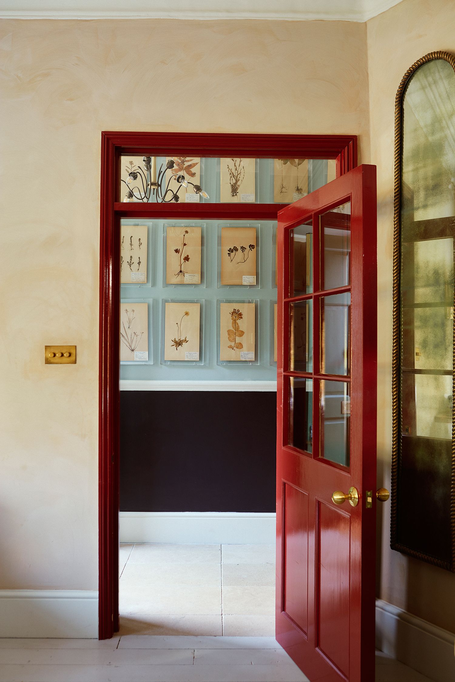
Whilst there's no rule saying you can't wash an entire room in a dusty shade of berry red, if you're a little red-shy then you may want to use these corporeal tones in splashes. “Trends like this year’s ‘Unexpected Red Theory’ have really shown the versatility of red as a strong contender for any interior decorating project," posits Marianne. “Even in the smallest doses, it can inject warmth, passion and a sense of courageousness.” And Joa concurs, pointing to the “inside of a cupboard, on an island, or just on the legs of a table” as spaces to add berry tones. Joa herself has used Farrow & Ball’s 'Picture Gallery Red' to add an injection of heat into a bedroom. Matilda Goad did a similar thing in her London home, using ‘Eating Room Red’ in a gloss which frames the room beautifully.

Cassandra suggests that windows onto gardens are the best place for an injection of red, particularly if you're tentative about washing a whole room: “if your planting was green and soft and spotted with red roses, dahlias, black or chocolate cosmos, then a deep, dark, dusty red window will encourage the eye to go straight out into the garden.”
So, if you love to wear red, or you're just a fan of the beautiful range of terracotta tones that form from a pile of autumn leaves, there's no reason why you can't build that into your interiors. Whether you choose to use a milky red on every surface, you create an earthy and romantic snug with warm whites, or you're injecting dusty shades of berry in a doorway or window frame, red is a joyous, enveloping and romantic shade that's just too good to miss out on.