17 timeless paint colours that should be in your house this year (and every year)
While it can be rather fun to see different paint colours coming back into style as the years go by – in the last year alone we've been excited to see the resurgence of yellow, brown and purple, the latter of which we never thought would be back – there's a lot to be said for choosing a timeless paint colour that won't have you desperate to repaint with the new season. Looking back through the House & Garden archive, it's clear to see that certain colours appear again and again regardless of trends, and there are shades we have loved for years without any loss of enthusiasm. There are certain soft tones and neutrals that always lend a gentle sophistication to a scheme, and there are stronger colours whose sense of drama never fades. Sometimes the way we treat these hues might change – nowadays the idea of using a brilliant white trim with a dark colour such as burgundy has gone out of style, and colour drenching rich shades is a popular choice – but the colours themselves are still sure to please. Scroll down for 17 of our favourite classic paint colours.
 Paul Massey1/17
Farrow & Ball's much-loved ‘Setting Plaster’ (here seen in the bedroom of Lisa Mehydene's barn conversion) is perhaps the best known shade in the family of pale, warm pinks with yellow undertones. These pinks are incredibly easy to use, will warm up any space (provided it has sufficient natural light) and go with a huge range of other colours. We adore them used with green, but they also work brilliantly with less predictable hues like red and purple, if you're so inclined. Although ‘Setting Plaster’ has been absolutely everywhere for the last decade or so, there are no signs of it going out of style.
 Owen Gale2/17
‘Jonquil’ by Edward Bulmer Natural Paints is another beautiful member of this pink family, and it turns up with almost equal regularity. Here in Jeremy Langmead's former house in Suffolk, a door off the hall opens into the study, which is painted in ‘Jonquil.’ The colour works beautifully with the sky blue paint on the door.
 Sophia Spring3/17
Pinks of any description are highly flattering colours, and therefore lovely for bathrooms as a backdrop to looking at yourself in a mirror. In the bathroom of her London house, interior designer Anna Haines has painted the walls in Edward Bulmer Natural Paints' ‘Cuisse de Nymphe Emue’, a perfect dusty pink.
 Rachel Whiting4/17
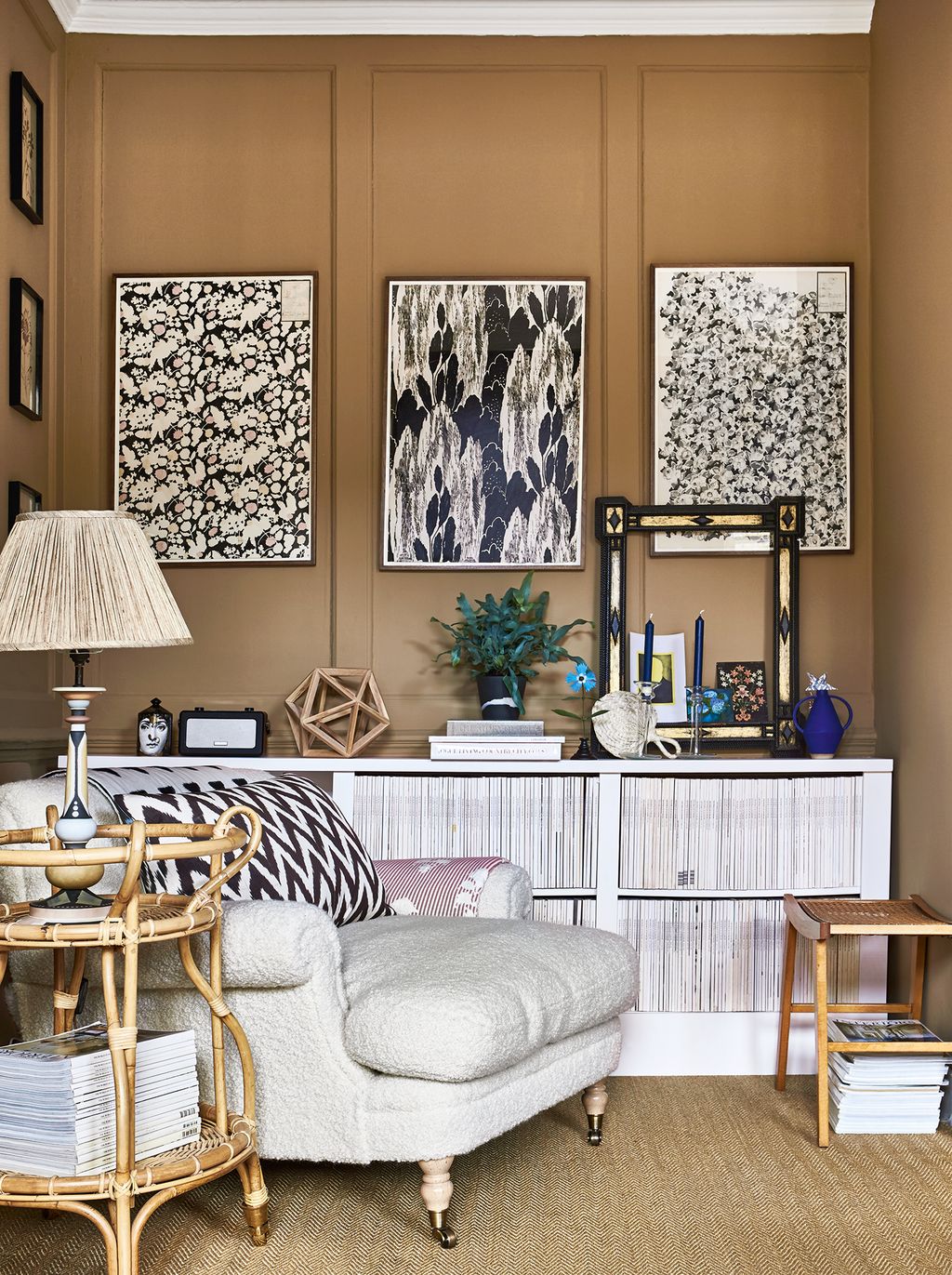
Mid-tones of brown (which we're variously calling coffee, caramel and biscuit shades) feel very of the moment, but looking back through houses we've featured in the last decade, there are some marvellous examples of this shade that prove how timeless it really is. A perennial favourite is Paint & Paper Library's ‘Caddie’, which our former Style Director Gabby Deeming used on the walls of her Bloomsbury flat. “It was the perfect backdrop for everything in the room, working well with the brighter colours and giving sophistication to the natural textures that before had looked a bit grungy.”


 James McDonald5/17
Edward Bulmer's ‘Mummy’ is another very useful shade in this mid-brown family. It makes a lovely, moody backdrop for antiques and patterned fabrics – here in James Mackie's Cotswold cottage it lends sophistication to a cheerful, colourful scheme of reds and blues.
 Paul Massey6/17
Gentle grey-green blues are another staple of every decorator's paint arsenal – they look fabulous when paired with pinks, reds and yellows. Alexandra Tolstoy has used the popular Farrow & Ball shade ‘Light Blue’ in the bedroom of her London house, and it's easy to see how well it works with red and patterned textiles.
 Paul Massey7/17
For a more classic sky blue or Wedgwood blue, try Little Greene's ‘Bone China Blue Mid’, which is indeed based on the colour of Wedgwood's famous jasperware. Here it looks beautiful as part of a blue scheme in designer Annabel Bevan's London home.
 Boz Gagovski8/17
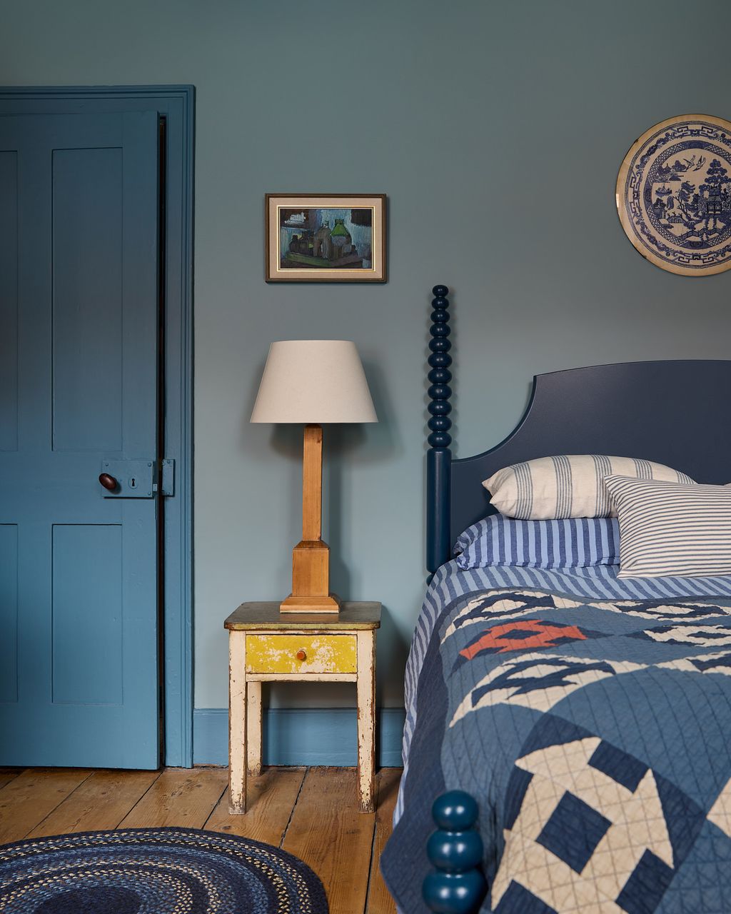
A slightly deeper blue which we see frequently is Farrow & Ball's ‘Oval Room Blue’, a blackened blue with a suggestion of the 18th century. It works well when paired with tonal blues – here in Russell Loughlan's house in Deal it appears on the walls with woodwork in ‘Sloe Blue’ and a bed painted in the even darker ‘Hague Blue’.


 Yuki Sugiura9/17
A soft sea-foam green such as Farrow & Ball's ‘Mizzle’, (seen here in the sitting room of Matilda Goad's London house) has the capacity to be a super-soothing backdrop to pretty much anything. Use it in rooms with lots of light and it will shift beautifully throughout the day. We also love Edward Bulmer's ‘Celadon’ for something equally delicate but a little more green.
 Paul Massey10/17
The perfect apple green is always going to be a useful colour, bringing a fresh cheerfulness to spaces like kitchens and bathrooms. Annabel Elliot chose Farrow & Ball's ‘Cooking Apple Green’ paint for the bathroom of Prince Charles’s sixteenth-century house in Cornwall, and we think it's the perfect choice for a sunny room.
 Paul Massey11/17
If you're looking for something a little bolder, a vivid grass green never seems to go out of style. Edward Bulmer’s ‘Invisible Green' is the one we see the most. Rita Konig explains why she chose to use it in the drawing room of her County Durham farmhouse: "I realised that I’ve never met a bright green room I don’t love, yet I rarely use the colour. This is the green of Babar’s coat – a shade that goes with so much, as it does in nature.”
 Paul Massey12/17
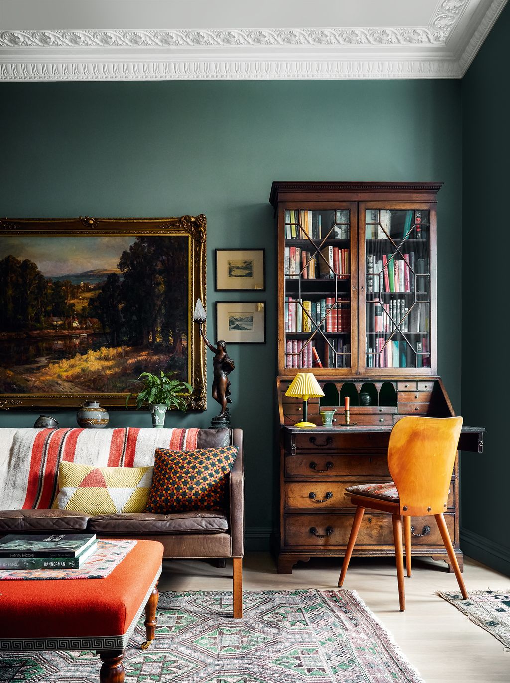
Dark, moody colours can be a brilliant solution for rooms that are naturally dark anyway, and can be wonderful backdrops for art and antiques. Farrow & Ball’s ‘Castle Gray’ paint demonstrates how well it sets off brown furniture here in Brandon Schubert's former London flat. The rich grey-green colour is a particularly classic choice – it changes with the light beautifully and makes the room full of interest at all times of the day.


 Michael Sinclair13/17
There is no doubt whatsoever that yellow paint is having a moment this year, and yellow kitchens and yellow living rooms, in particular, are showing up everywhere. But there are some yellow shades that feel completely timeless, and they're generally of the strong, mustardy variety. Farrow & Ball's ‘India Yellow’ is a classic, as seen here in the dining room of a London house by Lucy Hammond Giles, or try their ‘Babouche’ for something a little brighter and more cheerful, with plenty of egg-yolk punchiness.
 Christopher Horwood14/17
Red paint can be a bit marmite, but a deep merlot shade always feels incredibly sophisticated. One we especially love is ‘Murrey Red’ by Papers & Paints, which has been used for the walls and woodwork in the sitting room of this London house by Natasha Quick. To make shades like this feel up to date, designers are colour-drenching with it to give an enveloping feel to a room. We'd also recommend you avoid painting the woodwork a brilliant white, as that can make a deep red (or any deep colour) feel rather dated.
 Owen Gale15/17
Choosing the right white paint colour can be endlessly difficult, but there are a few classics that we see over and over again in the projects on our pages. Charlotte and Angus Buchanan of Buchanan Studio have opted for Little Greene's ‘Slaked Lime’ in their own house in north-west London. They say it ‘is the neutral we return to again and again in our projects at Buchanan Studio… Our own home is painted in it top to bottom.’
 Mark Anthony Fox16/17
We are constantly hearing from interior designers who love Paint & Paper Library's ‘Architectural’ series, a clever range of 95 neutrals in which each colour is numbered I, II, III, IV or V to denote how light or dark they are. A nice trick is to use a paler tone on the walls and a darker version of the same colour on the woodwork. The ‘Stone’ and ‘Slate’ series are particularly popular, and in his own London flat designer Christian Bense has used ‘Slate II’ on most of the walls, paired with woodwork in the brand's ‘Slate IV’.


 Paul Massey17/17
Whites with grey-green undertones make for a really interesting neutral backdrop, and we often see them being used in Georgian houses where they give a pleasingly grubby suggestion of the past. Katharine Howard has used Farrow & Ball’s ‘Hardwick White’ on the walls of the snug in her Georgian house in Kent, where it makes for a calm scheme and doesn't fight with the architectural features.

Comments
Back to Top


