
Unlike the fast-paced world of fashion, where a new collection seems to hit the shops before we’ve even had a chance to browse its predecessor, the world of interiors can be slower moving. New things come onto our radars at a more digestible rate and tend to stick around for much longer. Nowhere is this more true than at Farrow & Ball - the paint company favoured by many a UK household, whose recently launched latest collection of nine new colours and three brought back from the archive has been two years in the making, and which joins a colour card of 132 shades, some of which have firmly held their place over several decades.

The mastermind behind the colours (and their whimsical names) is Joa Studholme, a woman who lives and breathes colour. Her house, a 19th-century former schoolhouse in Somerset, is a melting pot of tones and provides not just inspiration for what's to come but also a brilliant testing ground once the new colours have been made. This new set of colours is the result of Joa taking in her surroundings and finding magic in the mundane. ‘I had this theory that we all miss out on colours that we’re very close to – the ones that are right under our noses’, she explains. ‘I started looking at things in the household that are really inspiring but are very ordinary’. Everyday objects, such as a duster, or a dibber (a gardening tool), stood out to her as ‘treasures’, and thus became the basis for the palette.


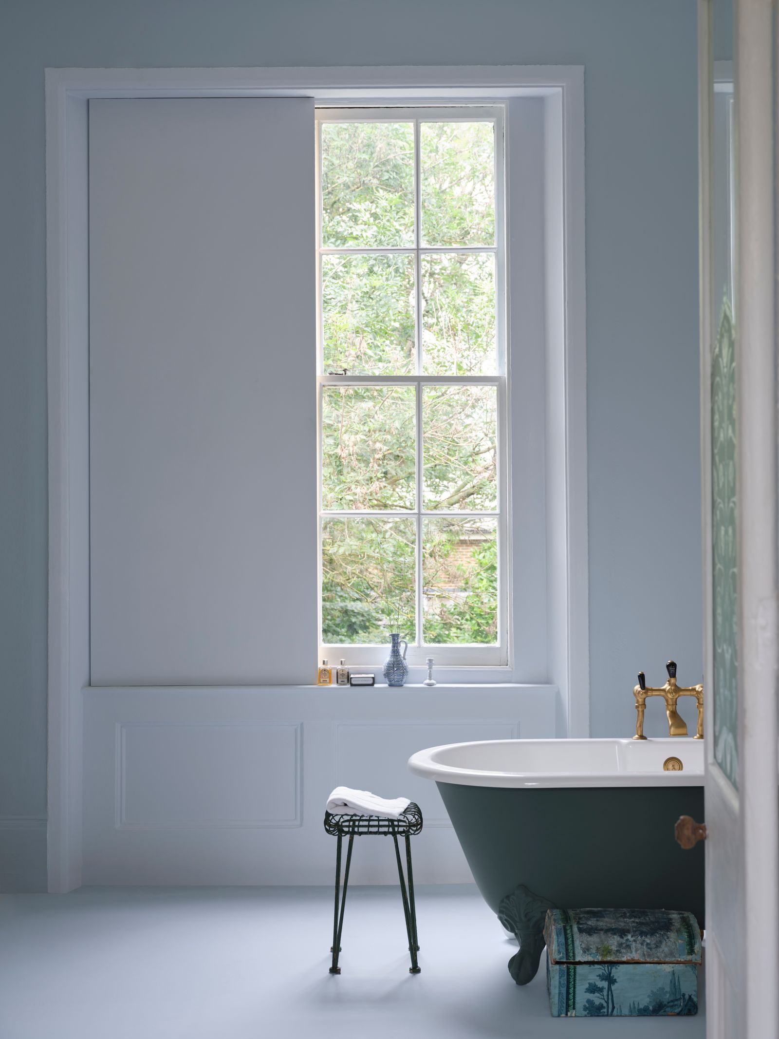
‘There’s been a huge change recently, everyone has turned their backs on grey and instead wants an earthiness at home’, says Joa. Certainly, whether it’s the clay-coloured ‘Naperon’, named after the original word for apron, or the terracotta-esque ‘Marmelo’ (a nod to marmalade), there is a murkiness to these colours - no doubt a reaction to the increased appetite for less saccharine surroundings.
The exception is ‘Sizing’, a sharp, crisp pale blue which makes up what Joa refers to as ‘the essential neutral that every palette must have’. The last colour launch saw the creation of ‘Stirabout’, which was named after the Irish porridge and whose creamy tint mirrored this. Unlike its forerunner, ‘‘Sizing’ is really cool. It almost feels like you can smell how clean it is’, says Joa.

Before the colours could be declared completely ready, they first had to be tested out in Joa’s house. The tongue and groove panelling in her kitchen is painted in ‘Duster’, which sits happily next to ‘Broccoli Brown’ - the chosen colour for the table legs, while reduced green on the cabinets is what Joa describes as ‘a natural bedfellow with ‘Marmelo’’, which she has used to paint her dresser.

These colours need to fight for their place on the colour card: for each new colour added, one must come off. Any removed colours can live in the archive, to be resurrected at a later date. Alongside the new collection, three archive colours have been reinstated: ‘Broccoli Brown’, ‘Etruscan Red’ and ‘Sap Green’. ‘Etruscan Red’, Joa explains, holds a special place in her heart. ‘It was the first Farrow & Ball colour I ever used, before I even worked here. I was recently painting it at home and my husband said it reminded him of something. I realised it was the exact same colour I’d used in the sitting room of our last house!’, she says, joyfully. It is certainly fitting that such a coincidence should happen in tandem with the release of a palette based on nostalgia. ‘The colours are strong but feel familiar, and there’s a safety in that’, says Joa. Quite.


