The naming process behind paint colours has long been a source of humour - and sometimes confusion. There are those – Papers and Paints' ‘Not totally white’ for example – which do exactly what they say on the tin, but there are others – like Farrow & Ball’s ‘Mole’s Breath' – which clearly have more of a story to tell. Food tends to be one of the main sources of inspiration for naming paints, and when you think about it, that makes perfect sense. “If I am naming a colour it's usually a question of creating a feeling”, says Joa Studholme, chief colour consultant at Farrow & Ball. “Food and ingredients can be so nostalgic and immediately bring an image or feeling to mind. I recently called a colour ‘Stirabout’, which is what children in Ireland used to call porridge; it is a warming colour and gives a bit of a glow a bit like porridge”. Joa is not alone in feeling a pull towards particularly evocative ingredients. For Cassandra Ellis, whose natural paint company offers a sumptuous palette of delicious colours, creating a “feeling” is also the driving force behind many of her names, and there is no better way to do that than by referencing food. “'Brown Betty', for me, creates a feeling of nostalgia, or afternoons with my favourite grandmother. And I called our deep, pinky colour ‘Summer Pudding’ because of joyful memories spent eating delicious and vibrant berries and jam," she says.

Cassandra finds her nomenclature and her tastebuds inextricably linked. “‘Bread & Butter' is a new favourite. As a colour it is almost foolproof and brings a simple warmth to every space. I love the immediate visceral and emotional connection everyone has to this colour. Then there's the beautiful thought of indulgent salty butter on the freshest of bread,” she confesses. And Joa was daydreaming about her childhood spent eating berry fool when naming a particularly vibrant shade of pink, and thus ended up naming the colour ‘Fruit Fool’.
It has reached a point where you could easily confuse a paint chart for a tasting menu, and naturally some things will appear more appetising than others. ‘Dead Salmon’ by Farrow & Ball is eternally divisive - not due to its colour, which is a rather soothing soft pink, but for the unpalatable image that it evokes. I for one am not a huge fan of pigeon (as a hazardous creature or an option on a menu) and thus might struggle to slather my walls in a paint named after it, even though the colour is very warm and would no doubt be a useful one to have in my arsenal. One might understandably find it hard to see beyond the name ‘Old Oyster’ - a shade from the Adam Bray-curated palette at Papers and Paints, and therefore might miss its brilliantly ubiquitous off-white tone.
On the other hand, you’d be hard-pressed to find someone who is put off by the delicious and rich brown ‘Tea & Toast’ (Atelier Ellis' slightly more cooked answer to ‘Bread & Butter’) – both edible and paintable. A lactose or gluten intolerant person perhaps? Edward Bulmer’s ‘Cinnamon' appeals to me as much for the cosy, warm atmosphere that it can present in a room as it does for the aromatic, sweet spiciness that it evokes.
On the subject of warm, biscuity colours, one could create an entire room which is both tonally complementary and entirely named after a heady array of deliciousness – we’d mix in Edward’s ‘Clove’, Farrow & Ball’s ‘Biscuit’ and Atelier Ellis’ ‘Bitter Chocolate’ – and be left confused as to whether we wanted to sit in the room or eat it. Cassandra did just that and named one of her paints ‘Sunday Suppers’, simply because “a Sunday Supper conjures quiet and comfort. A happy family - what ever your family may be - moment”.
If the pages of House & Garden read like a menu of delectable paint colours, then we have pulled some of our favourite and tastiest examples, offering you five courses that will prime either the appetite or the roller; the choice is yours.
To start
All good hosts will offer their guests a nibble before sitting down to eat, and our choice today is Edward Bulmer’s ‘Light Olive Green’: a murky colour which immediately brings to mind images of the plump salty berries, best consumed with a bubbly aperitif. We imagine Keith Johnson and Glen Senk had just this sort of scenario in mind when they painted their sitting room in the shade.

The soup course
What naturally follows the nibbles is a soup course, and our favourite is always a hearty Bisque, whose pinkish colour inspired the title of Farrow & Ball’s similarly rosy paint. Another fan of the colour (and, presumably the dish) is Benedict Foley, who has chosen the colour for the walls of Max Hurd’s house in London.

Fish course
It’s a formal dinner party we’re throwing, and so a fish course –'Smoked Trout' – is in order. We’ve been shopping in the Farrow & Ball aisle and found this rather tempting shade.

The main dish
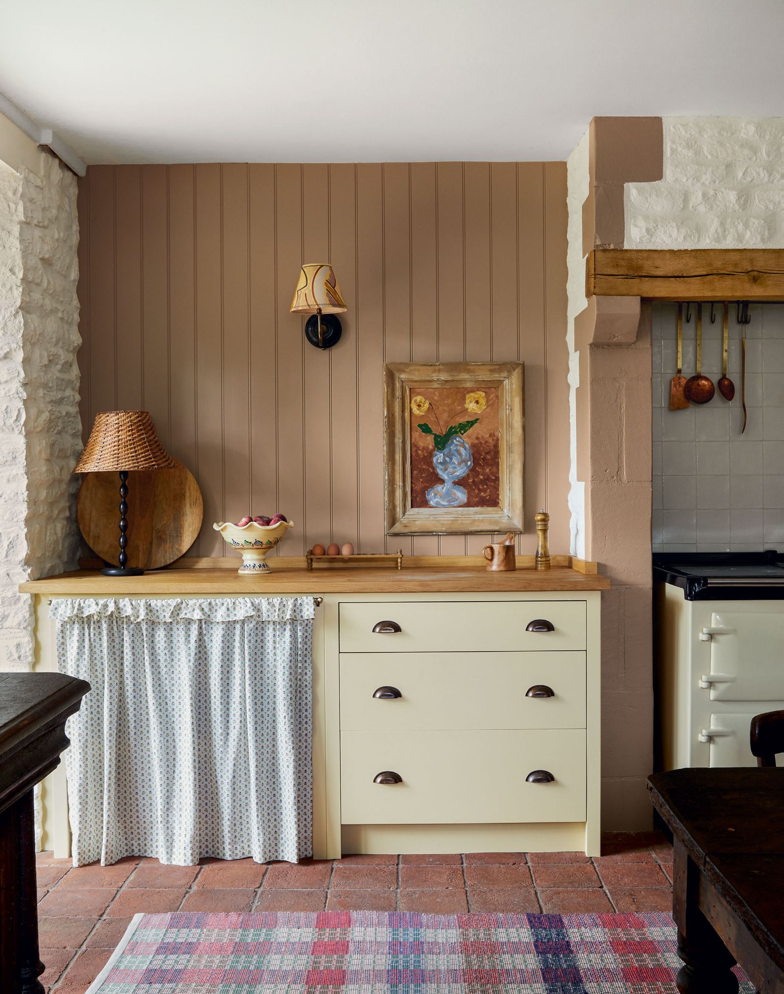
The main dish is always the star of any show, and for this particular dinner party we’re having a large helping of ‘Sunday Supper’ by Atelier Ellis. On the side, a rich and vibrant plate of ‘Sage and Onions’ by Little Greene, which brings a touch of vibrancy to any dinner table, or in the case of Sebastian Bergström’s tiny apartment in Stockholm, a chest of drawers in the hallway.

Dessert
To finish off, we’re after something rich and sweet, which arrives in the form of Little Greene’s ‘Baked Cherry’, used to striking effect in this Stoke Newington house decorated by Lonika Chande. Best served with a generous mound of 'Ice Cream' and a 'Biscuit' for good measure. These come courtesy of Atelier Ellis and Farrow & Ball respectively, and both will bring a depth to a neutral room, too.


