
It used to be that the first coat of paint on your walls would come as a bit of a surprise, however careful you'd been with the samples. No amount of painting large pieces of lining paper and sticking them all over your walls can really prepare you for how a paint colour looks, especially if it's remotely bold or bright. The last time I painted my living room it was in Farrow & Ball's ‘Setting Plaster’, a colour that, while very lovely, no one would describe as particularly brave, and I still had that heart palpitation ‘how is it so dark?’ moment as it flooded the white walls.
Five years later and I'm a bit bored of my millennial pink sitting room, and meanwhile a raft of moodily coloured rooms coming across my desk has made me think I should be going for something a bit more dramatic. But I'm scared. Yes, I know you can always paint it back, but I don't love the idea of painting an entire room petrol blue, regretting it, and then having to do heaven knows how many coats to restore it to neutral. And that's where AI came to the rescue.
Now look, I write on the internet for a living, so I'm not the biggest fan of AI, and the idea that it might eventually come for the jobs of interior designers and consultants is not fun to contemplate, but for the specific purpose of facing your paint colour fears, I'm forced to admit it's a game changer. It's also highly addictive. All you need to do is take some photos of the room, preferably from a few different angles, upload it to the tool of your choice, and voila, you have hours of entertainment ahead of you (or I did, anyway).
Since I was looking in the first instance at Farrow & Ball colours, I used their in-house tool, which can be found on each paint colour's individual page. It's super easy to use, and remembers the images you upload, so you can keep going back and trying the same room in different hues. You can also easily change to a complementary colour, and if you click into the tool, you can then customise things further by painting your walls, ceilings and floors in different colours.
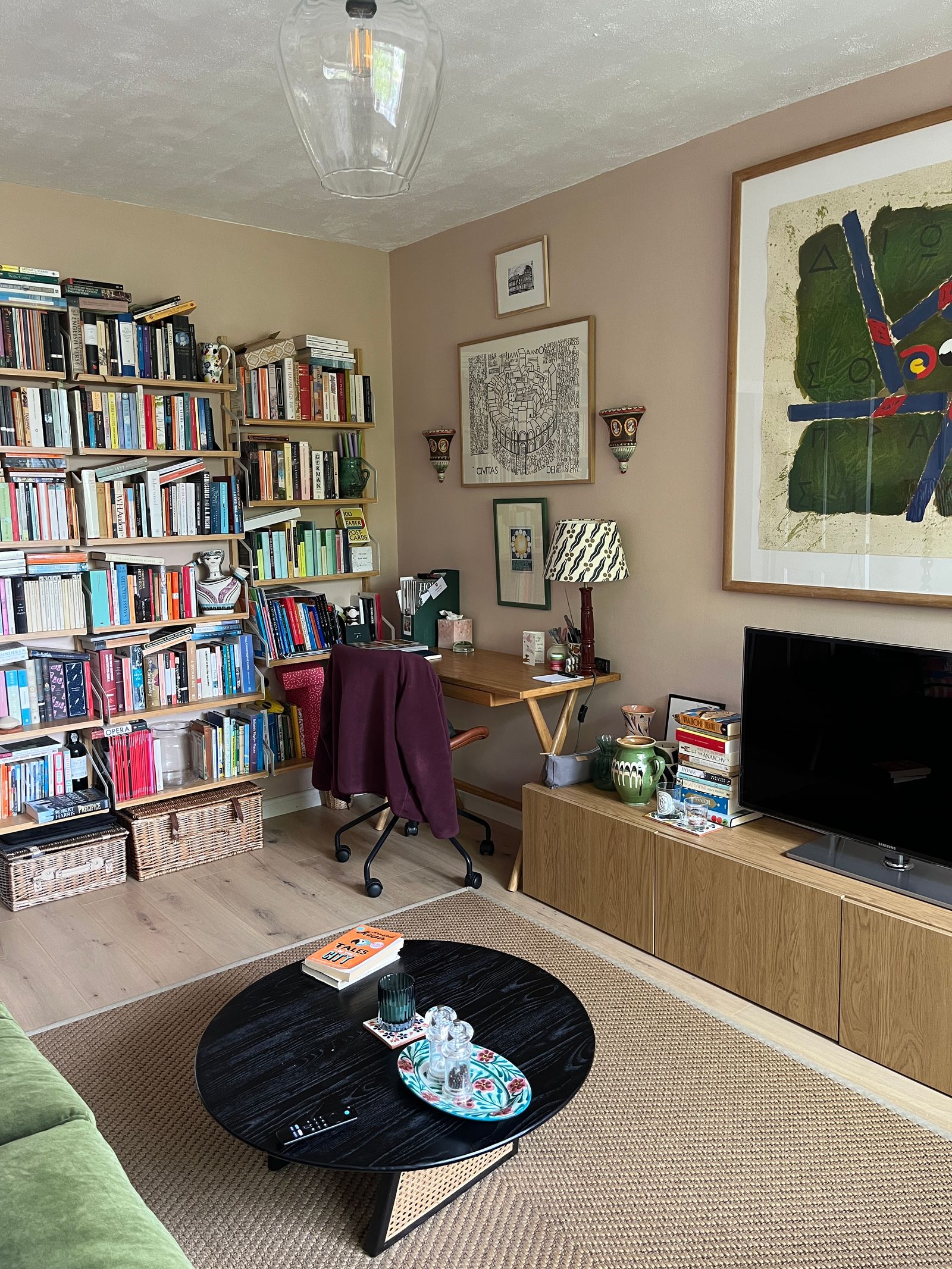
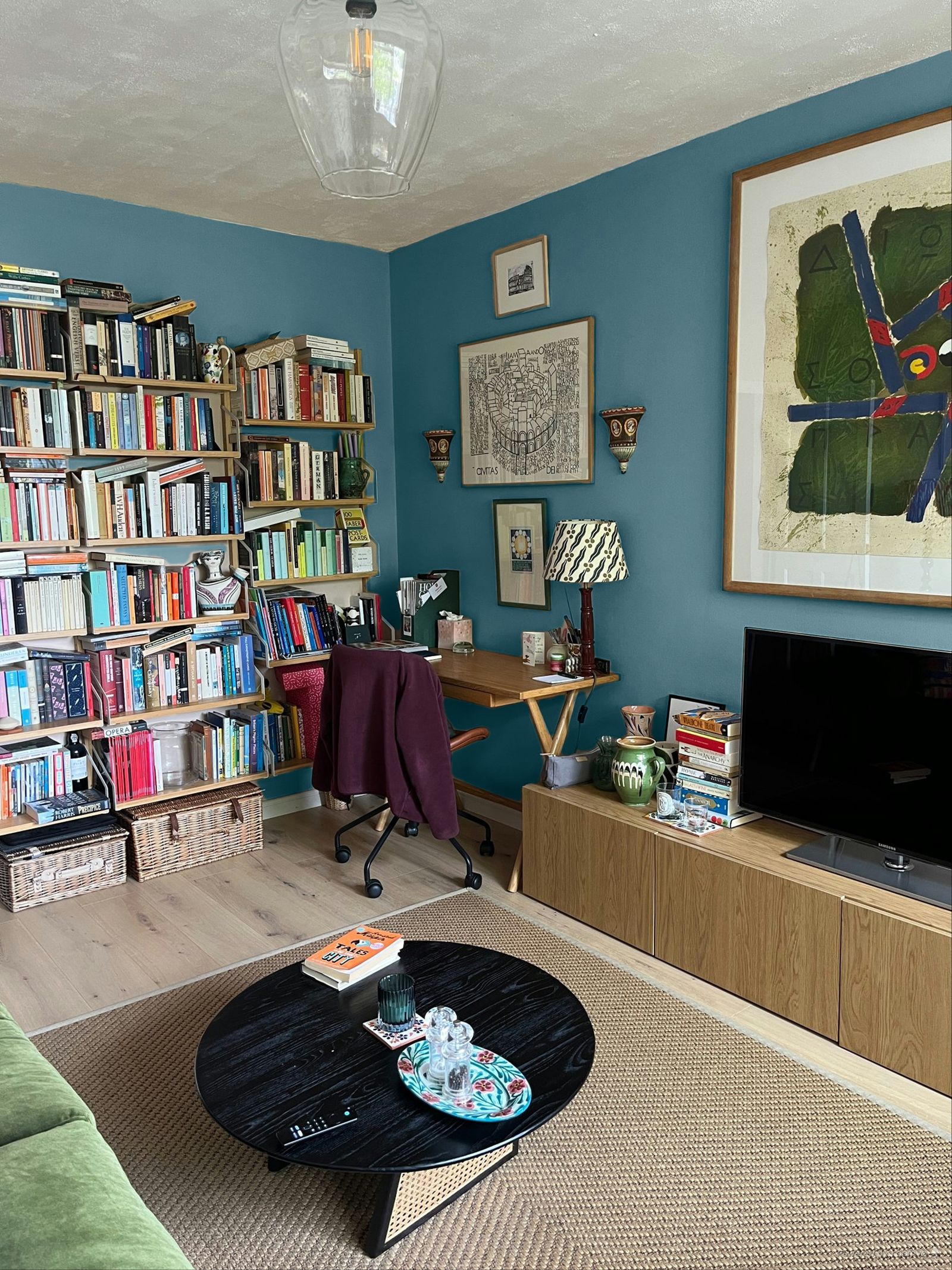
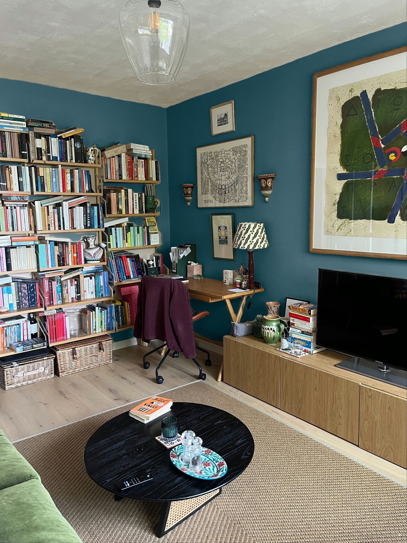
My main caveat would be to make sure you try lots of different images of the same space in different levels of light. A paint colour will change at various times of day and the tool tries to adjust for that, so if you upload an image of your room in bright sunlight, you might end up with a misleading idea of how that colour will generally look. Above on the left is an image of my sitting room on a reasonably bright day ‘painted’ in the shade ‘Sloe Blue’. On the right is a different angle of the same room on a duller day, and the black tones in the colour come out much more forcefully. For the full experience, it's also worth using some images taken with the lights on at night.
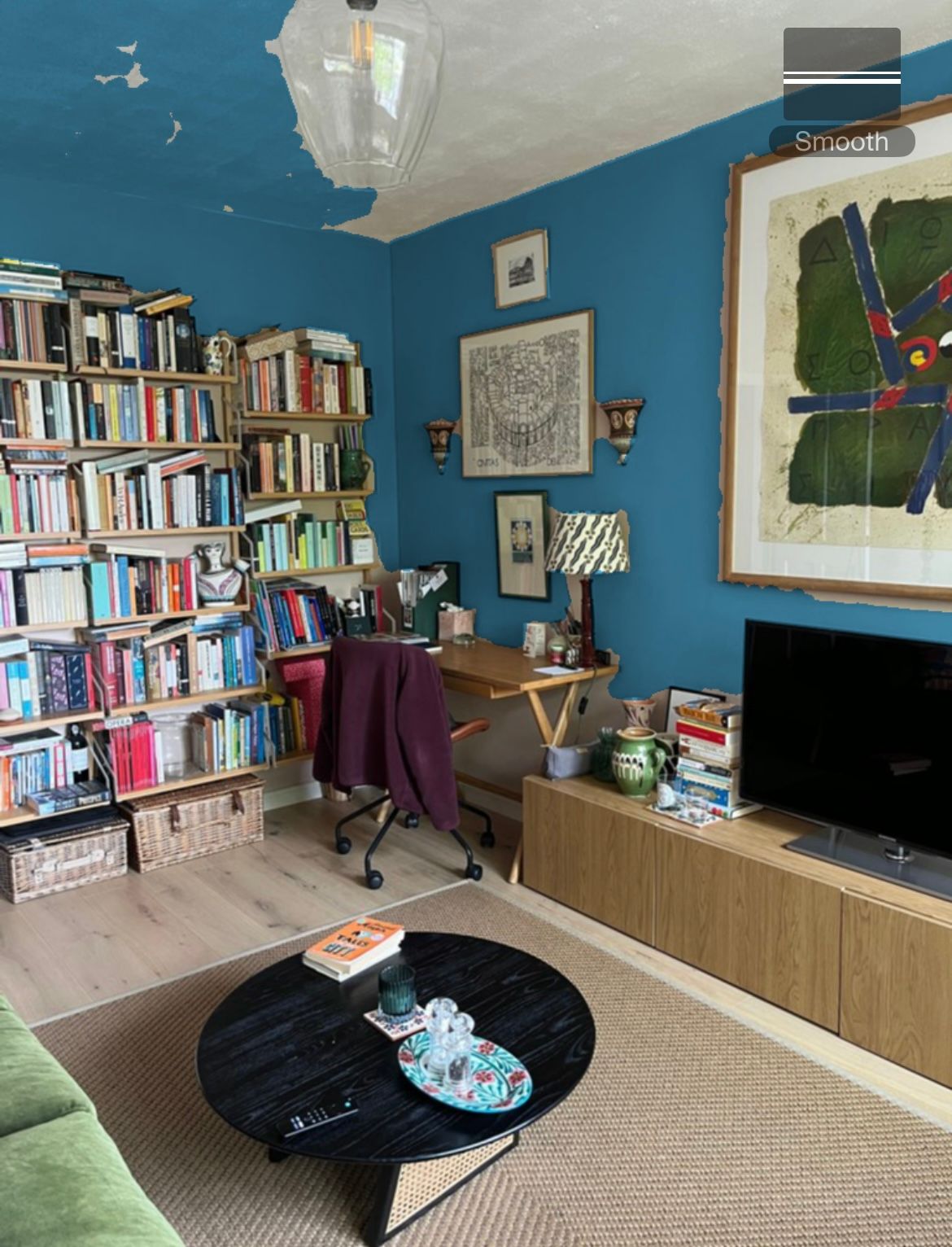
In the name of thoroughness, I tried a few different popular apps and tools. First up was the Dulux Visualiser app, which is designed mainly to be used as a real-time visualiser, so you point your phone camera at the relevant wall and it ‘paints’ whatever it sees in the colour of your choice. You can also upload still images, but overall I found it somewhat less polished than Farrow & Ball's web tool, as it doesn't distinguish what is wall and what isn't with as much accuracy. With a still image, you have to click on a bit of wall to paint it, and this does not work super well, as you can see below.
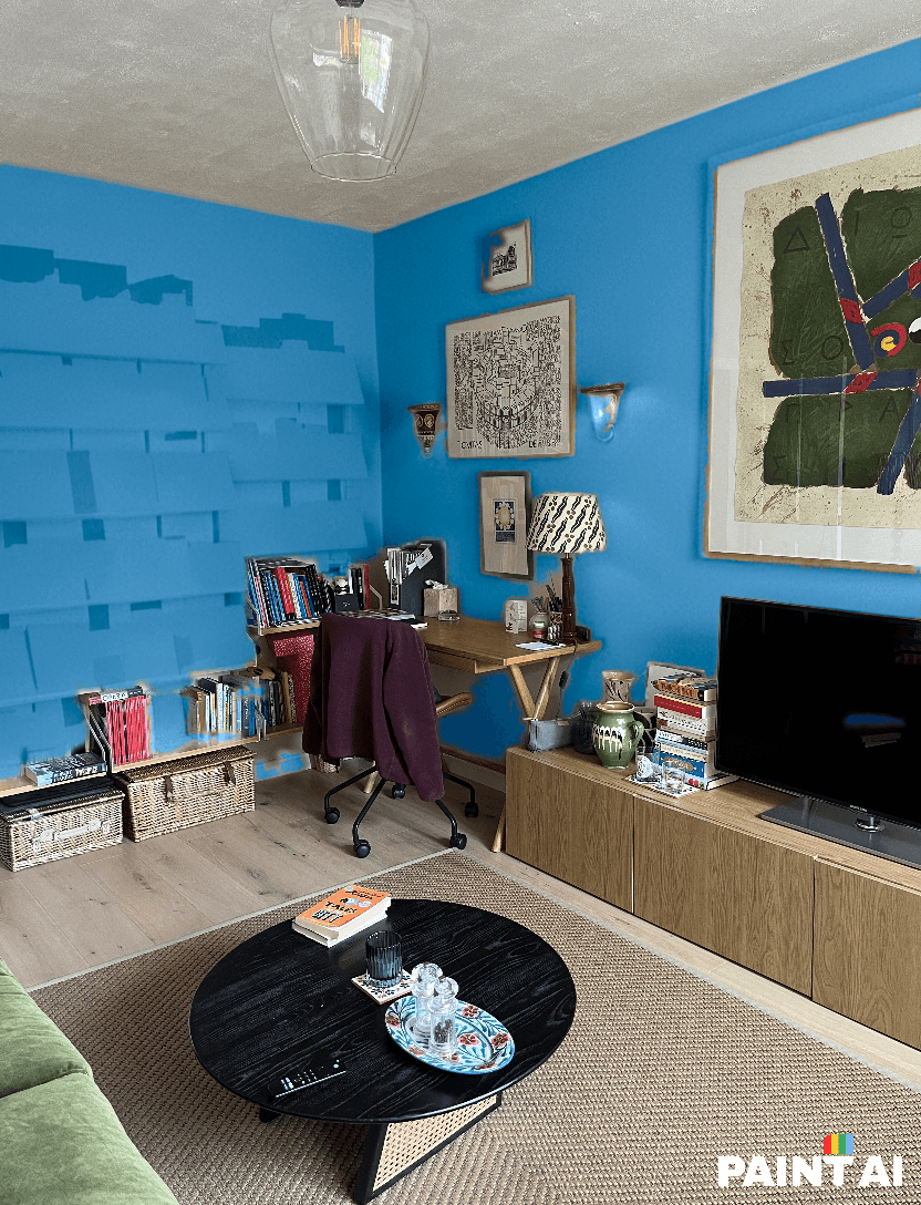
Things only went downhill with the ‘Paint AI’ app. It offered me a few Sherwin Williams paint colours to choose from, but the main functionality is designed around custom colours, so you slide your finger around on a very buggy colour grid until you find something that looks right, and then hope for the best. Since I don't usually choose my paint colours by hex code, this seemed like a bit of a gamble, and it really, really didn't pay off. It took its time generating the image and then painted all of my books and bookshelves blue. I'm sure there are ways to use this tool more cleverly than I did, but for a quick visualisation, it's a bit painful. Also, you can only do a few trial visualisations before you have to start paying for a subscription, and at this point I'm not sure why you would.
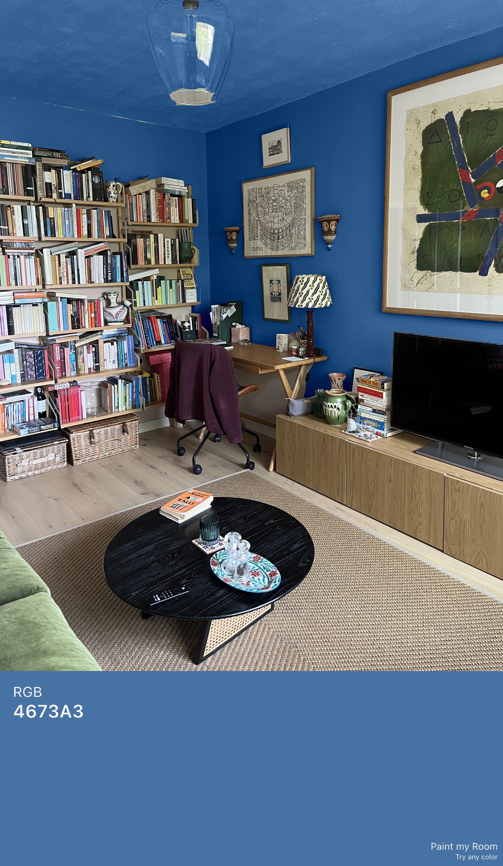
It's a similar story with the ‘Paint My Room’ app, which directs you to create your own custom colour and then just paints whatever the hell it likes in the result. In the image above, I did not ask the tool to paint the ceiling… It is, however, helpful that it creates an RGB code and attaches it to the image, so you can easily save the reference. At £4.99 for a monthly subscription, however, and only a three-day free trial, I'm not convinced.
.jpg)
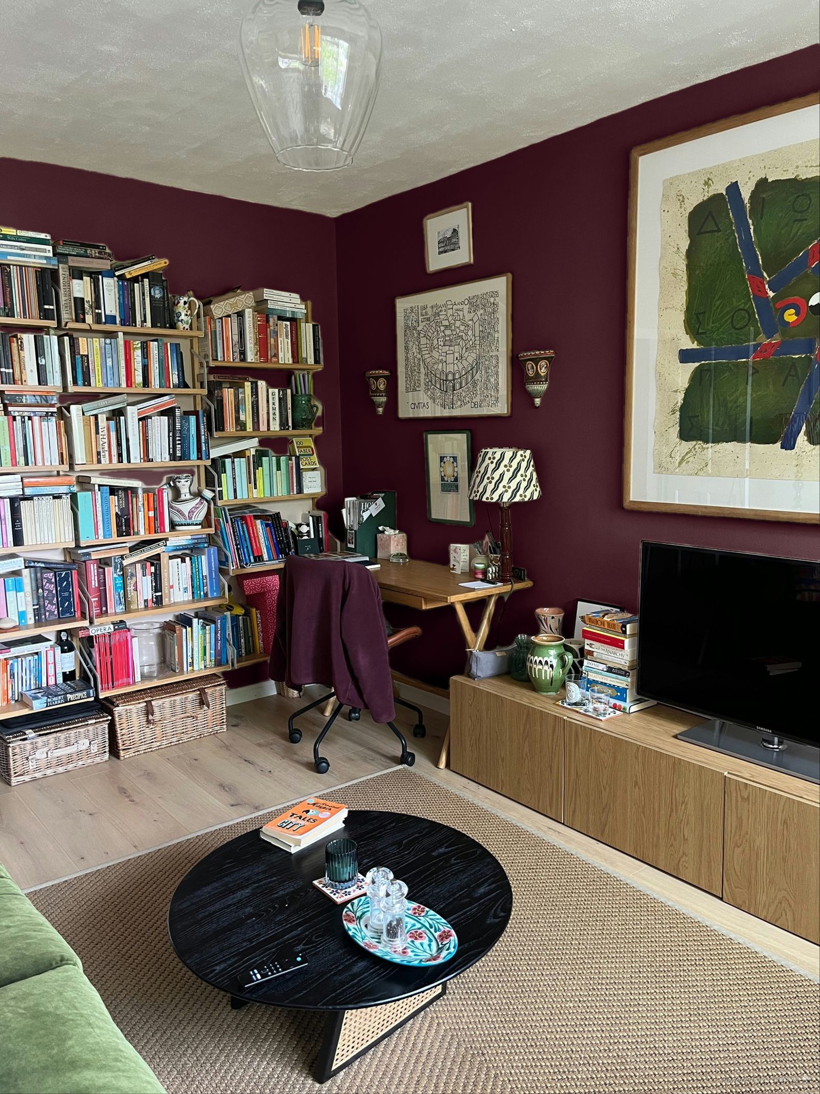
Back to Farrow & Ball I went, then, for a few happy hours of playing around with favourite shades. I won't show you the lemon and lime horror that appeared when I tried ‘India Yellow’, which I've always loved in other people's houses, but I'm kind of tempted by brown (very much the colour of the moment), and even, though I never thought I'd say it, the deep aubergine of ‘Brinjal’. Any supporting votes for these colours would be very welcome in the comments, although I'm now questioning whether I can really be bothered to repaint the room when it's this much fun pretending to.


