I recently offered to help a friend repaint her sitting room, though soon realised that this act of kindness was a huge mistake. In an effort to save money, my friend had taken her chosen paint colour to the nearest colour matcher (a service provided by many hardware shops and high street paint stores which can scan a colour, and recreate it for a more budget-friendly price), and headed home, rollers in tow, to apply it to her walls. Simple, right? Certainly not.
Said local colour matcher, (they shall remain nameless), mystifyingly only sells 2.5L tins of colour-matched paint at a time. This means you can apply roughly 1.75 coats of paint to the walls of a sitting room in a standard Victorian terraced house before you need to head back to pick up some more, and this is the point where it all started to go wrong. Batch number two of paint, though matched to the same designer shade, was an entirely different colour to batch number one. A few hours into applying the final 1.25 coats, we took a step back and accepted defeat: this was not going to work.
Back we went to try again. Another 2.5 litres later, with a third, entirely different colour on most of the walls, I left, exhausted and broken. The story continued, until eventually my patient friend, having spent more time and money than she had ever planned to dedicate to the project, also gave up and went directly to the shop of the brand which actually came up with the colour, and bought five litres from them. Though it is now looking glorious with its fresh coat, the project has caused much angst. I couldn’t believe that this is a method people actually use, let alone swear by, so I turned to the experts to find out more.
‘The analogy that I use when clients ask about colour matching is that it is a bit like saying you want your grandmother's lasagne for supper, and someone saying they can get it for you, before producing a ready made one from the corner shop. They may be called the same thing and, in theory, use the same ingredients, but they are worlds apart,’ says the interior designer Lucinda Griffith. For Lucinda, trying to replicate the shade of a designer paint through colour matching usually yields results which are lower in quality and longevity. ‘The subtlety of colour is lost and I have also found that matched colours can change over time, which the more expensive paints don’t,’ she says.
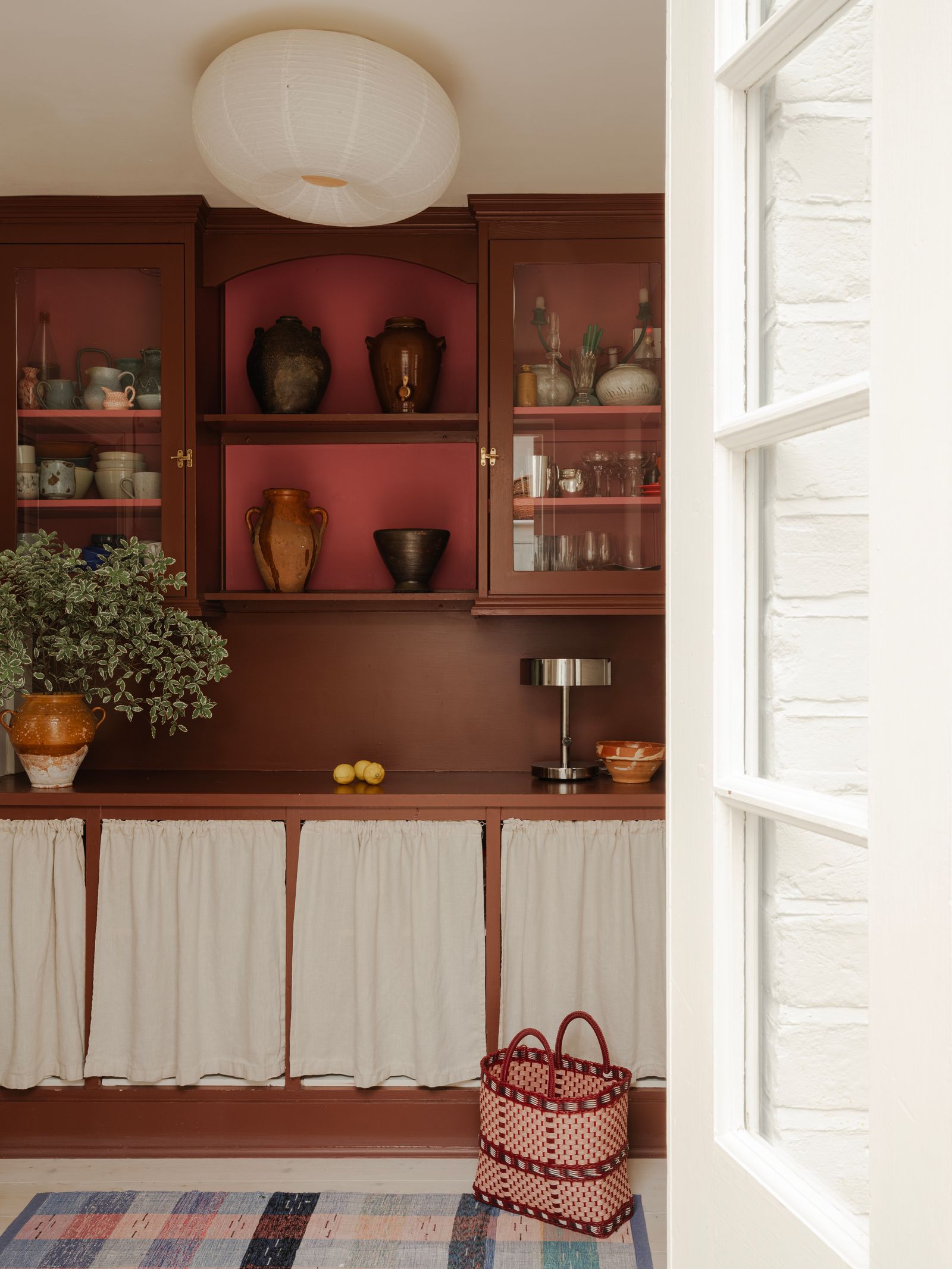
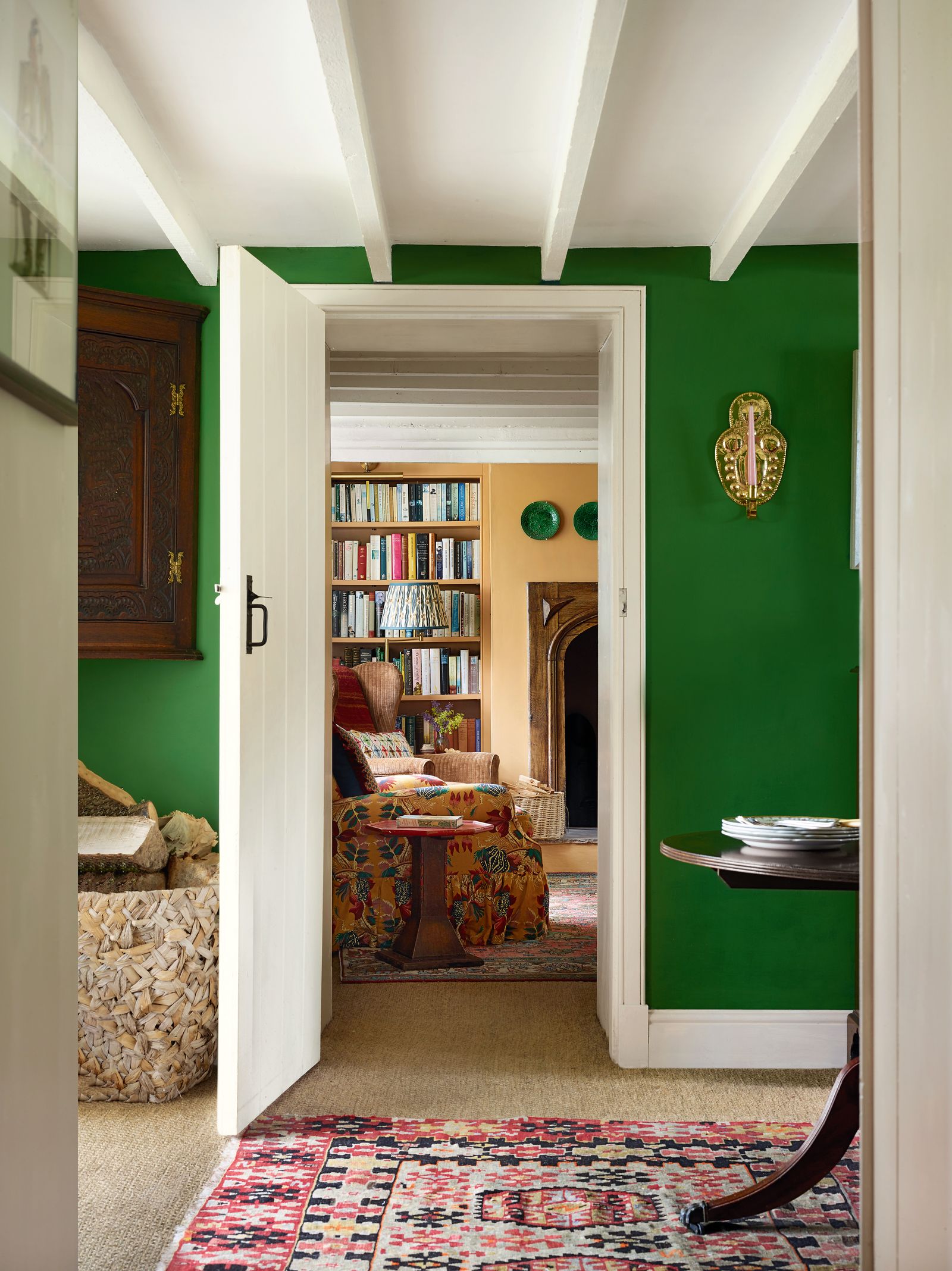
This subtlety of colour can be explained by a lower number of pigments in colour matched paint. As colour consultant Harriet Slaughter explains, ‘mass-market paints are designed for consistency and cost, often using just two or three pigments in a colour. Premium brands may use four, five, or more pigments, which gives their colours greater complexity and a quality that shifts beautifully in changing light. They also tend to use earth and mineral pigments with softer, muddier undertones, rather than relying mainly on synthetics.’ Cassandra Ellis, whose London-based paint company, Atelier Ellis, uses only natural pigments, puts up to 10 pigments in some of her richer colours. This makes it ‘virtually impossible to match them,’ she explains, simply because high street brands don't have the same capacity for multiple pigments.
For both Harriet and Lucinda, it is always best to buy paint directly from its creator: whether that is a high street brand or a more upmarket one. This way you are buying the colour as it was intended to be sold and used. ‘Lots of high street paint brands have improved their colour ranges hugely so if you can’t afford or don’t want to pay for the more expensive paints then perhaps start with choosing a colour from someone else that you can afford. That way you don’t risk the colour not doing what you wanted when you saw the original,’ advises Lucinda.
Finish makes a huge difference too. ‘Premium brands often offer a very flat matt with around 2 per cent sheen, whereas a mainstream 'matt' may be closer to 7 per cent. That sheen difference alone can make colours look lighter, shinier, or colder,’ explains Harriet, adding that there are some instances where an added sheen may be welcome, such as a garden office, shed, or fencing.
With all of this in mind, we're left wondering if there are instances when colour matching is a good idea. If you want to replicate a particular tone in a piece of artwork or one of the fabrics in your scheme, colour matching may be the way to go. As Harriet says, ‘I do think it is a lovely way to pull out a colour you might not notice immediately, especially in a piece of art or in the folds of a beloved textile. Even if it is a “convincing cousin” rather than an “identical twin”, tone-on-tone effects often feel the most successful of all in a scheme.’ It can be used in a nostalgic way too, says Harriet: ‘taking your granny’s favourite peach scarf or a chip of paint brought back from a weathered French shutter to the paint merchant has a certain romance to it and I’d highly recommend it as a delightful - if not entirely foolproof - part of any renovation adventure.’
Though she accepts that in the case of fabric and art, colour matching is a useful tool, when it comes to paint Harriet is inclined to agree with Cassandra. ‘If you’ve gone to the trouble of selecting a colour, my view is that it’s best to bite the bullet and buy the exact shade,’ she says. If we return again to Lucinda's analogy of the lasagne, by sticking to the authentic version of what you want (where possible), everything is bound to be much more palatable.


