An 18th-century mill in Wiltshire reimagined as a warm family house

There is a unifying factor to so many of the projects taken on by architects David Liddicoat and Sophie Goldhill. It is not a particular type of building or setting (the husband-and-wife duo have worked on everything from a Kent barn to London townhouses): what attracts them is a challenge. When the new owners of an old corn mill called upon them to transform the property, which had serious technical issues, they welcomed the opportunity.
Set in a Wiltshire valley, the 18th-century Grade II-listed mill spills down a hill away from the village road. What looks like a single-storey building on one side stands four floors tall on the other, leaving passers-by unaware of its true scale. As David explains, 'The Old Mill building is dominated by steel structures and concrete decks that were part of the original milling equipment. The previous conversion, which was done in the 1990s, had various impractical elements, such as steel beams cutting across staircases.' The building was also full of damp and was in quite a poor state. 'For us, the real trial revolved around how to turn this uncomfortable building into a flexible and welcoming place to live.' To achieve this, they worked with building company Stonewood.
The central issue concerned the flow of the interiors and the architects needed to work out how best to navigate the idiosyncratic layout. 'The owners foresaw the challenge that its vertical nature would present,' says David. 'As a result of the mill's position in the valley, it is a very steep living space, and it has multiple entrances and exits.'
To create a more lateral feel, David and Sophie drew up a plan for an entirely new structure to be built in the space that the wheelhouse would have occupied at the western end of the mill. Using cast plaster models that are works of art in their own right (several Liddicoat & Goldhill models have been selected for the Architecture Room at the Royal Academy of Art's Summer Exhibition), they were able to communicate their vision to both the planners and their clients.

The finished extension, constructed in lightweight steel and glass, was inspired by the original agricultural character of the mill and is a distinctive yet harmonious addition. Now, the property is a much more practical space for circulation. 'There is a route that takes you all round the house and, whichever way you turn, you end up outside,' says David. 'It was important that anyone walking through the Old Mill had a sense of it gradually unfolding. It is a surprising space and we wanted to retain that feeling of discovery.'
This effect is underscored by the inverted layout. With the dramatic, high-volume spaces upstairs contrasting with inviting, enclosed rooms downstairs, it quickly became clear that the kitchen and entertaining areas would be better placed in the former and the bedrooms in the latter. There were other factors, too, that David and Sophie considered when drawing up that initial floorplan - primarily, the acoustic changes between the floors. 'We have always been concerned with how design affects all the senses,' says David. 'If you can capture the senses, you end up with an exciting place to live in - we think it's a missed opportunity when people design just for the visual impact. We want you to feel different in different environments. Even if you're in a visually simple building, the textures and aromas can be intoxicating.'

A sculptural staircase connects the kitchen and dining area with the soaring mezzanine level. 'From the first moment we stepped inside, we knew the room demanded a centrepiece on a grand scale,' recalls David. 'We needed something to balance the volume of the space.' The final design was a major technical challenge to construct, made up of two helical pieces that merge together. The team had to corkscrew the parts through the windows to get them into place. Now, the staircase forms a striking focal point that tethers the two upper floors. Stepping down onto the lower floors containing the bedrooms is akin to going below deck on a ship, although those on the ground floor do open straight onto the garden.
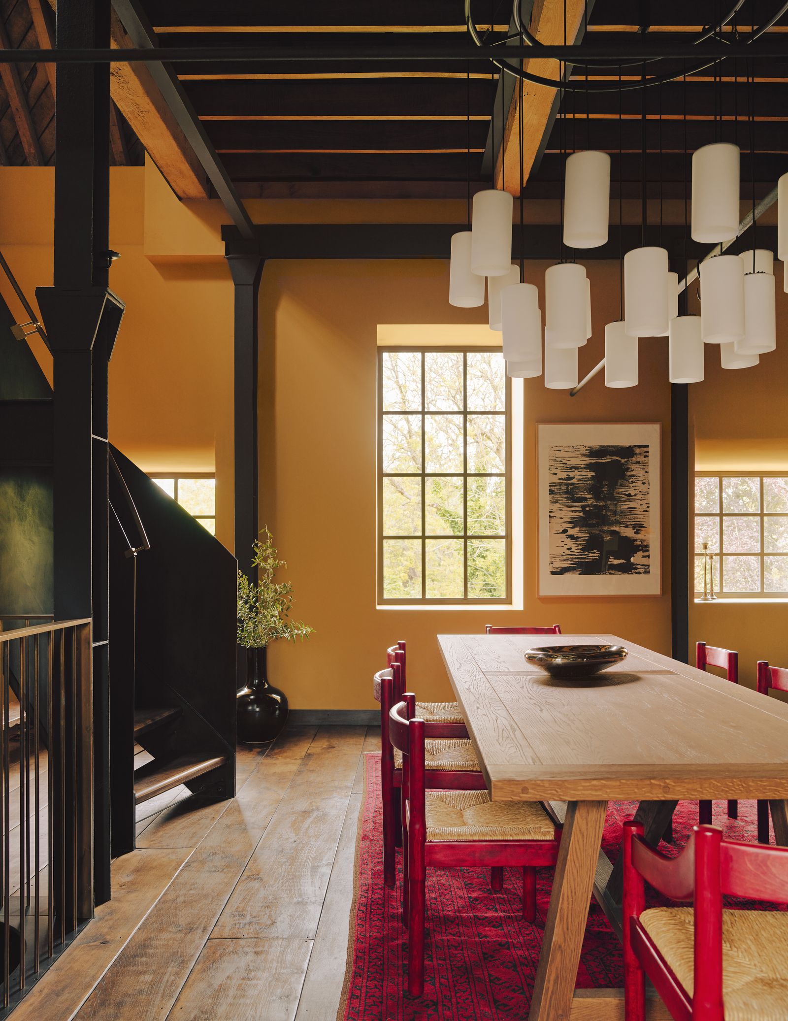
When it came to choosing the colours for the decoration, David says cues were taken from existing materials within the building, 'Sophie and I worked closely with the owners, who have backgrounds in painting and interior design, to find a palette that felt natural to the Old Mill.' The lime-plastered walls are painted in Farrow & Ball's 'India Yellow' as a warm balance to the steel and timber structure.

Yellow is a prevalent - yet not dominant - shade throughout, warming up the walls where the steel structures might have made rooms feel a little cold. Red accents on lampshades, rugs and chairs are lifted from the Belgian brick used in the wheelhouse extension. In certain places, the colour is almost that of rusted steel - an apt choice for this historic mill. As David says. 'The real acid test of a building is that, when vou visit it in person, it feels even better than vou had envisaged.' It is a test the Old Mill passes with flying colours.
Liddicoat & Goldhill: liddicoatgoldhill.com
 Michael Sinclair1/6
 Michael Sinclair2/6
The final curve of the balustrade extends to form a cocktail bar with a granite and brass interior, created in collaboration with Nicholas Alexander. Leather sofas from Oka and Windsor chairs inherited by the owners are combined with antique fair and jumble sale finds and layered rugs - three from the London Persian Rug Co, and one brought back from Kenya - for a relaxed, eclectic look. The round mirror is from Omelo.
 Michael Sinclair3/6
The vaulted ceiling, built to withstand heavy machinery, and a Line Design rug soften the acoustics in the spare room.
 Michael Sinclair4/6


 Michael Sinclair5/6
A roof terrace tops the library (above), where Rubn's 'Lord Bouquet' chandelier and Oka's 'Tohono' rug pick up on the glass, steel and brick.
 Michael Sinclair6/6
Lights by Davey Lighting from Original BTC, a shower screen made by Mike Honour Windows and The Water Monopoly fittings lend an industrial feel in the bathroom.


