A jewellery designer’s playful house filled with warm Spanish influences

When it comes to decorating our houses, there is endless evidence that our childhood homes have a huge influence over our taste as an adult. This is absolutely the case for Sandra Barrio von Hurter, a Spanish jewellery designer and founder of Sandralexandra, who lives in a typical Victorian house in Kensal Rise. Step over the threshold however, and her Spanish roots–as well as the influence of her very stylish mother-in-law (whose houses have been featured in House & Garden before)–are entirely evident. “People are always complimentary when they come to the house,” Sandra says “as it’s so different from other houses in London and this style of house particularly.”
She’s not wrong; while the layout is conventional for a terraced London house, the interiors are unexpected, full of vibrant oranges, yellows, greens and reds, contrasting woodwork and layers of pattern. It’s not mad cap at all, in fact it's carefully considered and cleverly thought through so that it stays playful but retains an elegance. This was not the case when they saw the house, however: “It was all mushroom-coloured!” exclaims Sandra. “Every floor was carpeted in a grey-brown carpet and it was depressing. It had really dense blinds too and lots of built in cabinets which made it very small and closed in.” Seeing the potential, Sandra and her husband jumped on it. They then had to rent it back to the owners for three months while their own purchase went through but once they were out, so too were the carpets and cabinetry.
The couple stripped the whole house back, then made their decisions when they could see what they were really working with. On the first floor, a wet room, boiler cupboard and bedroom were reconfigured to create a guest bedroom with an ensuite (a new window had to be added to give the bathroom light) as well as a family bathroom. The boiler was moved downstairs to a new set of utility cupboards, the sort of annoying job you don't want to have to do, but one that can make a huge difference to how you use the house.
MAY WE SUGGEST: An interior designer imbues his tiny, efficiently designed Stockholm apartment with joyful colour and pattern
Sandra is very aware of her indecisiveness, though she says “when I know what I want, I go for it”. As the couple had moved from a white box rental flat to a four-bedroom house and it was the first time Sandra was undertaking such a design project, she spent a lot of hours honing in on what it was she actually wanted. Pinterest was an inspiration (“I saved a lot of images of houses in Andalusia, as well as Mexican kitchens,” she admits), as were magazines but her childhood homes and her mother-in-law’s style were two major influences. It is perhaps a stroke of luck that Sandra and Felix had to rent the house back to its previous owners for three months, as they spent that time at Felix’s parents’ house, where they drew on the green and red colours that run throughout the house.
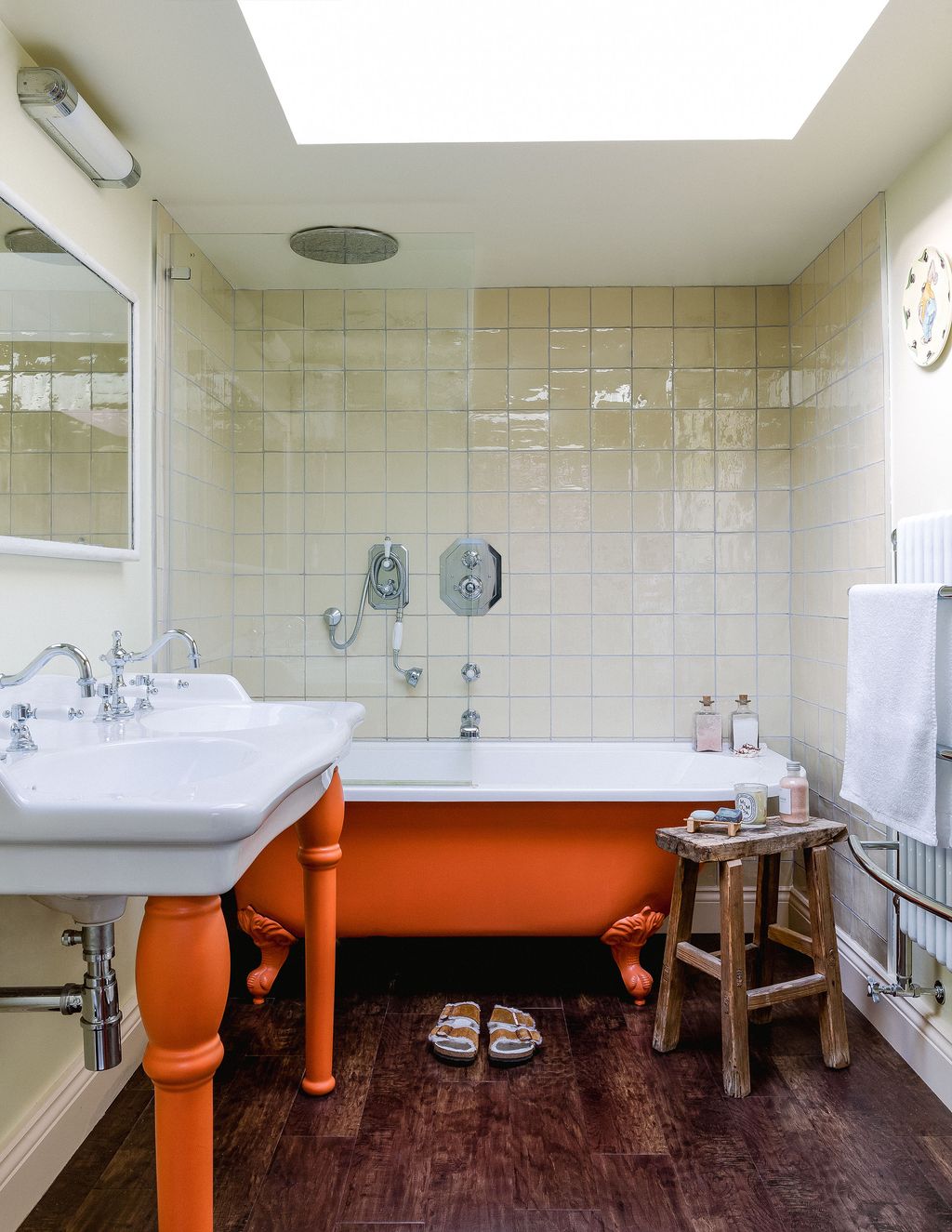
Colour is the most prominent characteristic of the house; the kitchen is painted a warm yellow with yellow, green and very pale pink tiles; while the living room contrasts Farrow & Ball’s soft ‘Lichen’ on the walls with bold ‘Hunter’s Dunn’ from Paper & Paints Library on the woodwork, a colour that appears on the spare bedroom woodwork–though it’s Farrow & Ball ‘Bancha’ here against bright orange walls. The same bright orange is used on the bath tub and basin legs in the master bathroom, which is itself a pale yellow. The bedroom has blush pink walls and pale lilac woodwork, while Sandra's studio is sunny yellow and the family bathroom red and blue. It's not a slapdash approach, however, and the repetition of certain colours throughout the house creates a narrative that works brilliantly. It might be as bold as you can go with colour but it is in no way intimidating–and that's no mean feat.
Remarkably, Sandra brought all of this about herself, using Powerpoint slides to work up moodboards for each room as “it made me feel less nervous or anxious about what we were going to do”. It helps of course that she is a designer by day and her jewellery plays on the same contrast of pop colours and more soothing neutrals. “My jewellery also walks the line between playful and elegant, fun and serious–a nice balance” she explains. “No one would ever say it’s too out there.”
MAY WE SUGGEST: An interior designer conjures up a fresh and colourful London house for her first solo project
There was some help in the form of Sandra's friend, interior designer Angelica Squire, who bridged two gaps in Sandra's own expertise: navigating eBay and finding fabrics. “She showed up at my house like the Mary Poppins of fabrics with this huge bag of swatches for me to look through,” laughs Sandra, who knew she wanted pattern in the house but didn't know where to start. “She showed me examples of what I was looking for and then showed me examples of room with each one in situ so I could understand the whole image.” The fabrics they landed on include Nicky Haslam’s ‘Shutter Stripe’ in Sandra’s studio and Christopher Farr Cloth’s ‘Carnival’, whose pomegranate shapes tie wonderfully to the other main theme of the house: groceries.
Most people might find an obsession with groceries a little off-centre but it is this aspect of Sandra’s jewellery that led me to discover her and then her house, so it's one I wholeheartedly share. Her house is full of plastic lemons, Murano glass fruits and vegetables of every description, a giant chilli in the kitchen and an incredible ceramic bouquet of chillies in the living room, as well as little details in the patterns and furniture throughout. Two vintage olive oil tins from an antiques shop in Dorset were repurposed into lamps for the living room and a bowl of plastic groceries that Sandra bought on her honeymoon in Japan have tiny bite marks from the couple’s 20-month-old daughter, Frida, who on the day we visited was running around shouting “apple” and “manzana” with delight.
“People always seem to love walking around the house when they visit,” Sandra concludes “and they see something they had not seen before when they last came. Everything has a little story behind it so there’s always a lot to say.” It’s precisely that which makes the house such a delight to be in–not just the fresh perspective on colour, the warm Spanish influences running throughout or the curated mix of antique and modern pieces, but the feeling that this is very much a family home, full of a lifetime of collected stories and many more that will be added to the fold.
Sandralexandra: sandralexandra.com | @sandralexandra_studio
 Owen Gale1/25
When choosing the colours for the living room, Sandra wanted it to be a more grown-up space. She landed on ‘Lichen’ by Farrow & Ball on the walls, with ‘Hunters Dunn’ in a gloss finish from Paint & Paper Library for the woodwork. A layer of pink tones in the furniture and the couple's collection of books and some of their art complete the scheme.
 Owen Gale2/25
A Kayapo headdress from Brazil frames the mantelpiece, where Sandra's new single flower "5 A Day" vase (which launches soon) mixes with candle holders from Marrakech.
 Owen Gale3/25
The sofa is from Sofa.com, while the side tables and lamps are repurposed vintage finds. The green side tables were used to store car parts and Sandra and Felix topped them with glass and turned them into side tables, while the Greek olive tins were wired to become lamps.
 Owen Gale4/25
A Frida Kahlo book is one of a few references to the artist, who Sandra cites as one of her inspirations when it comes to choosing colours for her jewellery designs. The Murano glass fruits were a present from her husband, Felix.


 Owen Gale5/25
A Ceraudo ‘Elio’ chair sits in front of the bookshelves, with a rug from Vanrenen GW Designs.
 Owen Gale6/25
A Massimo Lunardon murano glass puffer fish sits on the other end of the mantelpiece.
 Owen Gale7/25
The stairs leading up to the first floor are covered in a small part of the couple’s art collection, with pieces bought from around the world or as gifts.
 Owen Gale8/25
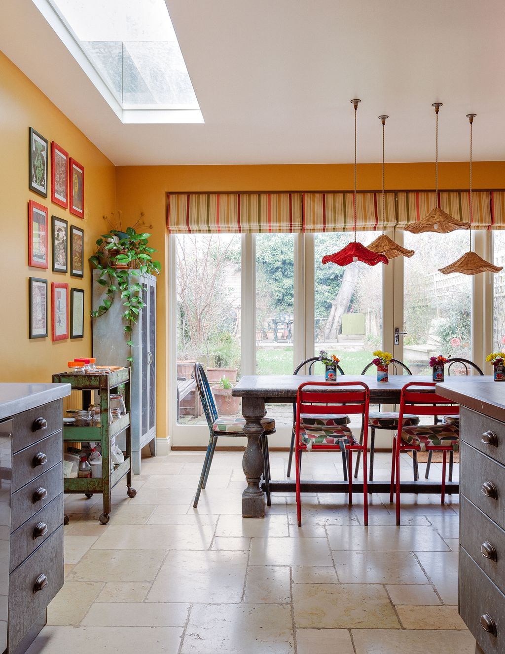
The kitchen is a kaleidoscopic room that best shows the Spanish influences in the house. “It’s the room we knew we’d spend most time in,” says Sandra, “so we spent the longest making sure we got the design right”. This involved staying up until 2am the night before the tiles were put up to ensure the pattern was correct for the mix of green, yellow and pale pink zellige tiles. The cabinet doors are painted in Farrow & Ball’s ‘Calke Green’, Paint & Paper Library’s ‘Geisha’ and ‘Rowan Berry’ from Sanderson, while the walls are an archive Farrow & Ball paint called ‘Orangery’.


 Owen Gale9/25
Sandra and Felix added extra windows to the end of the kitchen to open the space up further. The blinds are Mulberry’s ‘Sailboat’ fabric, while the ceiling shades are Matilda Goad x Edit 58.
Chairs surround a table from Kempton Market.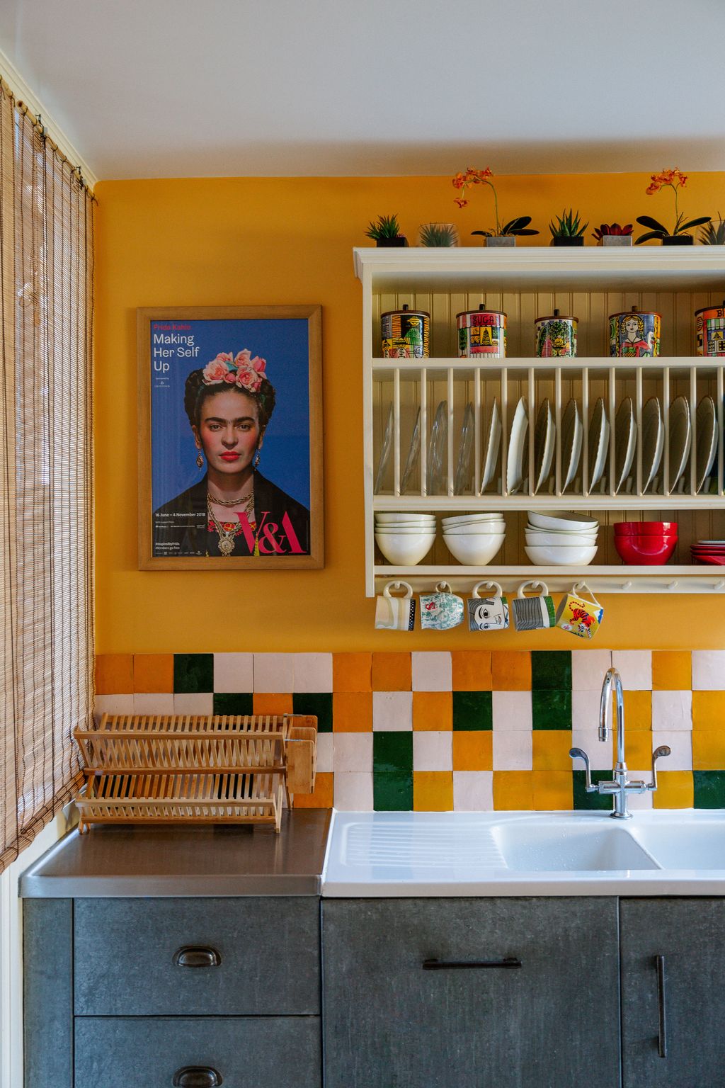 Owen Gale10/25
References to Frida Kahlo and Georgia O’Keefe can be found throughout the house. “They’re my go-to artists especially for colours and how they combined them,” explains Sandra.
 Owen Gale11/25
A metal cabinet was sourced from an antiques market in Dorset. It houses a collection of glassware from around the world.
 Owen Gale12/25
The stairs leading up to the master bedroom are filled with family pictures. Sandra describes it as a work in progress, with lots of space left to fill.


 Owen Gale13/25
Sandra’s studio is in what was the master bedroom when they viewed the house. It is south facing and gets sunlight all day long, which bounces off the walls painted in ‘Citron’ from Farrow & Ball. The woodwork is ‘Candy Pink’ from Farrow & Ball and the blinds are Nicky Haslam’s ‘Shutter Stripe’ fabric.
 Owen Gale14/25
A wall of art dominates one side of the studio. The table is from Golborne Road and the pink chair is a Ceraudo piece. The chequered rug is from La Redoute.
 Owen Gale15/25
The studio is where Sandra runs her business from.
 Owen Gale16/25
Sandra in her studio. The mantelpiece was found by Angelica Squire on eBay and has fast become one of Sandra’s most loved pieces in the house.


 Owen Gale17/25
A favourite vase from LNRCE houses beaded flowers.
 Owen Gale18/25
The bed is one of Sandra’s favourite things in the house. It is a traditional matrimonial bed that she and her husband bought from Lotts Road. “What I really like is the feature of two little hands holding hands together in the middle of the headboard,” she details.
 Owen Gale19/25
The colour combination in the master bedroom is a soothing use of ‘Setting Plaster’ on the walls, with ‘Sulking Pink’ on the woodwork, both from Farrow & Ball. Pooky lampshades sit on brass lamps from Chelsea Antiques Fair.
 Owen Gale20/25
Blinds in Jane Churchill’s ‘Paradise Garden’ have the same reference to fruits as can be found throughout the house, with pomegranates, raspberries and more.


 Owen Gale21/25
The orange of the spare room is picked up in the paint on the bath and basin legs of the master ensuite. Sanderson ‘Rowan Berry’ is the colour, tempered by the pale yellow tiles and walls.
 Owen Gale22/25
Frida’s bedroom is a calmer scheme than other rooms of the house, though with the same clever use of colour. The walls are a Farrow & Ball cream, while the mantelpiece is their ‘Churlish Green’. Sandra used a fabric from Ottoline for the blind.
 Owen Gale23/25
In the family bathroom, Winchester blue tiles and woodwork in ‘Rectory Red’ from Farrow & Ball create the colour scheme, with a Harvey Maria chequered vinyl floor adding a further layer of colour. The prints are from a Carlos Merida book of Mexican costume prints.
 Owen Gale24/25
In the spare room, Pooky lamps are topped with Matilda Goad lampshades. The headboard is upholstered in a fabric from The Cloth Shop.


 Owen Gale25/25
Originally, Sandra had planned to paint the spare room a bright pink and it’s the only room that changed from the original powerpoint. Instead, she chose a bright orange with woodwork in ‘Bancha’ from Farrow & Ball, which picks up on the green in the living room.


