
If you work from home on a regular basis, you’ll know just how important it is to create an environment that is conducive to your own personal productivity. For some – myself included – this means a calm, quiet space in which to collect your thoughts and put pen to paper; for others, it is somewhere vibrant and interesting to spark bright ideas. And as with any room in the house, a judicious use of colour can go a long way towards achieving your desired atmosphere.

‘You want it to feel like an extension of your home, but still have that little bit of separation between your work and personal life – and colour is such a powerful way to achieve that,’ says Tash Bradley, director of interior design at paint company Lick. ‘So if your office is tucked away in a separate room, or even just a little nook off your living space, focus on tones that will complement the rest of the house but still give it its own identity.’
Meanwhile, Ruth Mottershead, creative director at Little Greene Paint & Paper, reminds us to follow our instincts: ‘When it comes to decorating, colour choice is always a personal matter, so it’s really important to see how colours make you feel. Consider the atmosphere you want to create and how the space will be used.’ But with so much choice, it can be difficult to know where to start. To help you narrow down your preferred palette, we have asked Ruth, Tash and their fellow colour consultants to recommend their tried-and-tested paint colours for home offices.
Warm neutrals and whites
‘Now we spend so much more time working at home, most of us prefer to be in light rooms during the day and darker spaces in the evening, subconsciously working with natural light and following the rhythm of the day which is so good for our wellbeing,’ says Farrow & Ball’s colour consultant Joa Studholme. ‘So warm naturals like “Stirabout” or our archive colour “Single Cream” work brilliantly in home offices.’

Freelance colour consultant Harriet Slaughter has found that, when sitting at a computer, she prefers ‘a warm white that still feels light and airy but is cosy to sit in for many an hour’. She recommends the “Silent White” family from Little Greene, explaining that they are ‘warm whites with just a smidge of black in them to keep them grounded’. If you’re in a creative role ‘where there is a lot of colour going on in the work at hand’, Harriet recommends Edward Bulmer’s ‘Pure White’ as the perfect palette cleansing backdrop.
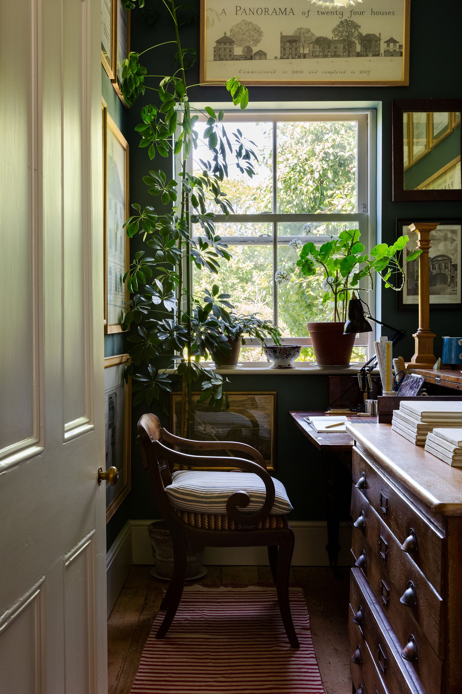
Greens and blues
There is something inherently calming about nature-inspired tones, so it is unsurprising that a number of our experts reach for greens when decorating homes offices. Ruth from Little Greene loves the brand’s muted “Windmill Lane”, particularly in absolute matt emulsion. ‘It provides a restful backdrop that is very easy on the eye,’ she says. Edward Bulmer draws on Johann Wolfgang von Goethe’s colour theory to explain why we find it so easy to live with. ‘Goethe observed that green is the most universal colour as it relies on a mixture of two pigments, rather than relying on a single primary colour,’ he says. ‘I would choose a mid-green like “Gladstone” for a smart, workman-like vibe, but would go for our deeper “Fine Green” or “Royal Grass Green” if I had bookcases to paint.’ Tash notes that ‘the more yellow you add to green, the more energising it becomes’, citing Lick’s dusky olive “Green 05” as her ‘absolute go-to for warmth and character’.

Blues, on the other hand, are said to nurture mind and spirit. ‘Followers of anthroposophy hold that blue is one of the most spiritually connecting colours,’ says Edward. ‘If you go to Järna in Sweden where Rudolf Steiner established his HQ, you will find it much in use. Blue also purports to be the world’s favourite colour, so there is no doubting its appeal for spaces used for work, play and learning.’ But Edward does caution against tones that are too cold: ‘We nuance all our blues with ochres to ensure that while spirit and science connect you don’t have to feel chilly!’ Even the pale blues in the Edward Bulmer Natural Paint range, like ‘Welmish Blew’ and ‘Aerial Tint’, still feel nice and warm.

‘The darker the blue, the more mentally stimulating it becomes,’ says Tash, ‘which is why I often suggest deeper teals – think Lick’s “Teal 01”, “Teal 02”, or “Teal 03”, colour-drenched across the room,’ she says. Similarly, Andy Greenall, who is head of design at Paint & Paper Library, explains that ‘nature-inspired teals occupy the enigmatic space between green and blue, and in different lights will tend more one way and then the other’. He likes Paint & Paper Library’s ‘Teal’ for its versatility, as he finds that it works well with ‘warm hues such as deep orange and fresh peach, as well as cool whites, darker blues, greys, and natural materials such as stone and wood’. If you’re looking for a more vibrant mid-blue, Ruth recommends Little Greene’s ‘Blue Verditer‘, ‘Tivoli’ and ‘Woad’.
Yellows
For a real hit of warmth and energy, why not be bold and go for a yellow? You could even take a leaf out of Andy’s book and combine different shades for a tonal scheme. ‘Consider walls painted in vibrant “Peruvian Yellow” by Paint & Paper Library complemented by an earthier undertone of “Pollen II” on woodwork, and grounded by a dark neutral such as “Bronze” on window frames, skirting, or a single door. This layered approach creates an environment that is fresh, welcoming and inspirational – and provides an enviable backdrop to your video calls!’ If you’d prefer a subtler treatment, Tash likes ‘a soft yellow ceiling paired with walls and woodwork in Lick’s “White 05”. It keeps the room feeling light and fresh, but with a lovely hit of optimism overhead.’

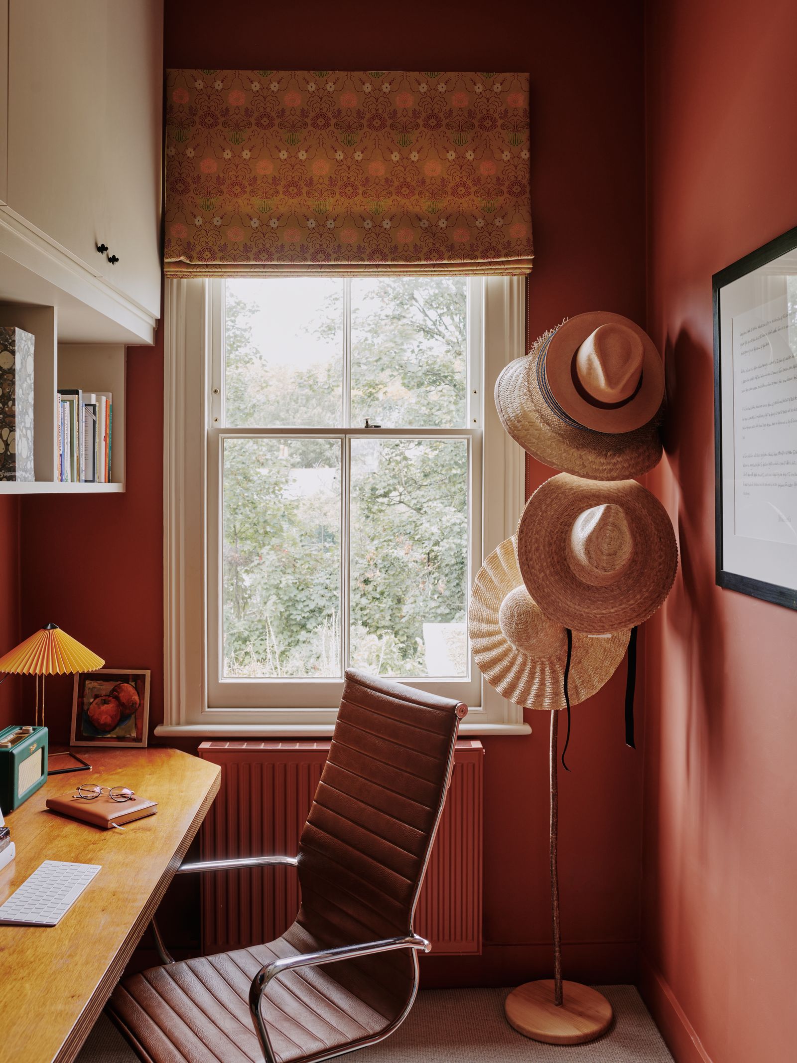
Reds
Like yellow, red is often considered a tricky colour but it can be very effective in a smaller space like a home office. ‘I’ve always been a fan of a deep red study, though it needs to be dressed accordingly with book-lined walls, plenty of art and soft lamp light,’ says Harriet. ‘Farrow & Ball’s “Eating Room Red” is one of my favourites for this look. It’s just a little raspberry in tone, which makes it feel cocooning and a little less harsh than some other reds. It’s a strong look, and not for everyone, but incredibly atmospheric.’
Alternatively, you could pick out just the woodwork in red, as designer Lonika Chande did in the study-cum-spare room of a family home in north London, pictured below. Whatever your desired effect, and your way of working, rest assured that there is a paint colour or scheme that will work hard in your home office.


