How to use ‘Arsenic’ (on your walls)

Out of every paint colour in existence, you'd be hard pressed to find one with a more surprisingly dark and checkered past than arsenic. Taking its name from the potent poison that was used widely in the Victorian era, the original paint colour was mixed with arsenic as its base pigment. Perhaps predictably, as the colour gained popularity, so did reports of arsenic poisoning. Victims noted symptoms from rashes and headaches, to vomiting, cramps, and in extreme cases, deaths were reported.
Strangely, though the Victorians were well-aware of arsenic's toxic effects, sales of the dangerous paints continued to sky rocket. Such was the appetite for green walls that people were willing to live with its effects. The worst culprit of all was ‘Scheele’s Green', created in 1778, which was loaded with copper arsenite. According to the Paris Review, a year before ‘the colour went into production, [Scheele] wrote to a friend that he thought users might want to know about its poisonous nature.’ Ultimately, no warnings were given.

Of course, as is always the case, there were those who did not believe the claims that arsenic was poisonous. Perhaps the most vocal and famous of these campaigners was William Morris, who suggested that doctors who diagnosed their patients with arsenic poisoning had been ‘bitten by witch fever.’ By the late 1870s, synthetic alternatives were found to replace the toxic pigments and the number of people affected by poisoning significantly decreased.
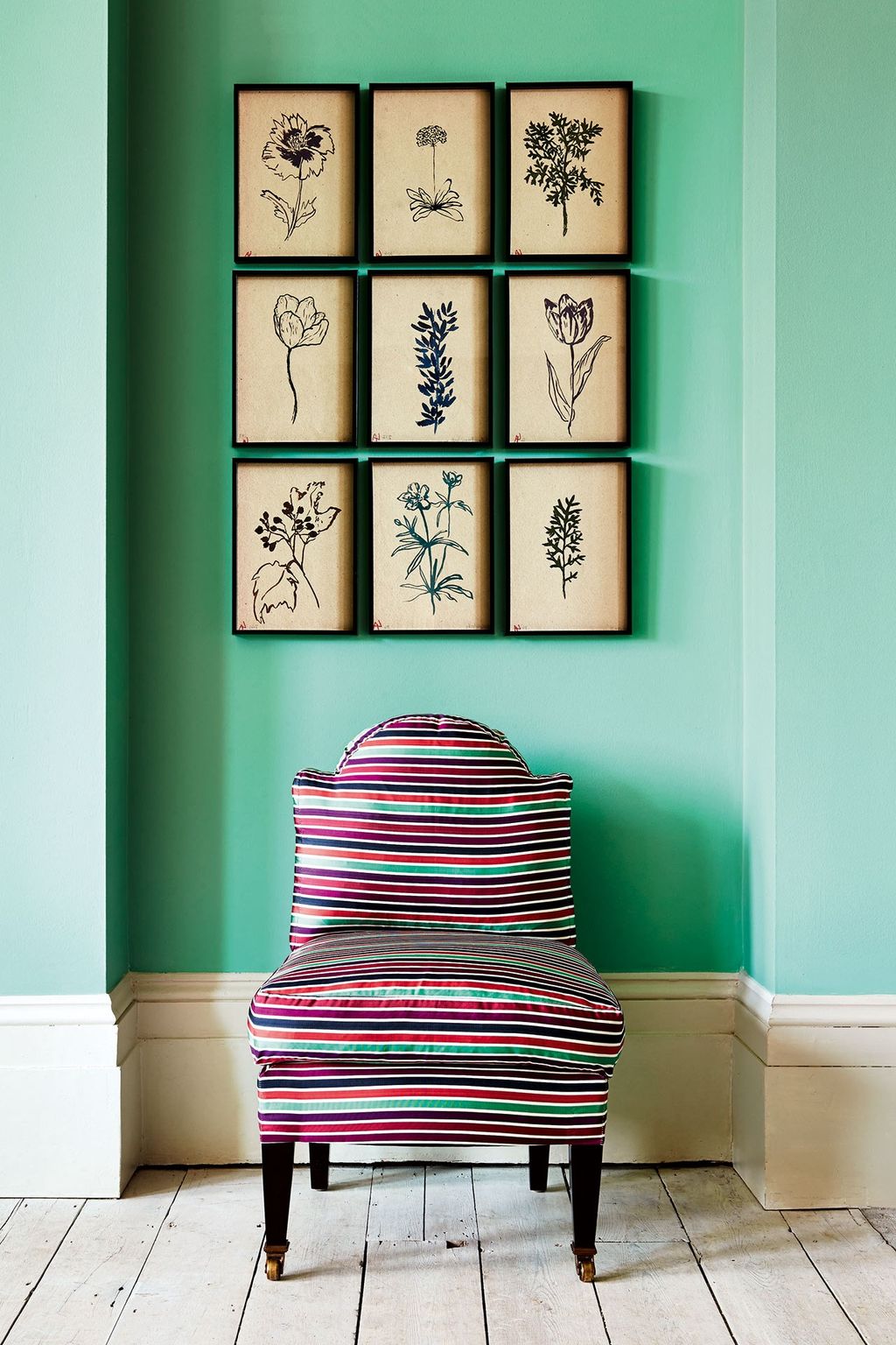
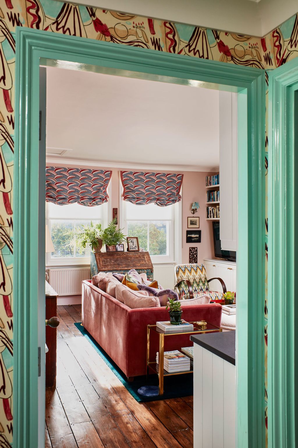
Today, you'll be pleased to hear the paint colour poses no risk at all. In fact, it's a rather life-affirming colour to live with. Key pairings used by our interior designers include rich red hues and toning greens and yellows. Below, you'll find 14 inspiring ideas for how to use arsenic on your walls.
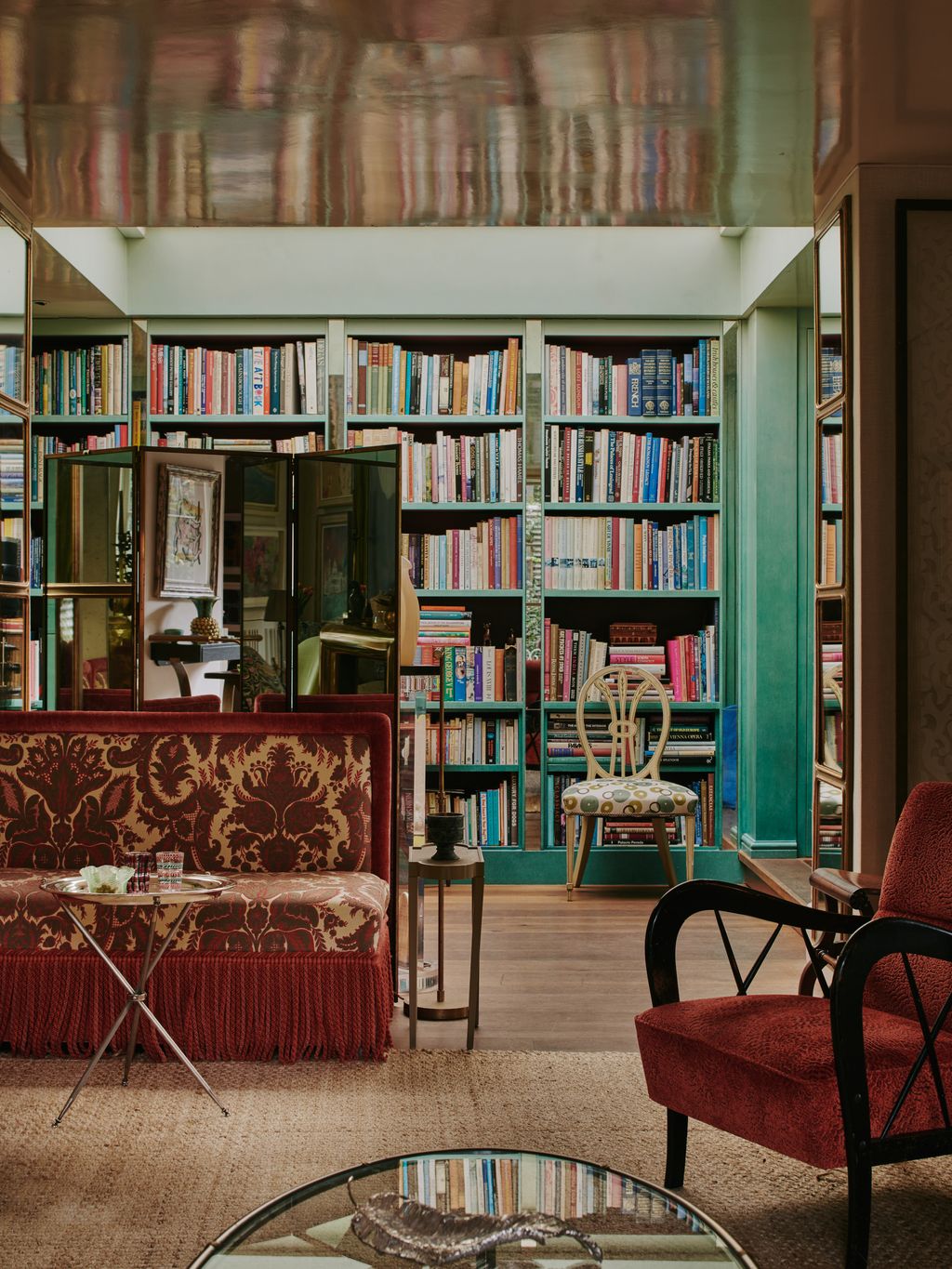 Chris Horwood1/14
In Nina Campbell's Chelsea house, her sitting room is painted in an ‘ombre turquoise’ hue. The colour was inspired by her collection of Kate Malone ceramics and is paired with mirrored slips and rich, deep red furniture.
 Owen Gale3/14
In this Victorian house in Chiswick, Chris Graves of Clarence & Graves has paired Farrow & Ball's Setting Plaster,’ with woodwork in ‘Arsenic’ to charming effect.
 Rachel Whiting4/14
It's not just interior designers and decorators who have fallen for this zingy shade of green, but House & Garden's decoration team. In this scheme by former Creative Director Gabby Deeming, the walls are painted in ‘Arsenic’, which provides the perfect backdrop for a setting of floral prints.


 Matt Clayton5/14
In the hallway, of this house by Yellow London, the woodwork is painted in Dulux green (30 GG 72/212). It is harmoniously paired with Whiteworks' ‘Rite of Spring’ wallpaper.
 Matt Clayton6/14
The wallpaper and paint combination in Cath Beckett's house, seen from another angle.
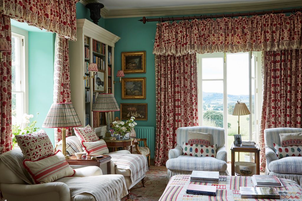 Miguel Flores-Vianna7/14
In Penny Morrison's Welsh house, the library is painted in ‘Arsenic’ by Farrow & Ball, which blends beautiful with the view from the space's French doors. In a similar colour combination to Nina Campbell, green is paired strikingly with red curtains in Penny Morrison’s ‘Arabella’ print.
 Christopher Horwood8/14
Howark Design transformed this bathroom, found in a former tannery conversion, using ‘Arsenic’ panelling and a ruby red roll top bath.


 Owen Gale9/14
In Joanna Plant's West London house, the cupboards in the upstairs bathroom have been coated in Farrow & Ball's ‘Arsenic’ and paired with complementary tiles from Bert & May.
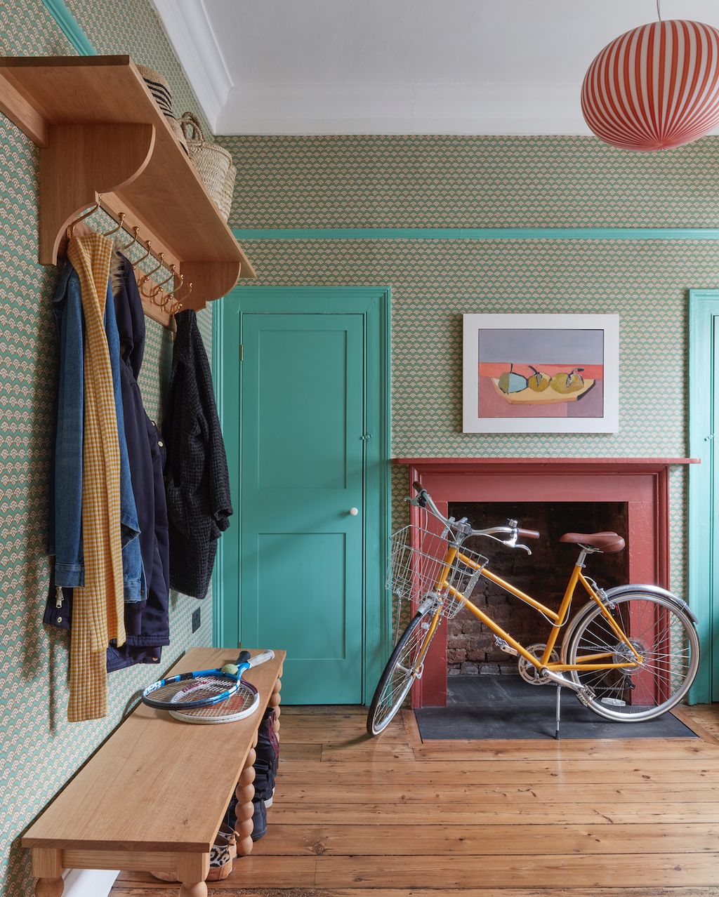 James McDonald10/14
In Kate Guinness's boot room, Farrow & Ball's ‘Arsenic’ brightens up the hardworking space. It provides a lovely contrast to Neisha Crosland’s ‘Pollen Emeraldo’ wallpaper (stocked by Turnell & Gigon).
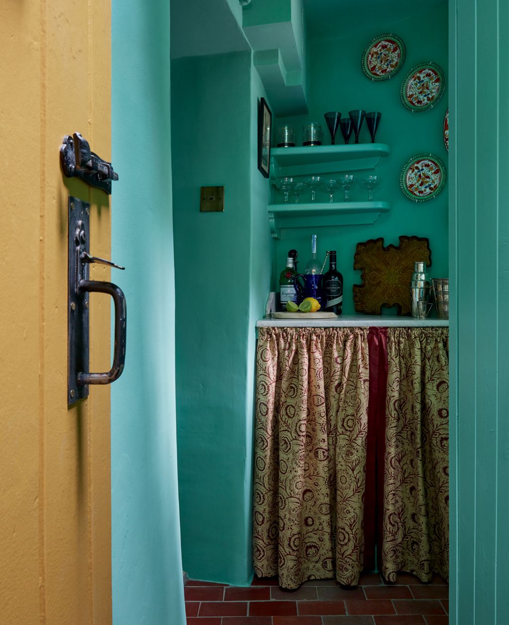 James McDonald11/14
James Mackie's 17th century cottage is a masterclass in colour, and this tiny bar area is no exception. Coming off the sitting room, the walls are painted in ‘Arsenic’, which sharpens up what might have been a dreary space.
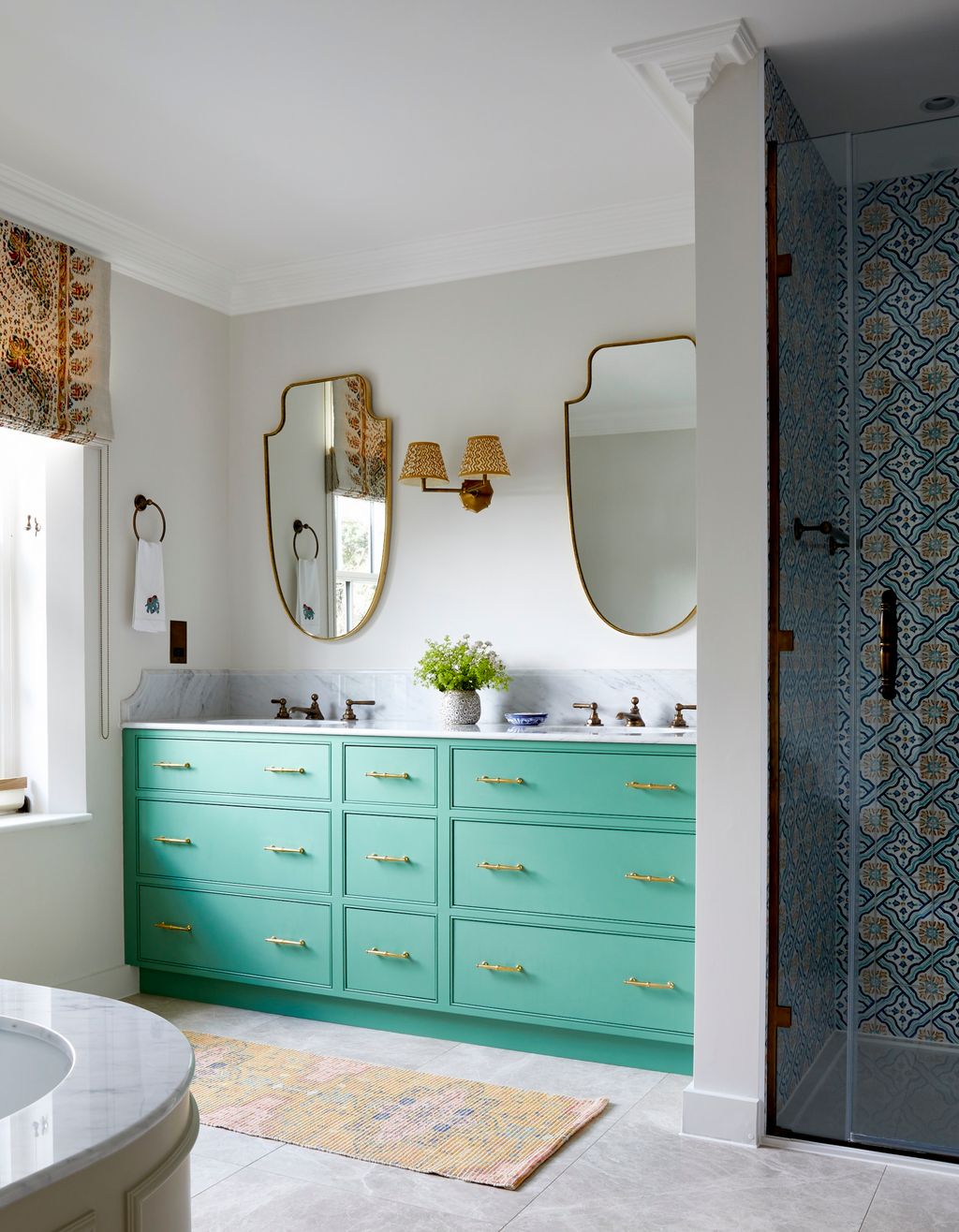 Paul Massey12/14
Much like Joanna Plant's bathroom, this space by Howark Design also has cabinetry in Farrow & Ball's ‘Arsenic'. The double vanity is a bespoke design, created by the duo.


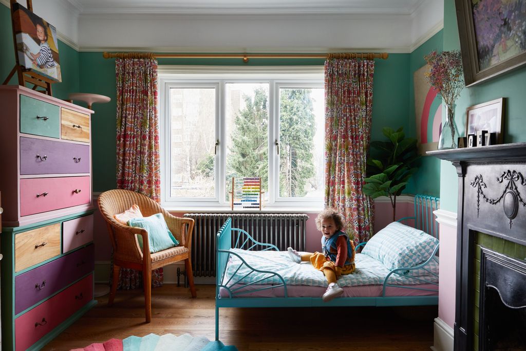
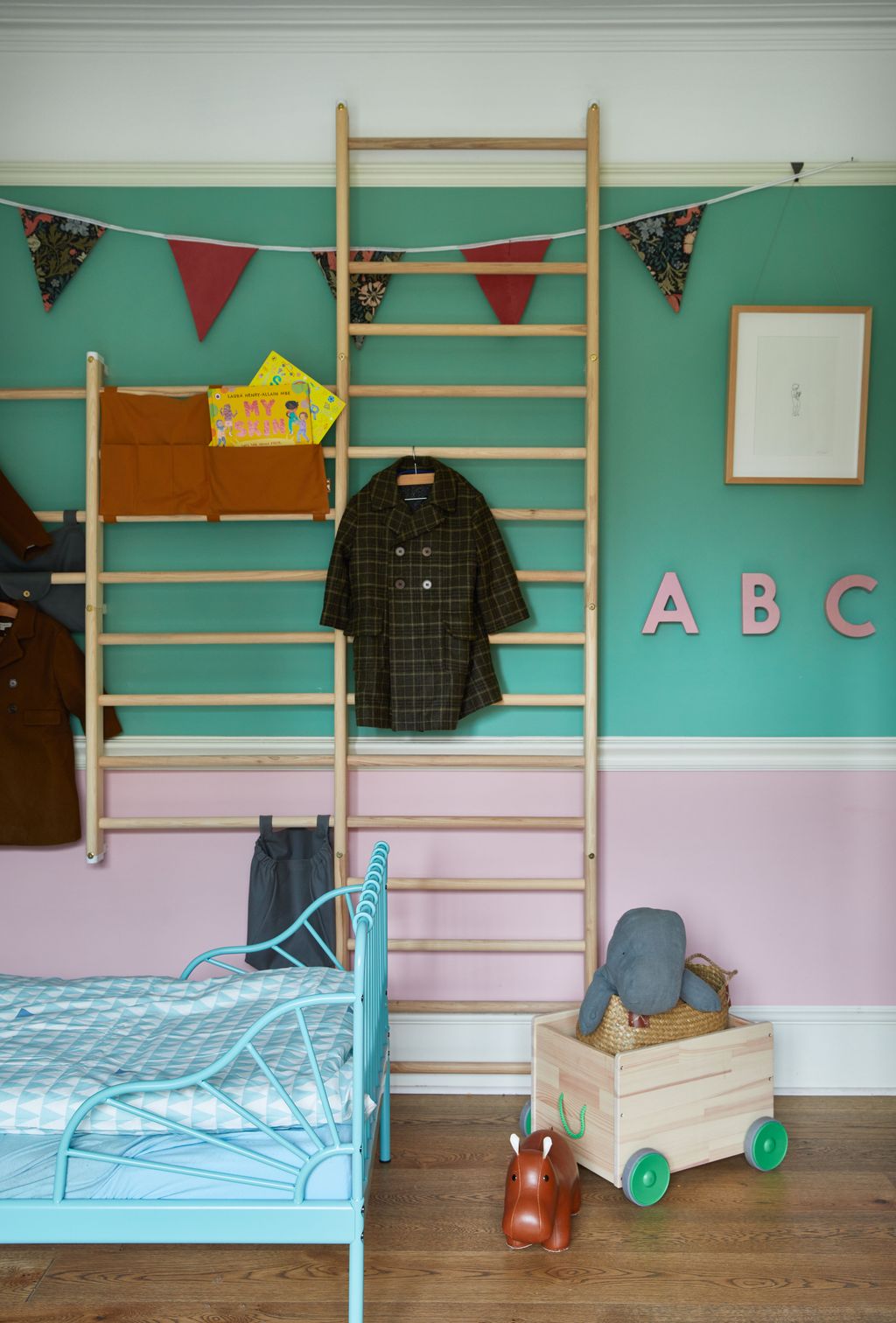 Helen Cathcart13/14
In Sophia and Simon Cook's Edwardian house, colour has been employed to riotous effect. The children's room is painted in 'Arsenic' and Sanderson's ‘French Rose’.
 Helen Cathcart14/14
The children's room, seen from another angle.


Comments
Back to Top


