

‘Before you leave the house, look in the mirror, and take one thing off,’ ordained Coco Chanel – giving us a guiding rule for ensuring that we don’t look overdone, but instead, effortlessly stylish, having removed the necklace, hairbow, logo-ed jersey or polka-dot tights that had tipped the balance out of our favour. It’s a comparatively easy and effective exercise – leading us to wonder if it’s an idea that could also be applied to interiors?
Sometimes, the ‘one thing’ that shouldn’t be in a room is obvious: a lamp that’s the wrong scale for the table it’s on, a chair you have to shimmy around to get through the door, a pile of paperwork and other ephemera that has inadvertently become a permanent installation. But other times, we might have a room that just doesn’t feel quite right, or isn’t comfortable to be in – even if we’ve worked to make it lovely, and it’s tidy. On occasion, that’s because the room has fallen victim to overdesign, or being over-accessorised, which isn’t totally dissimilar to being overdressed.

Let’s start at the beginning, with the planning stage. One of the challenges for today’s enthusiast is that our source inspiration is often photographic, which is all well and good, but it depends a bit on where the image comes from. Brandon Schubert points out that social media apps ‘reward certain colour combinations and highly patterned rooms – calmer interiors don’t look as attractive on screen. So you see people pushing for more and more colour and pattern. I love colour and pattern – but does anyone really want to sleep in a wild room with leopard print ceilings and more contrasting pattern on the walls and curtains?’ As Tiffany Duggan of Studio Duggan explains, ‘a little empty space allows a room to breathe – and I’m not talking about furniture, but the design scheme itself.’ She recounts how she’ll mix bold with more neutral elements: a bedroom might have a bed that is upholstered in orange mohair and ‘an epic snake rug’ on the floor, but the walls are cream; in a bathroom, a patterned tile floor is paired with plain tadelakt walls, thus ‘what’s been taken away is an additional pattern.’
Continuing with the false promises of photographs, another issue is ‘perfect’, in terms of a moodboard made of up patterns, plains and more that all tone together. ‘In real life, that level of matching doesn’t feel friendly,’ notes Octavia Dickinson (and in fashion terms, ‘matchy- matchy’ has, at times, been an insult.) There exist shoppable, pre-packaged schemes – and Octavia urges caution with some of them, suggesting that as a general rule, and unless it’s a toile room (when you want to go all in), we should take out one of the faultlessly harmonious ingredients. Similarly, ‘in a bathroom, take away the taps that have the exact same finish as the rest of the hardware,’ Octavia continues.
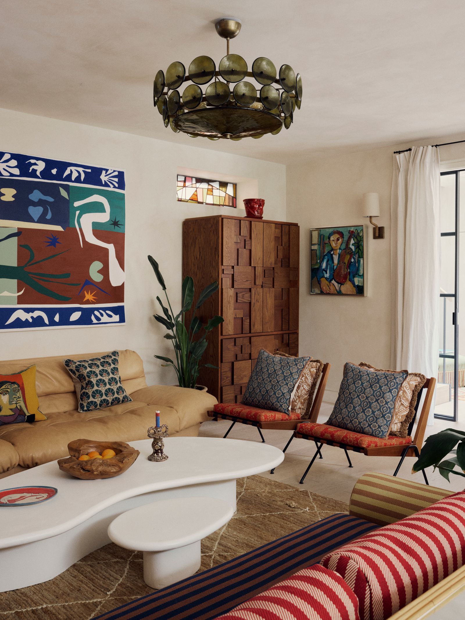
Olivia Outred explains that ‘you don’t want a room to look themed.’ She’s referring less to a passion for, say, ducks, than a tendency to go accidentally overboard with frills (I’ve been there), scallops, skirted furniture (ideally, we need a mixture of legs and skirts), pleated lampshades, or bouclé – a situation that can be remedied with a simple removal of one (or maybe two or three) of the de trop frivolities. You’ll notice that we’ve segued to accessories, of which ‘you can have too many,’ continues Olivia, ‘too many cushions on a sofa, too many lamps in a room, too many runners on beds. And too many ornaments on a side table which means you can’t put down your drink.’ That last can happen to the best of us - for such things multiply via insidious creep - and is especially worth thinking about if you’re entertaining. ‘Every time I’ve got friends coming to stay for the weekend, I’ll do a sweep to make sure there are ready surfaces,’ recounts Octavia. Who then adds, pointedly, ‘the other thing that ought to be removed, and permanently banned, is a plastic bin liner in an open wastepaper basket.’
But, all that said, the polled designers are keen to emphasise that we shouldn’t necessarily go looking for something to remove. ‘When mixed properly, each element of a room, each layer of time and space adds something - take away that Staffordshire dog and the whole house of cards could come tumbling down,’ identifies Lucy Hammond Giles, a Director at Sibyl Colefax & John Fowler.

And Octavia states that actually, she’s often more likely to recommend that we add something. Indeed, notable is that every instance she put forward (except for that bin liner) requires a replacement: few aspire to brushing their teeth from a fountain-spurting hole – and Tiffany’s advice relies on the same. To go back to the scheme, ‘you can’t finish a room on paper, you have to leave space for impulse’ counselled the great John Fowler. And that impulse, says Octavia, might be something that doesn’t obviously ‘go’, such as ‘souvenirs from a Gap year in Vietnam, or inherited furniture’ - but it can make the room, ‘and stop it feeling like a hotel.’ Rita Konig advocates for always including an antique textile to break up brand-new fabric meterage (which could be as simple as a quilt positioned on the back of the sofa). Flip the situation around, and Nicky Haslam insists that however exquisite a collection of antiques, you’ve got to also have modern matter ‘so it doesn’t feel like a museum.’ Then there’s Nancy Lancaster, who famously decreed that ‘every room needs something a little bit ugly.’
Finally, Lucy recounts being at a playgroup when her children were tiny: ‘there was a lady in the corner looking very hot in her coat, but she couldn’t take it off because she’d forgotten to put her skirt on that morning.’ Undoubtedly, what is most crucial is to ensure that we’ve got the right things in place to start with.


