

If you’re acquainted with the work of the late musical comedy duo Michael Flanders and Donald Swann, you might also know of their 1956 song Design for Living, with its catchy refrain “We’re terribly House & Garden, at number 7b.” (Just in case not, I’ve put a link to it on YouTube.) As a child, I used to play it on repeat, finding hilarity in their charting of the ways they were designing an interior “that won’t disgrace our ‘House & Garden’ friends.” There were curtains made of straw, and “we’ve wallpapered the floor!” It got even better: “Have you a home that cries out to your every visitor: 'Here lives somebody who is exciting to know!' No? Well, why not collect those little metal bottle-tops and nail them upside down to the floor?” A hysterically insane – and uncomfortable – idea, right? Except that, recently, I was perusing the House & Garden Fifties House (a gem of a book; available on Amazon) and found an article entitled ‘Easy Ways to Easier Living’, taken from the April 1954 issue – which essentially advised the same, albeit by suggesting that readers should use those upside down metal bottletops nailed to a board, “in your own initials or a pretty pattern” as a shoe-scraper. It’s less intense, but I’m still not sure I’d want to accidentally stand on it in stockinged feet.
That same article had some other ideas that we’d consider somewhat suspect now, including “pad your lavatory seat with bright-coloured towelling,” (thank you, but, no) and “a goldfish tank is a good decoration in the bathroom.” There are, interspersed, some quite genius tips too – I’m definitely considering painting all my lightswitches and the fuse box with luminous paint so as not to stumble around in the dark – but it did give rise to a thought concerning just how many totally baffling interior design ideas we’ve seen that yet were heralded as a fresh idea at the time – to which end, read on:
Wall-to-wall carpeted kitchens
If you thought wall-to-wall carpeted bathrooms were a bad idea (and oh, they are contentious) let us introduce you to the concept of wall-to-wall carpeted kitchens. They came to be in the late 1960s, 70s and early 80s, i.e. the decades that saw the heyday of fitted, deep-pile carpet, and – anecdotally – were even embraced by the otherwise beyond chic. Yes, it was warm underfoot (though if that’s your end aim, there’s also underfloor heating). Yes, it stopped drafts coming up through the floorboards (though insulation can help with that). Yes, it brought in colour and texture (keep reading). The fact that literally zero (to our knowledge) wall-to-wall deep-pile carpeted kitchens exist now could be seen as proof of its being terrible idea – and evidently none of the carpets laid then survived the onslaught of food and drink spillages.
Which isn’t to say that you can’t put carpet in a kitchen – just, maybe one that can be moved and cleaned. Which, technically, means you’re looking for a rug – perhaps a flatweave, or seagrass – and at the kitchens of Sarah Vanrenen, Marie-Louise Sjögren, and Nicola Mardas, who all know how to up the colour and texture quotient without also creating an inadvertent safe haven for crumbs, cornflakes, and tiny bits of ham. We’d also like to take a moment to point out how many other impractical kitchen flooring choices can be made. White tiles with white grout, and a dropped bottle of red wine, anyone?
(While we’re here, it wasn’t just kitchens that were over-enthusiastically carpeted. It was once quite normal for bathroom carpeting to extended up the side of the bath, and Octavia Dickinson reports that at Graceland, Elvis Presley went in for what could perhaps only be termed immersive carpeting – he covered the floors, walls and the ceiling.)
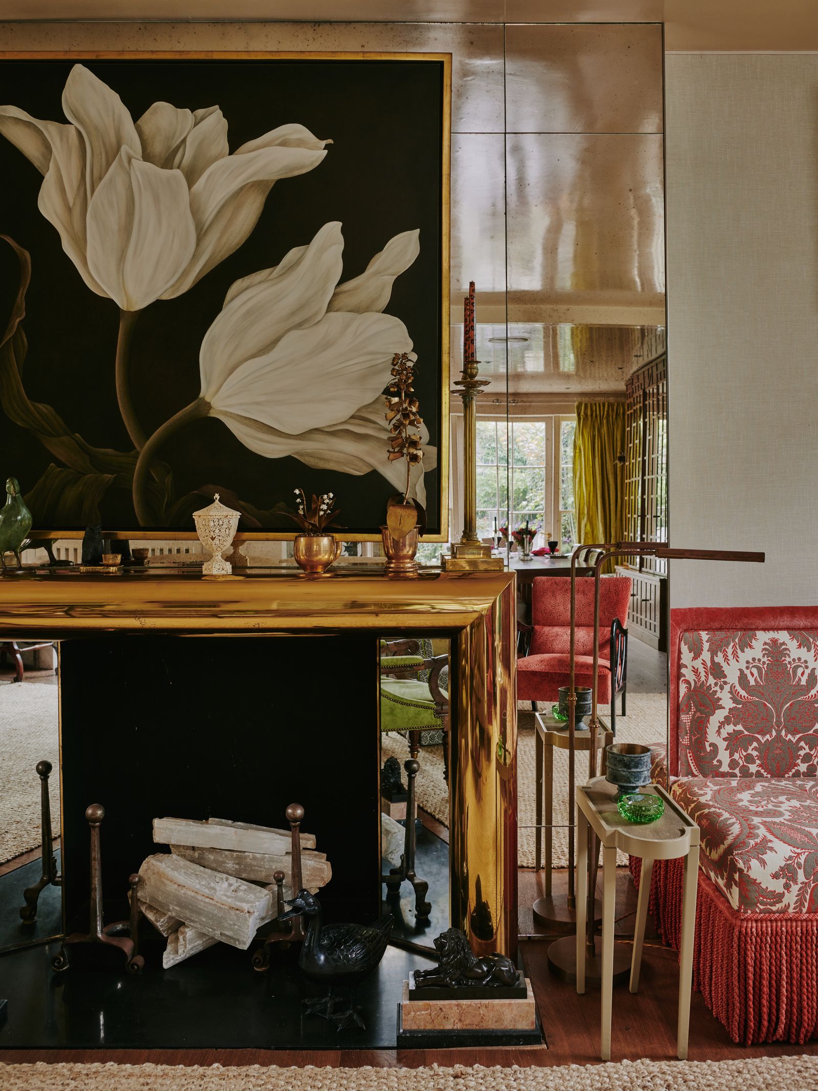
A surfeit of supposedly functional mirrored furniture
What would you say to a mirrored chest of drawers, that not only shows up every smeary fingerprint, but also reflects the untidy pile of clothes on the chair opposite? Bonus points if your floor is wonky, making the reflection wonky too, and extra bonus points for more than one piece of mirrored furniture in a room, effectively meaning you need to keep the room show home tidy, all the time. See also the indignity of fully mirrored bathrooms (unless beautifully aged, and thus flattering), mirrored splashbacks, and high-sheen kitchen accoutrements, such as kettles and bins – which seem lovely in theory, until realise that you cannot possibly keep up with the necessary cleaning routine. How did this happen?
Once upon a time mirrors were a status symbol. The Hall of Mirrors at Versailles was a power play by Louis XIV (who, it should be noted, also had the means for a full palace-worth of cleaners. That said, Versailles was, apparently, filthy). The earliest pieces of mirrored furniture date back to a similar time – mirrored women’s dressing tables were popular in the 18th century – and there was another wave when Art Deco hit in the 1920s and 30s. Stylistically, Art Deco’s geometrical tendencies developed from Cubism, so the refracting properties of a mirror were embraced, along with opulence – and a heady dose of optimism. Mirrors can make a room seem larger and lighter, and so all permeations were valid right through Hollywood Regency – and then, via high street shops, all through the last 15 or so years, giving us a plethora of mirrored chests of drawers, consoles, and coffee tables, which we attempted to combine with small children and dogs, leading, more often than not, to a disaster.
Of course, you can still find exquisite antique, vintage, and higher end reproduction mirrored furniture, and there are many means of decorating with mirrors in a beautiful fashion; Nina Campbell’s Chelsea home is a masterclass in the matter, with mirrored slips between bookshelves, and a mirrored fireplace. But key – unless you are successful at clutter-free living, and really love polishing things – is to avoid mirrored surfaces you have to keep touching because they’re also meant to be functional.

Artex ceilings and woodchip walls
How many of us have decided not to purchase a house, due to the swirl of Artex on a ceiling, or endless little bumps of woodchip on the walls, and wondered why, why, anybody would have applied something that is so hard to remove? We’re not exaggerating. Woodchip and Artex peaked in popularity in the 1970s, and yet, unlike carpeted kitchens, both are still everywhere.
The answer lies, as it so often does, in convenience. Artex was marketed as easy to use, and a means of finishing a ceiling even if you had no plastering skills – i.e., perfect for enthusiastic weekend DIYers. (It’s textured, hence the familiar stippled and swirled patterns it was given.) Woodchip wallpaper was another means of avoiding plastering, as it disguised the condition of walls. It’s textured too (the 1970s were generally big on texture, think of all those shag pile carpets) – and you could paint it as often as you liked and still it retained its bobbliness. What wasn’t to love? Except, fifty years later, everything. (Although the artist and designer Robin Lucas reckons woodchip wallpaper is an excellent base for a mural – which is also a clever way of disguising it.)
Of course, the problems that Artex and woodchip seemed to solve are still there – but, good news. Firstly, plastering is not actually an impossible DIY skill; secondly, you can get quality wall lining paper that will disguise the state of your walls just as well as woodchip will – but without the textural bumps. (Although you can still buy woodchip wallpaper, if you want it – and indeed Artex. And the 70s are having a resurgence, so . . . )

The stripping of mouldings in period houses . . . and open plan living?
Modernism has a lot to answer for in this country, not least the wide-scale stripping, post-WW2, of decorative mouldings from Regency, Victorian and Edwardian houses. It was a case of farewell to ceiling roses and cornicing, and hello to flat expanses of ornament-less plaster, as ordained by so many of the architects and designers working then, who promoted sleek lines and an end to unnecessary embellishment. It’s true that the majority of the mouldings weren’t serving any purpose – but, decades later, here we are, putting them back because we’ve learned that a room can look characterless without them. (And, fortunately, there are those among us who were wise enough not to pass by the treasure being chucked into skips; Charles Brooking started his mouldings collection aged 13, it’s now a museum and it’s formed the basis of Atkey & Company’s range of reproductions.)
The lesson – and there is one – is to tread carefully with all renovations, perhaps particularly with an old house that isn’t listed (thus enabling us to – theoretically – do what we like.) There are interior designers who have demonstrated that it’s possible, with some adjustments, to get around the difficulties that mouldings can create (bulky chimney breasts, proportion-altering dado rails) – and Katie Glaister’s approach is worth examining. We should also point out that some of that 20th century stripping took place due to residual bomb damage; it was cheaper and easier, when restoring houses, not to put those ceiling roses back.
But we do wonder if, one day, future generations will look back at our propensity for open-plan living and wonder why on earth we pulled down all the walls, making rooms harder to heat, and taking away natural sound insulation? Flanders & Swann covered that, too: “Our boudoir of open-plan has been a huge success; now everywhere’s so open, there’s nowhere safe to dress!”
Incongruous dado rails, so-faux-fireplaces, and more
But, at the same time as buildings were being stripped, so somewhat incongruous mouldings were being added to decidedly modern flats – often emphasised by way of paint or wallpaper choices. My 1970s ex-local authority brutalist low-rise came with cornicing, and my fellow House & Garden writer Charlotte McCaughan-Hawes lives in a 1960s flat that came with a dado rail. “When we arrived, it was dark blue on the bottom and cream on top, with the dado itself in white. It was awful to repaint,” she reports. That trend for splitting the wall at the dado, and treating each half separately, has endured. Mostly because it can save money on wallpaper costs – and, if you’re doing it on a staircase or in a hall, the bottom half of the wall is potentially going to receive more knocks than the top half.
It is not, however, historically correct. In the 18th century, walls and dado were often painted in one colour, for, says Patrick Baty, “the relative complexity of the wall surface was not an excuse for the elaborate ‘picking out’ beloved by so many modern interior designers.” But, John Fowler did it (albeit very attractively, there was no white/navy contrast for him) – and moving on to so-faux fireplaces, as in, so-faux that we all know those pristine white pebbles/lurid pink rocks/gold glittery pinecones are never going to produce a real flame – Nina Campbell has done that (her logs are crystal) and done it exquisitely.
The relationship between form and function has shifted, a fireplace – even in a room without a chimney breast – creates atmosphere and a focus, and both Charlotte and I kept our spurious mouldings (if not the coloured emphasis.) Here, the difference between brilliant and baffling lies in the execution – though purists might beg to differ.

Straw curtains, and wallpapered floors
We’ve already demonstrated that the roots of that Flanders & Swann ditty lay in reality, and this line did too. However – plot twist alert – these ideas are markedly less ridiculous than they initially sound. The ‘curtains made of straw’ most likely referred to bamboo blinds, also known as chik blinds – which are still a design staple, used by Beata Heuman, Pallas Kalamotusis, and many more, for “they are equally successful in a mid-century modernist setting as they are in a more classic country house,” says Virginia Tupker.
And as for wallpapering the floor – well, the great Roger Banks-Pye of Sibyl Colefax & John Fowler use his favourite Colefax & Fowler Indian Fuchsia chintz fabric on his bedroom floor, having first tested the fabric’s durability by wrapping it around a board at the top of the stairs in the Brook Street office, and it looked glorious. Wallpaper – particularly if varnished appropriately – might work just as well.


