When thinking about the colour teal, chances are you’re transported to the nineties or noughties. Over the last two decades, the shade has been put very much on the back burner along with the bad feature walls and boxy built-in kitchens that also dominated these eras. However, as we start to see 90s interiors in an inspirational light and the return of other 2000s colour choices (see the current shift to chrome and silver), the shade is starting have something of a comeback.
Trend forecasters WGSN named ‘Transformative Teal’ as their colour of the year for 2026 while paint companies also put the colour in the spotlight – albeit without calling out teal directly. Mylands chose a teal, dubbed Burlington Arcade No. 216, as their colour for 2026 and Birdie Fortescue’s just-launched debut paint collection in partnership with Fenwick & Tilbrook includes Wissey, a light teal shade described as a ‘mist green’ and a darker teal hue called Babingley.
What’s driving the teal revival?
While trend cycling is a tale as old as time, there is a lot to unpack in teal’s return. Trend forecasters at WGSN are connecting teal’s revival to our collective yearning for calm. ‘Consumers are looking for interiors that are serene. People are looking to slow down and reflect, and they want a nature-inspired environment to do just that,’ Angela Ringo, Senior Trend Forecaster & Editor, Interiors at WGSN, explains.
Charlotte Cropper, an independent colour consultant who has seen an uptick in clients requesting teal this year, sees it similarly: ‘Teal perfectly bridges two of the most-loved colours from the natural world: blue and green. Combining the serenity of blue with the restorative energy of green, it’s a versatile, feel-good colour that satisfies our craving for nature-inspired tones.’
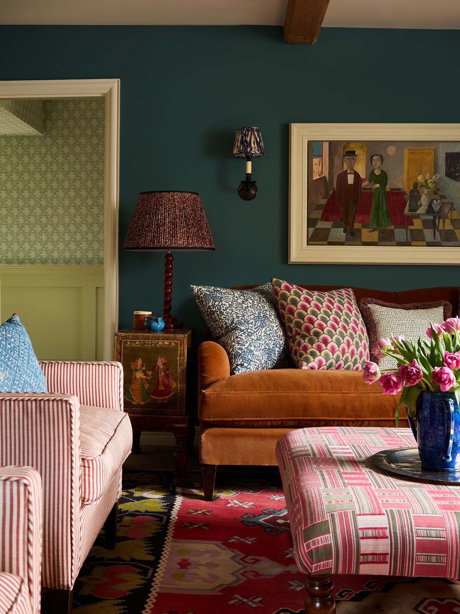
Despite the nostalgic design mood, the teal of today is different to last time around. Forget the jewel-toned teals of the past, today Cropper’s clients are requesting dusty, moody and slightly muddy teals. ‘They’re drawn to colours that feel lived-in rather than loud. Those that add character and comfort in equal measure,’ Cropper notes.
How to use teal in your home
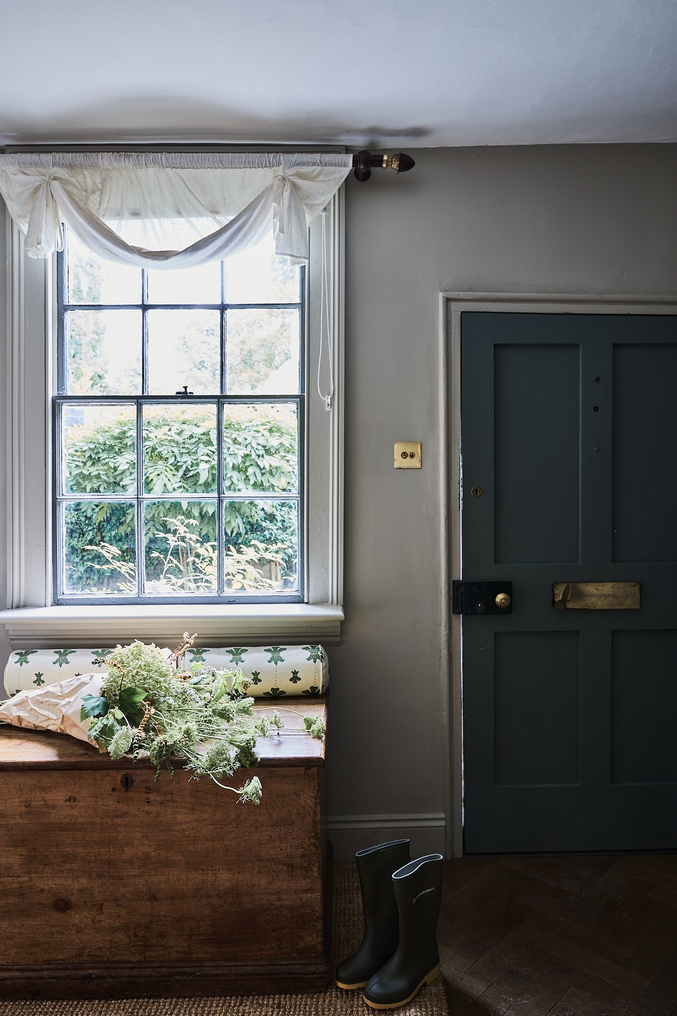
Versatile and forgiving, teal can be used in many spaces throughout the home. ‘It’s really easy to decorate with. It’s striking on its own but also goes well with so many different colours. It possesses the familiarity of a deep blue or a rich green but also offers a hint of the unexpected without being too shouty,’ Dominic Myland, CEO of Mylands, shares.
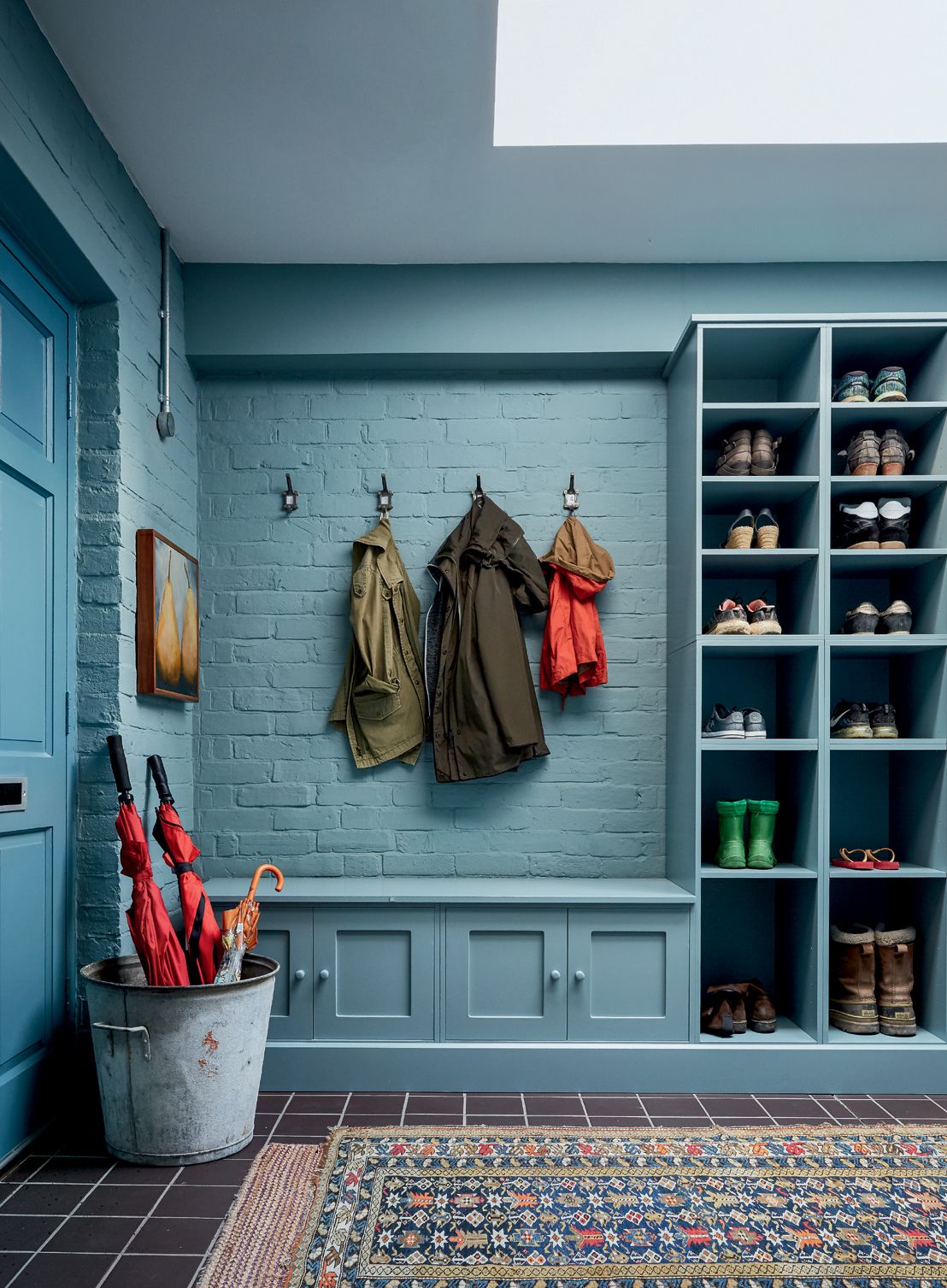
Myland suggests colour drenching it across walls, ceilings, and woodwork: ‘I’ve seen some great examples of this, whether for a cocooning bedroom or a dramatic dining room.’ For something that really sings, he suggests trying it in a gloss finish that gives an extra sheen.
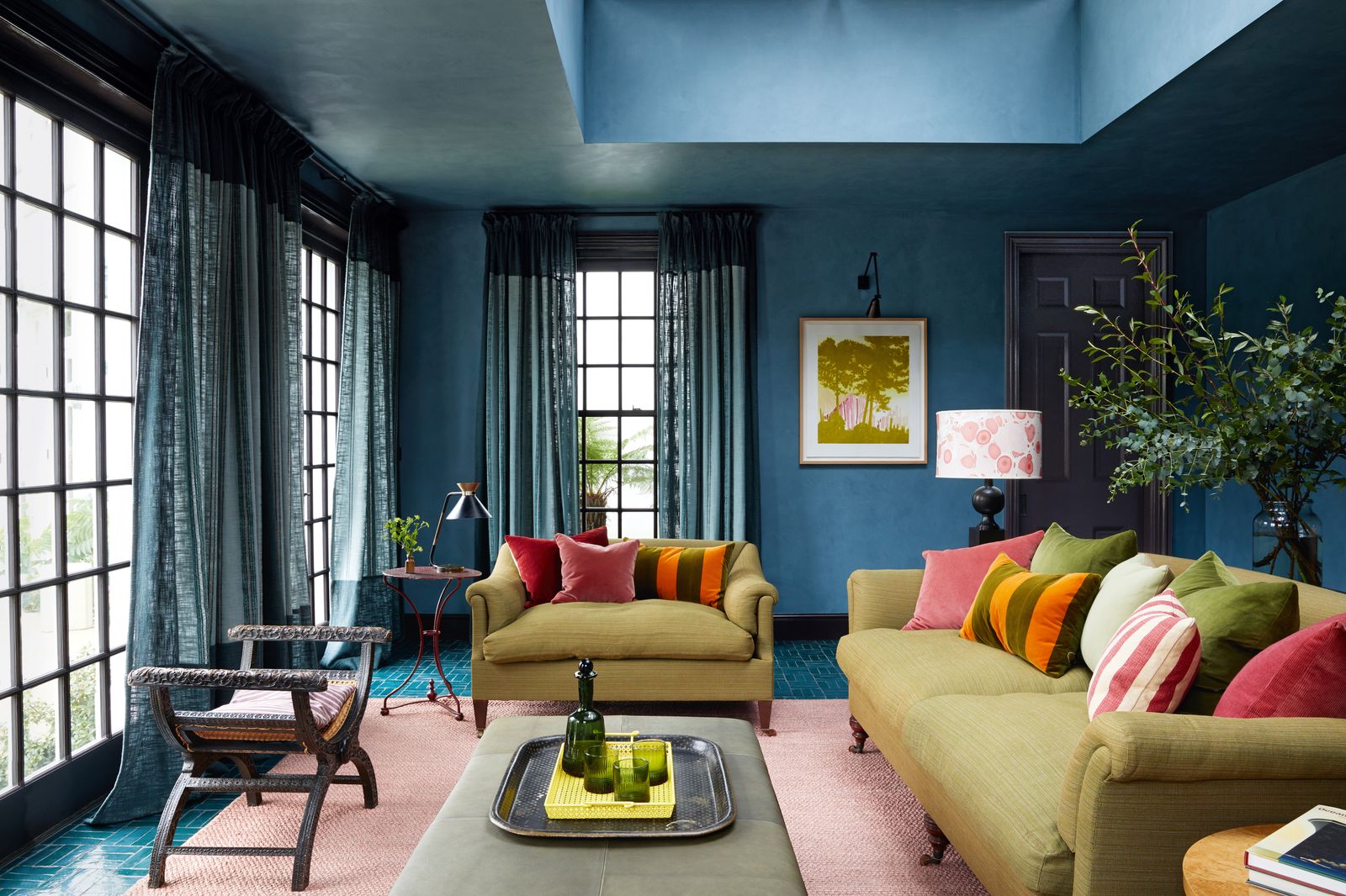
Cropper loves how it can shift the mood depending on how and where it’s used. ‘It has the rare ability to suit both dramatic and tranquil spaces alike. In a hallway, paired with an off-white ceiling, coving and woodwork, it feels confident, sophisticated and full of impact. In a bedroom, when layered with soft pinks, terracotta or neutral tones, it takes on a cocooning, intimate quality,’ she explains.
As always with paint colours, you have to be careful with the light. ‘Some teals can lean quite grey, especially in the cooler light of UK homes, while others really pop on the wall,’ Cropper shares. Sampling generously and checking your options in different lights can ensure you get the right shade for the room.
In terms of the wider scheme, light naturally plays a role too. ‘In darker rooms, teal can become quite intense, so it’s important to balance it with lighter tones or plenty of texture to avoid it feeling flat,’ Henriette von Stockhausen, Creative Director of VSP Interiors, adds. She advises steering clear of pairing teal with overly crisp whites as it can look stark. ‘Instead, use warmer neutrals or natural materials to soften the look and bring harmony to the space. The combination of teal with cream, rich wood and antique textiles creates a layered, inviting atmosphere,’ she adds.
The experts’ favourite teal paints
In terms of specific shades, Cropper loves using a moody teal with a warm grey undertone in living rooms to create a cosy yet sophisticated backdrop – her favourites are Plume by Atelier Ellis or Teal 03 by Lick. For something softer in a bedroom she suggests Oval Room Blue by Farrow & Ball while for a vibrant accent on doors, woodwork or upcycled furniture, it’s Venetian Lagoon by Claybrook that’s her top recommendation.
Von Stockhausen is also a fan of using teal in a sitting room or bedroom. ‘Basically anywhere you want a sense of comfort and calm, yet with personality,’ she adds. For von Stockhausen, Vardo by Farrow & Ball, Malachite by Rose of Jericho and Venetian Lagoon by Claybrook are her all-time favourite go-tos.
Whether you’re a long-term teal advocate or a new convert to teal 2.0, what’s for certain is that this blue-green shade is here to stay – and with it a huge variety of decorating options.


