
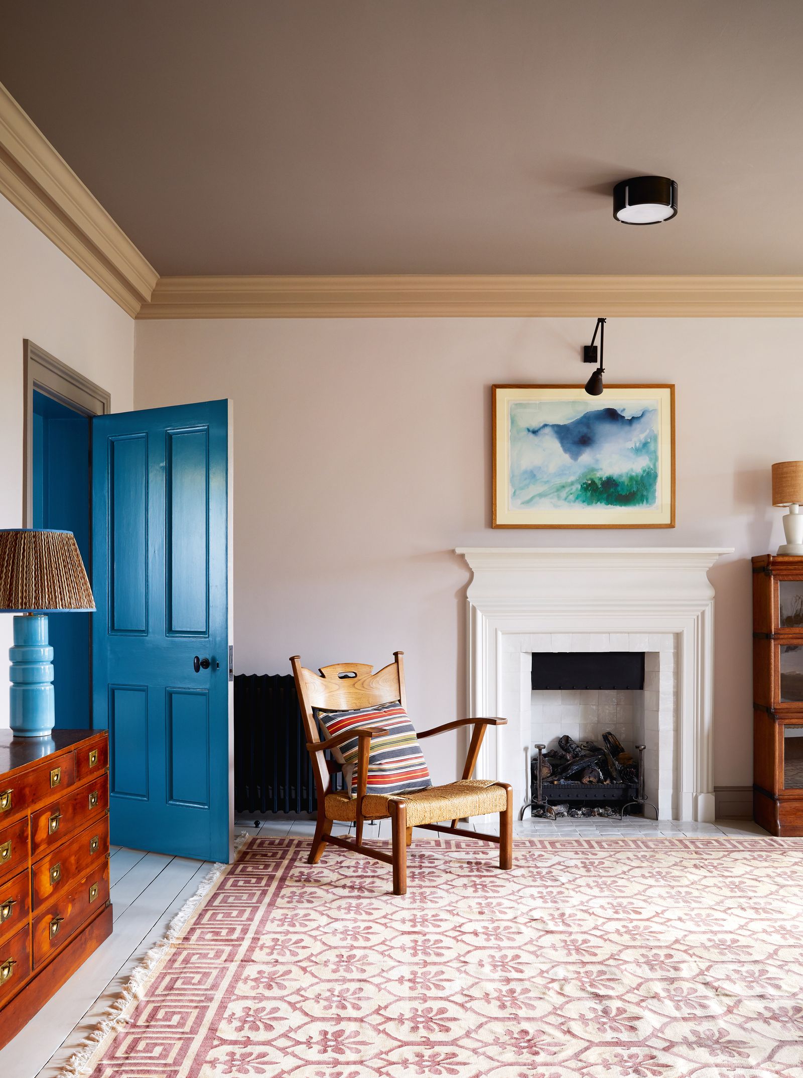
Calm, tonal and quietly transformative, colour capping is the painterly shortcut designers are using to shift how rooms feel. The technique involves painting the walls and ceiling in complementary shades, creating a subtle change in tone or depth as the eye moves upward. Sometimes the colour grows lighter, sometimes deeper, and sometimes deliberately contrasting. The result is a gentle transition that draws the eye through the space and makes the ceiling - the fifth, and too often forgotten, wall - part of the picture.
Sure, you could paint the walls one colour and call it a day. That would be perfectly en vogue too. It's called colour drenching, and we've covered it extensively. But colour capping offers something more nuanced: a way to manipulate space. There’s no fixed height or rulebook, which is precisely the point, and when handled well, it’s a subtle device that can elongate, compress, or completely recalibrate the proportions of a room.
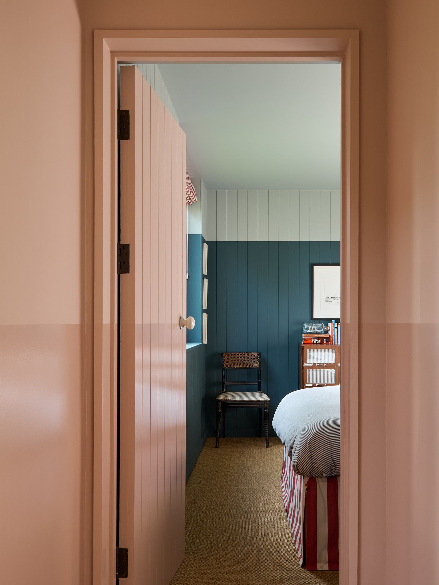
‘The use of colour in interiors is all about balance, and colour capping is definitely very popular right now,’ says Farrow & Ball colour curator Joa Studholme. ‘Simply put, it’s a paint technique that subtly creates a tonal graduation from the same colour family.’ Depending on the room, the colour transition might begin at cornice level, sweep down to a picture rail or wrap softly over the ceiling like a painted hood. ‘We’ve all got used to not having the default white ceiling,’ Joa adds. ‘And as we embrace colour we’ve become more adventurous.’
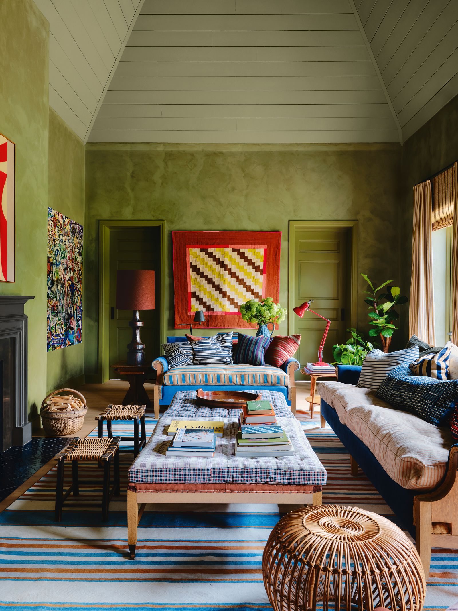
That appetite for colour has encouraged many designers to look upward, using colour capping to draw attention to architectural detail, disguise uneven ceiling lines or visually gather large rooms that risk feeling untethered. For interior designer Nicola Harding, colour capping serves as a compositional tool, which her London practice uses to shift mood and clarify a look. ‘It’s a way of rounding off a colour scheme, making it complete and immersive,’ Nicola explains, emphasising that colour capping can change not just how a room looks, but how it behaves.
‘A paler colour to the top can leave the space feeling open and airy, letting the energy escape,’ Nicola adds. ‘Sometimes that’s what you want, but sometimes you want to focus the energy within the space and using a richer colour to the top helps to do that. Your eye tends to be drawn to the palest thing, so using a darker colour focuses your eye down. In doing so, it intensifies the atmosphere.’
Joa agrees: ‘In contemporary homes it’s a great way to change the optics of a room without changing the footprint. And in period rooms it’s a subtle way to highlight features and give ceilings a more thought-about role in the overall design scheme. It’s also a great way of injecting colour without painting all the walls in a dark tone if a client wants to keep their interior light but also wants to add a touch of drama,’ she says.
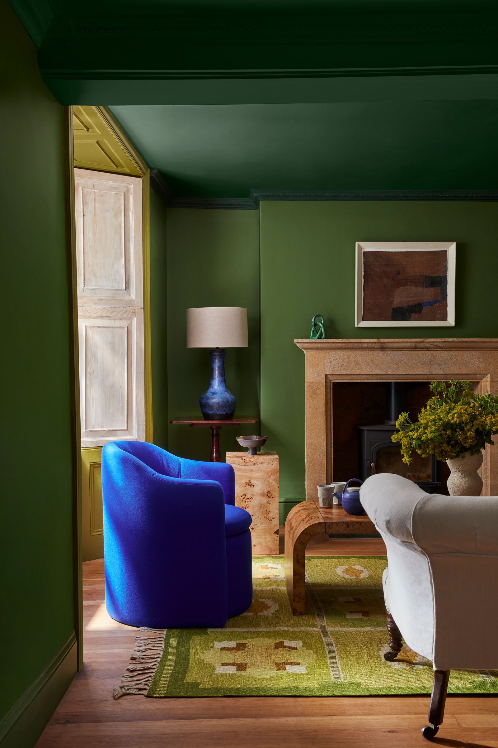
There’s no universal height at which the colour should change. For Nicola, it’s more about emotion than measurement. ‘I’m always driven by mood. What feeling am I trying to create, and what are the tools that will best serve me?’ she explains. To avoid the line looking abrupt, she suggests letting the transition meet an architectural feature, like a picture rail, a cornice or a dado. ‘There should be something for it to run into, to define the dividing line. I like it when the capping wraps over the ceiling and down some of the wall.’
Joa offers a more proportional guide for graduating colour: ‘The lightest tone should be used on the walls, the mid colour (if using one) on the top 40cm of the walls or above the picture rail, and the strongest tone on the ceiling.’
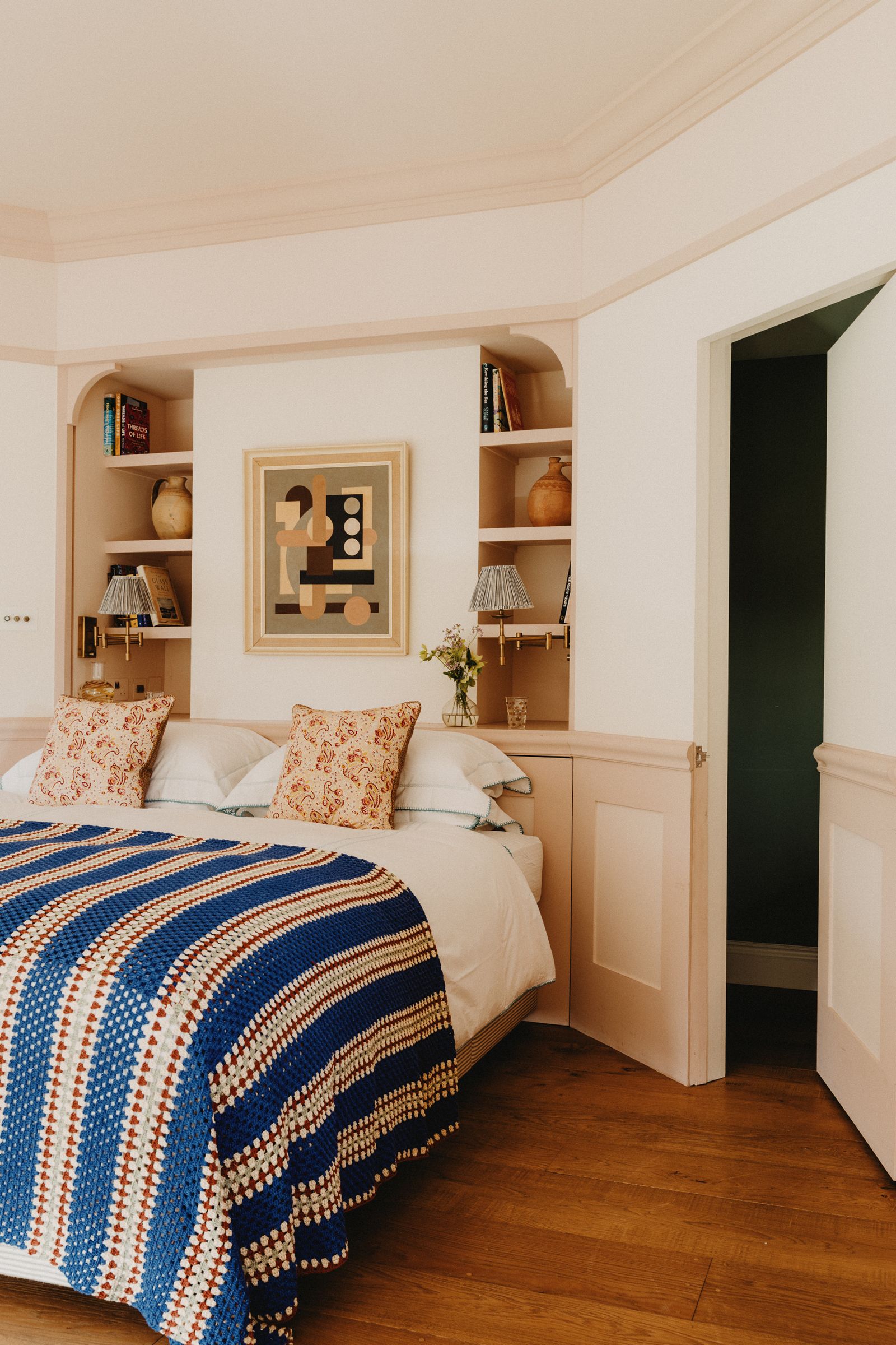
When it comes to choosing colours, Nicola prefers tonal relatives rather than harsh opposites. ‘Start gently, using a colour that’s related rather than completely different. For example, a warm pink wall might have a soft pinky-mushroom ceiling,’ she says. ‘I suggest slightly muted tones, colours that feel like they could belong in nature. They feel grounded and easy to live with.’ Meanwhile, Joa champions both neutrals and moodier hues, depending on ambition: ‘When stronger tones are used, it feels more contemporary and dramatic.’
Either way, when colour capping comes into play, everything else in the room has to pull its weight. ‘The power of any one thing is determined by how you use it in combination with other things,’ Nicola explains. ‘So the power of colour capping is determined by how much the ceiling contrasts to the other ingredients in the room.’ Art, furniture and even the shape of a ceiling can all shift how the treatment reads: hanging art above the divide lifts attention, while hanging it below grounds it; tall furniture that pierces the cap becomes dramatic, while lower pieces emphasise the colour horizon.
Colour capping encourages us to think volumetrically, not just about surfaces, but about how rooms behave. Its popularity isn’t accidental. As interiors move away from stark minimalism, colour is becoming softer, moodier, warmer and more psychologically astute. Gentle, adaptable and low-commitment, colour capping offers a way to recalibrate a room’s mood with minimal intervention. Painting the ceiling might still seem daring to some, but sometimes a soft act of defiance is exactly what a room needs.


