How to pick a calming paint colour
Picking a paint is not merely a question of aesthetics. Of course, a certain shade should aim to bring beauty, add a theme, create symbolic associations or send a message about your character – feminine, minimalist, maximalist, etcetera. But the effect of a particular paint doesn't end there. Colour always creates a certain mood or ambiance, the effect of which is deeply psychological, even if it is working at a subconscious level. In recent columns, our interiors expert Fiona Mckenzie Johnston explored the notion of ‘colour therapy’, and how colour, as far back as Ancient Greece, chromatics were used for curative effect, to treat depression and even cure pain. Colour psychology is a well-explored area, with studies showing that the colour red stimulates conversation (so perfect for dining rooms and living rooms), whilst yellow promotes positivity (perhaps due to associations with sunlight). In another, more recent column, Fiona explores the other end of the spectrum (pardon the pun): chromophobia, whereby colour creates such strong emotional attachments, can even cause extremely negative affective responses in the beholder, and how such colour can be gently reincorporated into a home to make it bearable and even pleasurable.
MAY WE SUGGEST: 60+ Farrow and Ball paint colours in real homes
Flash forward to 2023 and it's perhaps no surprise that one of the most frequent questions we hear when it comes to picking paint is ‘what is the most calming colour?’ In a chaotic, increasingly uncertain world, when, following the pandemic, we are spending more time at home than ever, it is not surprise that we are increasingly seeing our homes as sanctuaries, with colour selected for therapeutic effect. Your initial reaction might be to grab a tin of blue paint: a famously calming tone, it is generally used in clinical settings and studies have shown it can literally lower a heart rate. “Light blue is a mindful colour – it's calming and mentally soothing, so it works perfectly in larger spaces such as bedrooms, kitchens, and living rooms," says colour consultant Alex Glover. "Dark blues are more mentally stimulating; so they work perfectly on the walls in smaller spaces such as studies, utility rooms, even a bathroom if that's where you choose to ponder.” “I have used Papers and Paints' very subtle ‘Fenching Blue’ a lot,” says interior designer Octavia Dickinson, “as it’s incredibly calming and amazingly ’un-cold' for a light blue.” Tom Morris goes for ‘Stone Blue’ by Farrow & Ball, when he's searching for a calming shade. “It has an artificial quality that makes it work in Modernist projects, but a warm flatness that suits older homes too,” he explains.
White is another obvious go-to (although not all whites are equal, and it very much depending on the tones and hues). Most decorators steer clear of a true, builder's white and opt for shades with pink or yellow tones. Nicole Salvesen and Mary Graham of Salvesen Graham explain that “when choosing white paint, we often turn to Farrow & Ball ‘Pointing’ or ‘Slipper Satin’ as perfect ceiling and woodwork colours that remain warm and gentle.” Light pinks and pale, Scandinavian blues are also popular paints, proven to promote peace and calm. Sage green seems to have a similar effect, and is increasingly being used in bathrooms and bedrooms for a warming, soothing effect. Even a dark green can be warm and relaxing in the right setting. ““Hornblende by Paint & Paper Library is a grown-up dark green that makes you feel calm and grounded,” says Camilla Clarke, Creative Director at Albion Nord. “It’s particularly good in grander spaces as it feels relaxed but still sophisticated.” If this feels too much, try a more gentle green grey. Sarah Stemp, interior designer at Sascal Studio says, “We recently did a bedroom in French Gray by Farrow & Ball (we used this green-gray on the walls, woodwork and ceilings) and loved the end result so much that we’ve specified it for a snug in another project. It’s a very calming and muted green that almost reads as neutral in the evening but has a lovely subtle green glow when the light hits it in the daytime.”
However, there are no hard and fast rules, and when selecting a shade, it is about the tone and quality of the particular colour, and not the taxonomy of the colour which counts. 'You can have a very vibrant blue that doesn’t feel calm at all, or a very dark womb-like red that is calming,'" says artist and colour specialist Ptolemy Mann, in Fiona's article. "Fundamentally, the colours we use in decoration were originally created from pigment, and in the past pigment only came either from the earth, or from the plant and animal kingdom, or from minerals. Minerals give a strong, clear colour, while I believe that earth pigment is fundamental to getting colour that is harmonious; earth pigments can make any colour calm.” Ultimately, all colour is going to be subjective, up to personal preference, however when it comes to calming paint colours, here are some starting ideas, from homes taken from the House & Garden archive.
 Alicia Taylor1/20
White
Edward Bulmer paints in peacefully neutral colours were used throughout this Surrey home, inspired by the owner's Scandinavian origins. ‘The room has odd architectural detailing and mouldings, so we worked with the paint expert Edward Bulmer to ensure the colours change at just the right point. The advantage of Edward’s natural paints is that you can control the percentage of tint,’ says designer Kate Earle.
 Jan Baldwin2/20
Walls in Dulux’s ‘White Cotton’ and fumed oak flooring by Barham & Sons make a fresh entrance at this Victorian house in southwest London.
 Jake Curtis3/20
Thea Speake has painted her entire flat in a soft white. Being a basement flat, this helps to avoid a sense of darkness and creates a light, relaxed and airy feel.
 Paul Massey4/20
This all-white open-plan kitchen is calmingly minimal. It features vintage powder-coated wall lights from Skinflint Design, a marble worktop and splashback and walls painted in 'Old White'. Greenery adds colour and brings the room to life. The scheme belongs to Anna Valentine's bright and minimalist London flat.


 Line Klein5/20
Being a south-facing flat in Copenhagen, light was an intense factor for designer Josephine Akvama Hoffmeyer to deal with. She selected File Under Pop paints ‘Under My Skin’ for the walls and ‘Stone and Bones’ for the ceiling. With pink and grey-yellow hues respectively, the colours are not stable, but ‘change around all day’ depending on the light. Their super-matte finish creates a ‘softer, more peaceful feel’.
 Michael Sinclair6/20
Grey
The calm grandeur of interior designer Pallas Kalamotusis's living area is sustained through the wall colour: Little Greene's French Grey.
 Jan Baldwin7/20
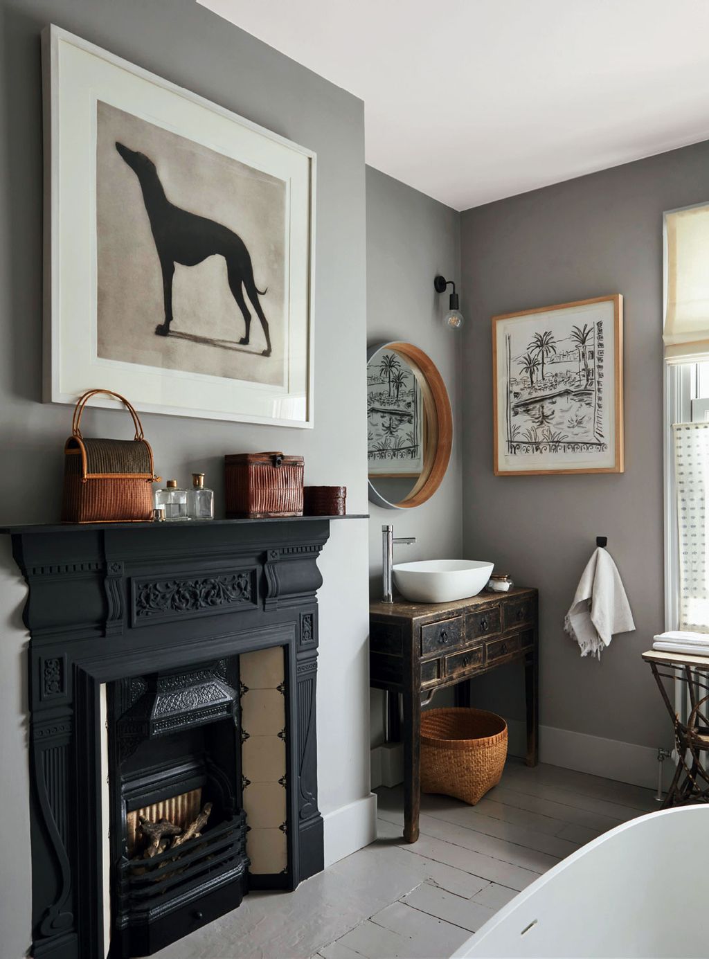
At this Victorian house owned by a former House & Garden editor, greys have been used to great effect. In the sitting room, walls in Paint & Paper Library’s ‘Salt IV’ showcase Helen Fay’s Greyhound etching and a charcoal drawing by Hugh Barnden. The bath is from Waters Baths of Ashbourne.
 Paul Massey8/20
Grey has been selected for the elegant, pared-back living areas of Solenne de la Fouchardiere's home. The neutral colour scheme allows the furniture and greenery to pop.


 Paul Massey9/20
In the bedroom at this elegant Georgian home, owned by Ochre director, a subtle palette of Farrow & Ball paints and a headboard and bench covered in alpaca wool create a relaxed mood. The Ochre ‘Beach Pebble’ pendant also helps to cast a soft light.
 Alicia Taylor10/20
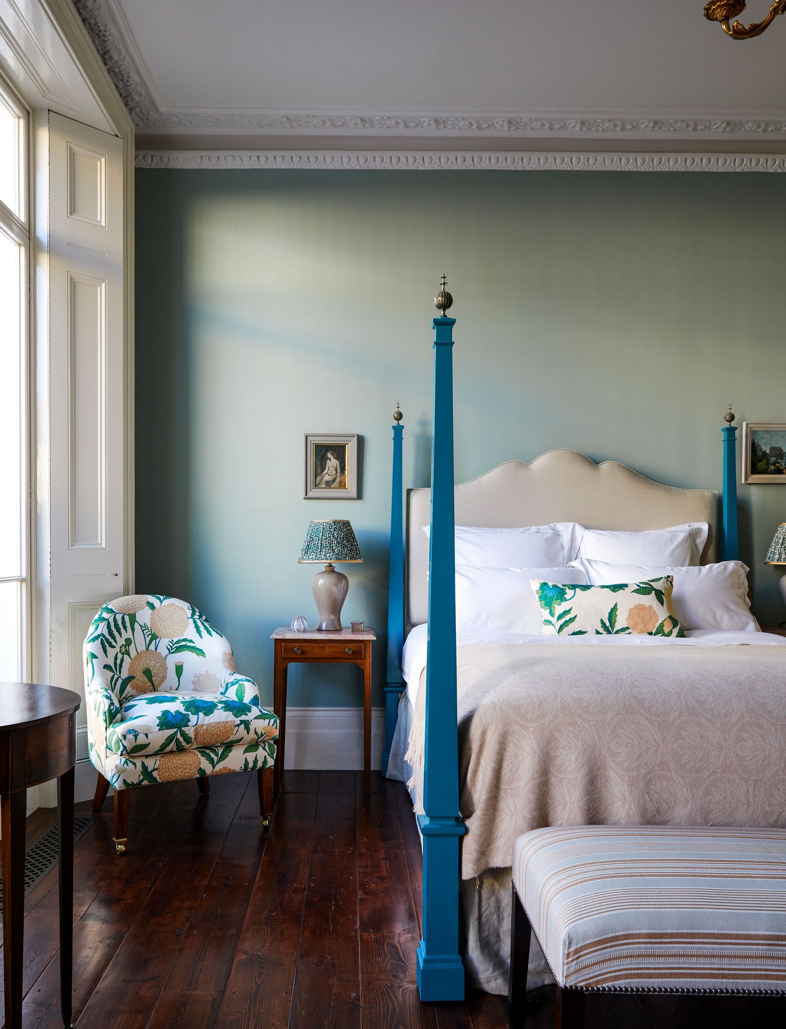
Blue
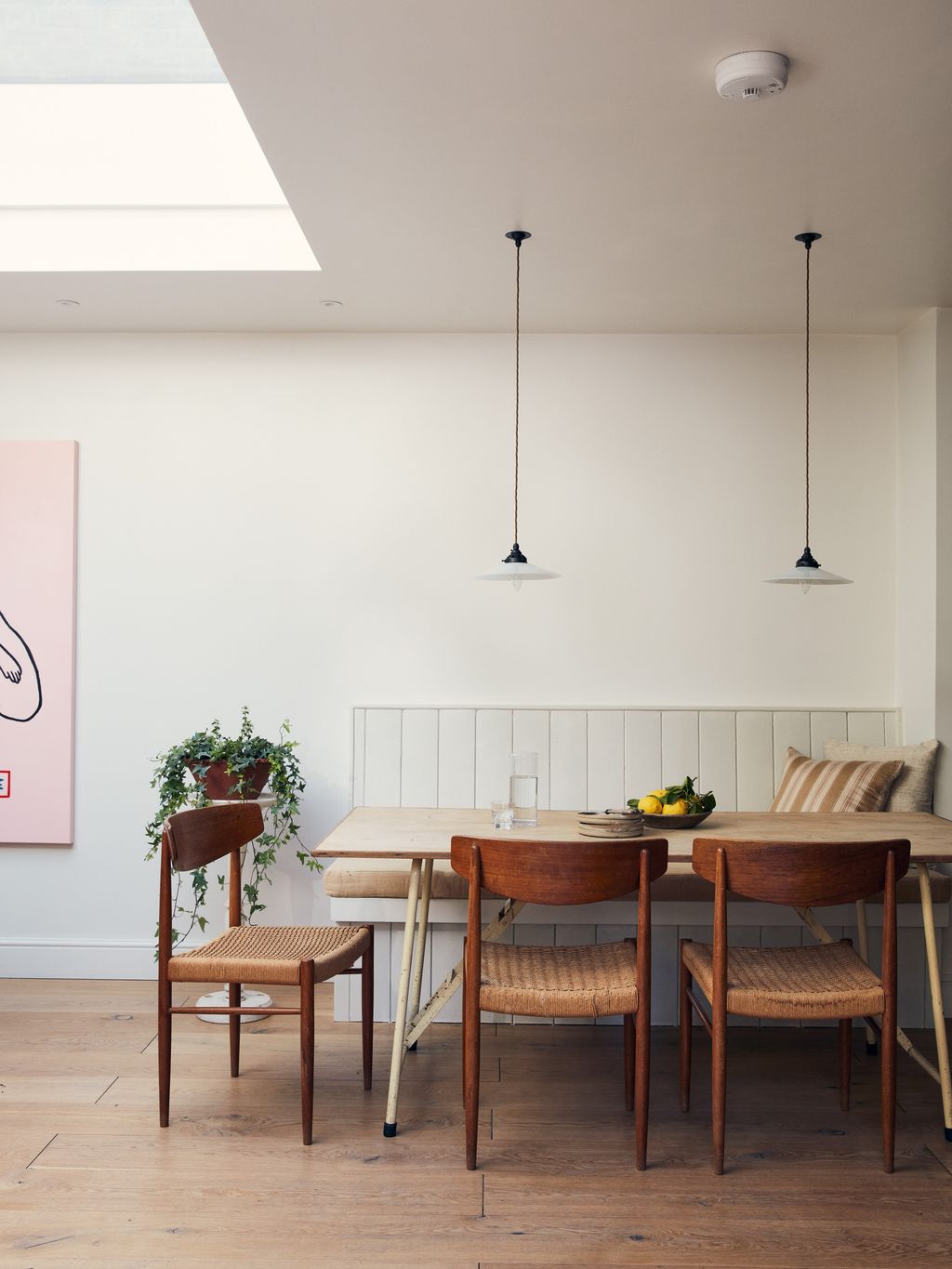
Forget conversation-starting reds, cool, nordic blues are perfect for low-key grandeur. Having used whites in the other rooms (see above), at this Scandinavian-inspired Surrey home an icy blue-green, also by Edward Bulmer has been selected for the dining area.
 Paul Massey11/20
Marie-Louise Sjögren’s historic house on the Stockholm archipelago also includes elegant, pale blues which perfectly fit the scene and complement the warmer tones of a cosy fire.
 12/20
12/20In the main bedroom of Rita Konig's London flat she has used ‘acres of C & C Milano wool’ for generous curtains, and Farrow and Ball's 'Skylight' for the walls. ‘Pale Powder’ is another go-to pale blue from the purveyors of paint.


 Paul Massey13/20
Pink
Setting Plaster by Farrow and Ball is a go-to pale pink, with earthy tones that make it naturally calming. For another, more icy pink by Farrow & Ball, try ‘Peignoir’.
 Simon Brown14/20
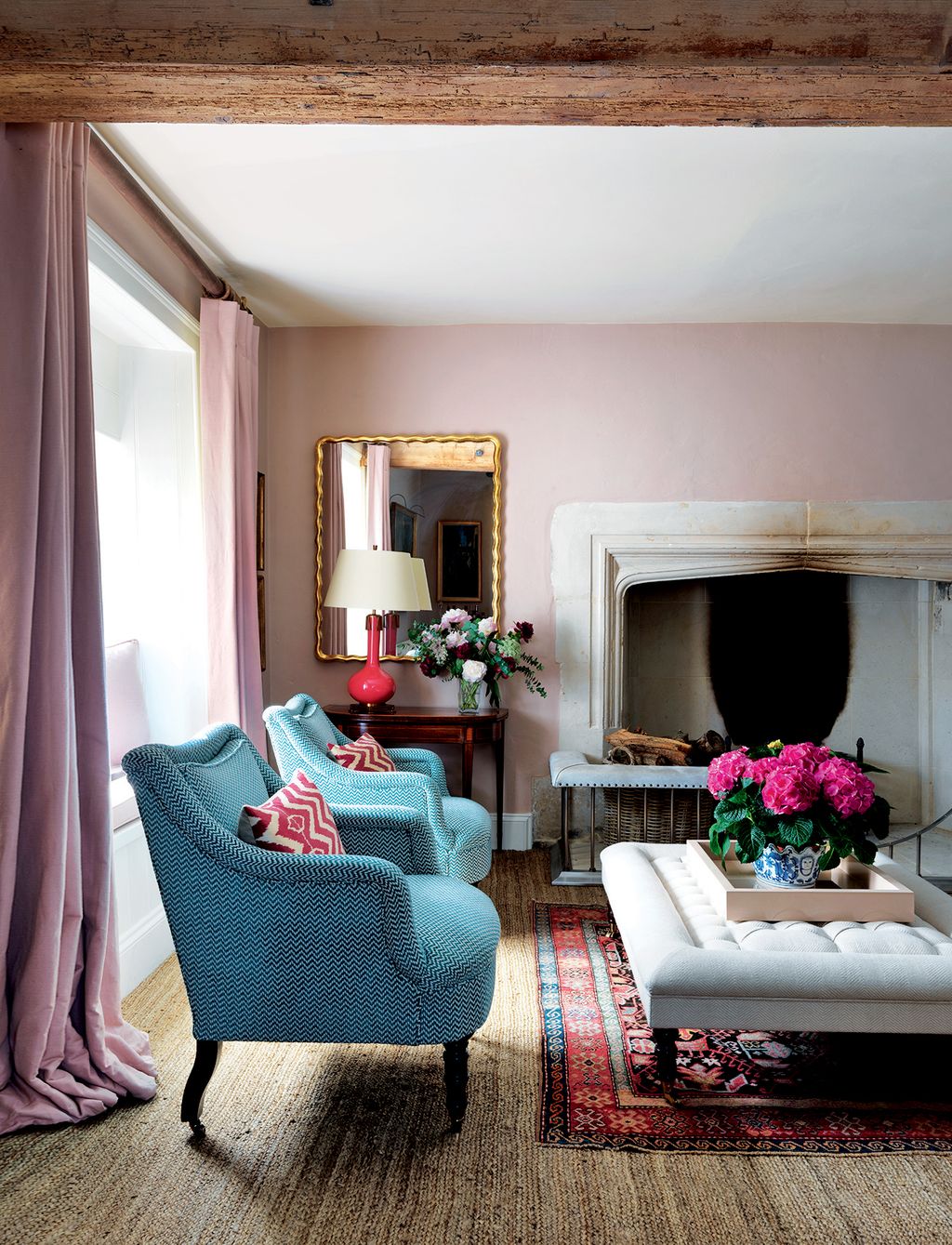
In the drawing room of this 16th-century farmhouse in Dorset with interiors by Samantha Todhunter, ‘Setting Plaster’ also appears in a very pink tone, complementing the curtains and cushions and nicely contrasting with the ‘Fairhill’ chairs by George Smith.
 Jake Curtis15/20
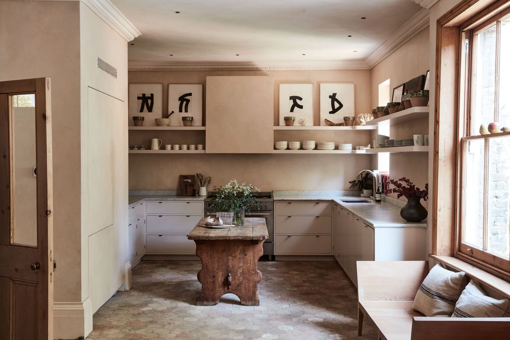
A custom pink paint has been used at the kitchen of a home designed by Jessica Summer. Drawn out from tones of the reclaimed terracotta floor the hue has an earthy depth that adds to the sense of calmness.
 Jake Curtis16/20
In the upstairs of this Jessica Summer-designed home, the panelling has been painted in another light, rich pink: Farrow & Ball’s ‘Smoked Trout’, which in her words, allows the teak bathtub ‘to sing’.


 Michael Sinclair17/20
At her home, Thea Speake has also opted for a cohesive pink colour scheme. In the living room, walls in Edward Bulmer Natural Paint’s ‘Jonquil’ are the backdrop for a painting by Chloe Lamb.
 Michael Sinclair18/20
Tonal pinks have also been chosen for the walls in the entrance hall. ‘Lilac Pink’ from Edward Bulmer Natural Paint makes a cool but bright entrance.
 Michael Sinclair19/20
Green
For the upstairs, Thea Speake has selected green for the bedroom. The shade is Paint & Paper Library’s archive colour ‘Both Barrels’.
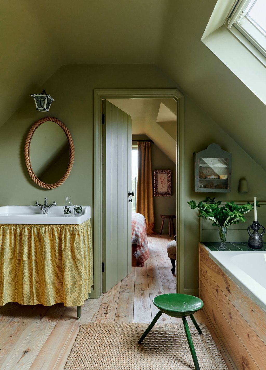 Michael Sinclair20/20
The bathroom continues the green theme.


