
“I wish colour were an area of design immune to passing fancies and prejudices,” muses the late, great American interior designer Mark Hampton, in his brilliant treatise On Decorating, published in 1989. He was referring specifically to peach, a hue he loved – and one that has certainly gone in and out of fashion over the decades. Indeed, Pantone’s announcement of ‘Peach Fuzz’ as its 2024 colour of the year came as a surprise to those of us who see the shade as somewhat dated, equating it with tired bed & breakfast candlewick bedspreads, badly varnished pine kitchens, the bridesmaids’ dresses in Muriel’s Wedding, and – as Mark declared himself (sadly) aware – “ladies’ underwear.” “Peach is a rather terrifying term,” agrees Benedict Foley, explaining that he puts it in the same bracket as magnolia. “They’re rental paint colours,” he says (albeit from the pre-greige decades.) And yet – though we aren’t by any means advocating for kowtowing to trends – might it be time to rehabilitate peach?
As we all know, it is popularity that makes for mass market ruination – and popularity stems from success. Benedict, becoming far more upbeat, begins to list positive peach moments from recent history: “peach taffeta crimped and cut into the most fantastical of confections . . . I’m thinking SS Normandie deco Terry towelling, Pauline de Rothschild, Raine Spencer. And I feel sure that Louis Mountbatten’s lavatory paper was peach.” (Rewind three or four decades, and everybody’s loo paper was peach – or mint-green or baby-blue, depending on the colour of your bathmat.)

There’s more: Princess Diana’s Bellville Sassoon honeymoon ‘going-away’ peach silk skirt suit (complete with contrasting froths of white at the collar and cuffs), and a slew of pages in another favourite tome, 1982’s The Laura Ashley Book of Home Decorating, where various peachy fabrics – patterns, plains, and satin – are quilted, frilled, flounced and swagged in accordance with the era’s Hameau-de-la-Reine reliance on ruffles and decidedly Rococo leanings. (Guess what colour the dress is the girl is wearing in Jean-Honoré Fragonard’s famous painting, The Swing, which, part of the Wallace Collection, is hanging in Manchester Square, just behind Oxford Street? Yes! It’s peach.)
Mark Hampton reminds us that peach was one of the inimitable John Fowler’s favourite colours, and mentions the ever-elegant Gothic gallery at Wilton House in Wiltshire, which has peach walls with an off-white trim and a stone floor – it’s on the cover of a third decorating volume, John Cornforth’s The Inspiration of the Past: Country House Taste in the Twentieth Century. Flick through it, and you’ll see numerous schemes that Fowler orchestrated – peach walls and ceilings at Haseley Court and Syon House, and heavenly peach silk curtains with a fan edge trim in a London drawing room.
Important to note is that it’s not always referred to as ‘peach’; ‘apricot’ is a popular alternative, see also ‘nectarine’, ‘terracotta’, ‘melon’, ‘melba’, ‘shrimp’, ‘coral’ and even ‘plaster.’ Remembering William Shakespeare’s line in Romeo & Juliet that “a rose by any other name would smell as sweet,” the point is that peach exists somewhere in the liminal space between the endlessly popular pink and yellow, able to take on more or less of either. It is also closely related to the biscuity shades that have been cropping up in the chicest interiors – and orange, though it has a softness that orange lacks. (“Orange is like a man, convinced of his own powers,” wrote the Russian artist Wassily Kandinsky in his book, Concerning the Spiritual in Art.) Edward Bulmer – another fan – mentions that “peach colours have a rare ability to trigger our memory of the sun-drenched façade of some European villa or South American hacienda,” describing it as “literal summer sunshine.” Pantone explained that they chose ‘Peach Fuzz’ to “reflect our current need for nurturing, empathy, and compassion” – and there can be a sweetness, even an innocence to peach, especially when you think about the word’s colloquial uses, ‘peaches and cream’ and ‘peachy-keen’. But, putting meaning and associations aside, what is undisputable is that peach is useful.
Mark Hampton likened peach to beige or white, in that “peach or some related shade of it will go with absolutely any other colour.” And, says Edward Bulmer, “it’s grand, timeless and easy going all at the same time,” which reinforces Mark’s argument that it works with every period of architecture, in any room of the house – though particularly, perhaps, a bathroom or bedroom, for it gives off an endlessly flattering light, and “what better colour for any place where bare skin is a factor?” (a very salient consideration). Mark also maintained that it’s a perfect foil to chintz, to “light frothy-coloured upholstery. . . and Oriental carpets are superb with peach in the background.” Picking up the thread, Octavia Dickinson – who grew up with an ‘apricot’ room – moots that as a wall colour “it softens furniture, be it an antique stool or brass column lamps. I like to play with the juxtaposition of light and dark, and peachy looks so smart against dark shades of wood typical of 19th-century antique furniture.” Finally, it’s warmth makes it a shoe-in for a north-facing room.
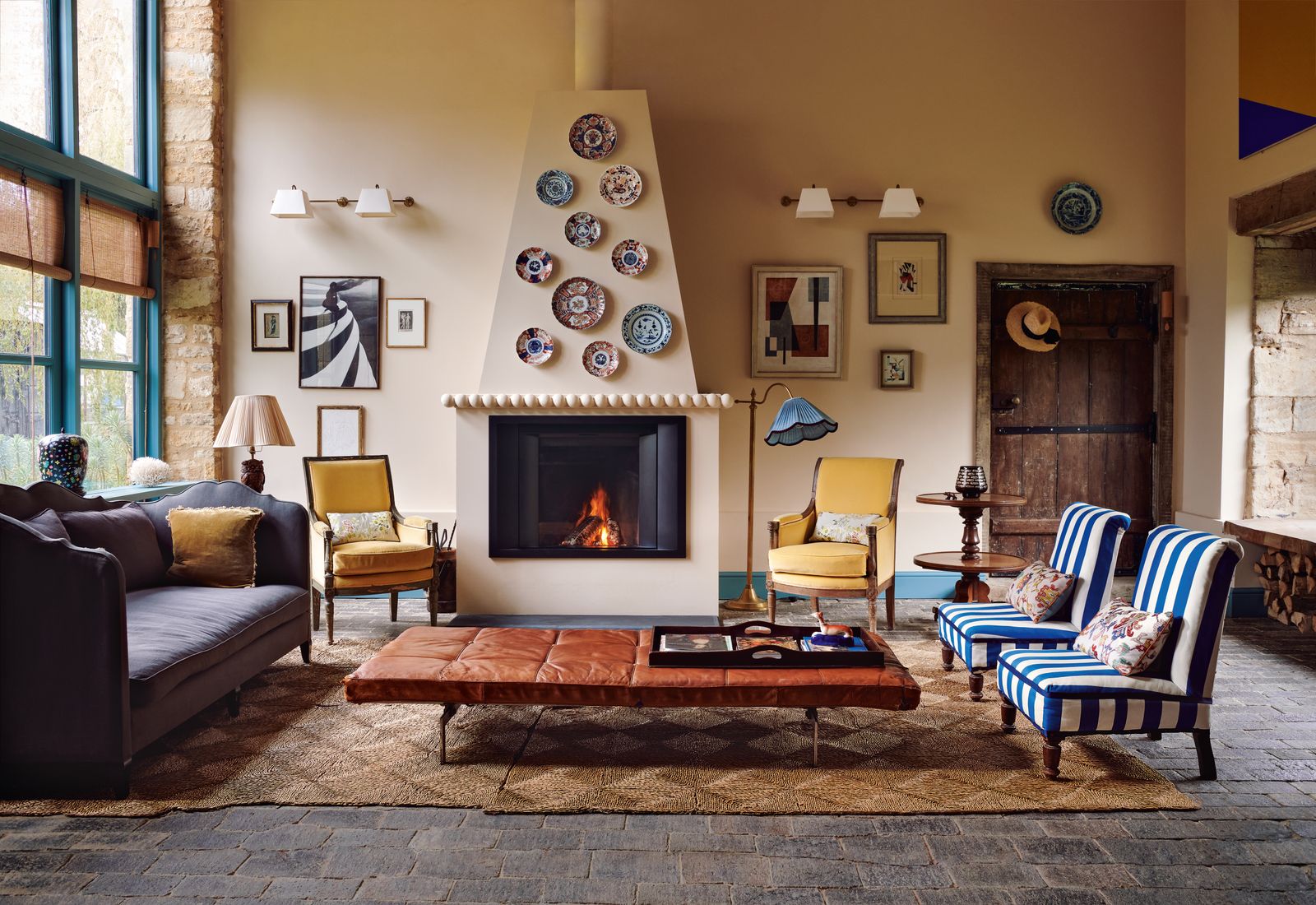
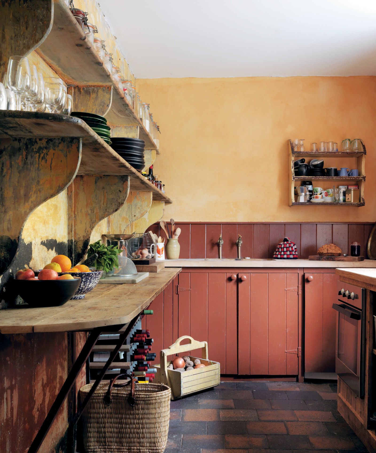
So of course, people have been using it. Watch the video House & Garden made with Nina Campbell of her house in Chelsea and pay particular attention to the peachy wall outside the basement television room that gives the space such a lovely glow; it’s ‘Mojo’ by Vanessa Konig. There’s a pale peach tint to the walls of the room in Catherine Chichester’s Cotswolds barn that is on the cover of the February issue of House & Garden (on newsstands now); it’s ‘Single Cream’ by Farrow & Ball, which, the company explains, “has a redder base than most classic creams.” The kitchen in Max Hurd’s London house, an interior conceived in collaboration with Benedict Foley, is peach by way of the wittily named ‘Fake Tan’, also by Farrow & Ball, proving Mark correct when he wrote that peach can even be “strong, with enough of a jolt to suit the most adventurous extremist.”
The peach-hued dining room belonging to Anna Hope of interiors Instagram account @hope_and_the_house was so made by mixing Farrow & Ball’s ‘Dutch Orange’ with ‘Clunch’(“roughly 1:2” she says, of the ratio.) And Edward Bulmer – who reports that sales of tester pots in peach shades have gone up by 59% in recent months – launched two new peachy shades in October, ‘Header’ and ‘Hespan’, the last named for “the country’s best painter Charles Hesp, of Hesp & Jones,” after Edward asked him “to name a colour that he gets asked for because it’s not on the colour charts, and he identified a light terracotta.” Edward’s ‘Dutch Orange’, incidentally, is an homage to the shade that John Fowler mixed.

So are there any rules to peach’s use – anything that we can learn from the mistakes of yesteryear, as well as the triumphs? “I find that solid peach paint does not work well except in the palest tones, otherwise it becomes heavy and dull, resembling pancake make-up rather than possessing the clear, lush qualities that can make it enormously appealing,” wrote Mark, who generally favoured Fowler’s approach, with specialist paint effects such as dragging and stippling. Though, if you do want to go darker, know that quality of paint makes all the difference. The dramatic hue of Max Hurd’s kitchen, amped up by the castellation of the cabinets, is bold, remarks Benedict, “and was very much chosen as part of an enfilade of colour – various rooms connect one to the next with a related logic that helps the sum feel more restful than the parts. So I think you simply long for peach via ‘Fake Tan’, think about what’s happening next door to it – and if you’re not fully confident maybe use it in a smaller room or a more isolated context.”
Then there are the soft furnishings. Some might suggest that clean lines will keep it more 2024 than 1984 or 1964, and that retro flounces should not be combined with an equally retro shade – but do we need to specify the decade? Isn’t that exactly the point that Mark was making when he referred to passing fancies and prejudices? Luke Edward Hall has just installed peach-coloured curtains in Amaru, the soon-to-open Peruvian restaurant in the Kulm Hotel in St. Moritz, and their leading edge is both frilled and bordered in a Greek key pattern, while Octavia’s new lampshade collection includes an irresistible model in gathered peach silk with a contrasting silver-grey ruffle frill. Finally, “I do like a repeated colour reference,” says Benedict. “So here’s to peach loo paper!” Which is the one thing that does benefit from a contemporary interpretation, via the unbleached variety by Naked Sprout. Admittedly it’s not as peach – but there’s enough of a hint to make it count.


